“`
Some rooms are born with excellent bones. Others have a suspiciously beige wall, an ordinary window, and a floor that seems determined to mind its own business. The good news is that you do not need a demolitioht in front of you: jewel-toned voile curtains.
Voile curtains are light, semi-sheer panels with a soft, airy drape. In a rich emerald, sapphire, ruby, amethyst, topaz, or teal, they become more than window coverings. They create a glowing layer between the indoors and outdoors, tint daylight beautifully, and connect the room’s walls, windows, and floors into one intentional story.
The trick is not simply choosing a dramatic color and hoping the room applauds. Jewel-toned voile curtains work best when they are treated as part of a larger design conversation. Your wall color sets the mood, your flooring provides the visual anchor, and your windows become the spotlight. Get those three elements talking to each other, and even a very ordinary room can look like it has been promoted to leading role status.
What Makes Voile Curtains So Special?
Voile is a lightweight woven fabric, commonly made from cotton, polyester, linen blends, or synthetic fibers designed to mimic the crisp softness of natural textiles. It is not meant to block every ray of sun or create complete privacy at night. Its job is gentler: diffuse daylight, soften hard window lines, add movement, and make a room feel less like a box with furniture inside it.
Unlike heavy velvet drapes, voile curtains do not dominate a window by sheer mass. Instead, they create atmosphere. When sunlight passes through a sapphire-blue voile, the room can take on a cool, watery glow. Ruby voile can warm a neutral living room with a rosy cast. Emerald voile brings a garden-like richness indoors, even when the only plant in the room is a heroic pothos trying its best.
Jewel tones are especially effective because they feel saturated, elegant, and expressive. They borrow their names and visual character from gemstones: emerald, sapphire, ruby, amethyst, garnet, turquoise, citrine, and deep topaz. These colors have presence, but voile keeps them from becoming too heavy. The fabric acts like a color filter rather than a solid wall of pigment.
Start With the Room’s Three Biggest Surfaces
Before ordering curtain panels, look at the elements that already take up the most visual space: walls, floors, and windows. A jewel-toned voile curtain should create a bridge between them, not arrive like a guest wearing a tuxedo to a backyard barbecue.
Walls: The Mood Setter
Your walls create the background against which the curtains will perform. Pale walls allow jewel-toned voile to become the focal point. Warm white, cream, putty, greige, soft mushroom, and light taupe walls are excellent companions for emerald, teal, plum, and ruby panels because they keep the room bright while giving the color room to breathe.
Deep walls can work too, but the relationship should feel deliberate. Navy walls paired with sapphire voile may sound like too much blue at first, yet the result can be layered and cocoon-like when the curtain is several shades lighter or more transparent than the wall. Olive walls with sheer emerald curtains can feel botanical and moody, especially with warm wood furniture and brass accents.
For a calmer room, use tonal layering. Think pale lilac walls with amethyst voile, dusty rose walls with garnet panels, or soft blue-gray walls with dark teal sheers. The curtain color adds depth without shouting across the room. For stronger contrast, pair rich jewel tones with warm neutrals: topaz voile against ivory walls, emerald against camel, or ruby against soft beige.
Windows: The Light Laboratory
Windows are where voile earns its keep. In daylight, the fabric filters brightness and softens glare. At night, it adds a decorative layer, although it should not be your only privacy solution in a bedroom or street-facing room.
If privacy matters, use a layered window treatment. Hang jewel-toned voile on the front rod, then place a roller shade, Roman shade, blackout lining, or heavier curtain panel behind it. During the day, the voile can remain closed for softness and partial privacy. At night, the secondary layer takes over. It is the interior-design equivalent of having both a favorite jacket and a raincoat: stylish, practical, and much less likely to leave you regretting your choices.
For rooms with a lovely outdoor view, choose a lighter voile and hang panels wide enough that they can stack off the glass when open. This allows the window to remain a feature instead of becoming a permanently tinted obstacle course.
Floors: The Quiet Anchor
Floors often receive less attention than walls and furniture, but they quietly determine whether a room feels grounded. A jewel-toned curtain should acknowledge what is happening underfoot.
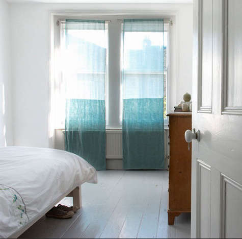
Light oak, bleached wood, pale tile, and natural stone create a relaxed contrast with deep blue, emerald, plum, or ruby voile. The result feels bright but polished. Medium-toned wood floors work beautifully with teal, garnet, amethyst, and dark green because the warm grain prevents the palette from feeling icy.
Dark wood or charcoal flooring calls for a little more thought. You can lean into drama with sapphire, aubergine, or deep ruby voile, then lift the room with pale upholstery, a warm rug, or brass and cream accents. Alternatively, choose a lighter jewel tone such as peacock blue or citrine so the curtains bring light upward rather than making the room feel visually bottom-heavy.
How to Choose the Right Jewel Tone
The best curtain color is not always the boldest one in the swatch book. Consider the room’s natural light, nearby surfaces, and the mood you want to create.
Emerald and Deep Green
Emerald voile curtains suit rooms with warm wood, rattan, antique brass, cream upholstery, and plants. They can make a simple living room feel more collected and organic. In a dining room, emerald voile adds a sense of occasion without the heaviness of traditional drapery.
Sapphire and Peacock Blue
Blue voile curtains feel calm, tailored, and quietly luxurious. Sapphire works well with white walls, warm metallics, walnut flooring, and soft gray furniture. Peacock blue brings more green into the mix and looks especially striking with caramel leather, natural linen, and light oak.
Ruby, Garnet, and Wine
Red-based jewel tones are warm, social, and energetic. Ruby voile curtains can turn a bland dining room into a space that feels ready for candlelight and long conversations. Garnet and wine colors are slightly softer choices for bedrooms, reading rooms, and traditional interiors with cream walls and darker wood floors.
Amethyst, Plum, and Aubergine
Purple jewel tones are for people who want elegance with a small dash of mischief. Amethyst voile pairs beautifully with pale gray, soft lavender, cream, and brushed nickel. Aubergine works with walnut, black accents, warm ivory, and muted gold. Use it in a bedroom or den where you want the atmosphere to feel rich, restful, and slightly theatrical.
Topaz, Citrine, and Golden Amber
Golden voile curtains create warmth without the density of mustard-colored upholstery or heavy ochre drapes. They are especially effective in rooms with cool walls, gray floors, or north-facing windows that need a visual dose of sunshine. Pair them with navy, forest green, rust, or chocolate brown for a balanced palette.
Get the Measurements Right Before You Fall in Love With a Color
Even the most gorgeous jewel-toned voile cannot rescue curtain panels that are too short, too narrow, or hung directly above the window frame like a hat that does not fit. The visual payoff comes from proportion.
Mount the curtain rod high and wide whenever the architecture allows. Positioning it several inches above the window frameor closer to the ceiling in rooms with enough wall spacedraws the eye upward and makes the room feel taller. Extending the rod beyond each side of the window gives the panels somewhere to rest when open, helping the glass appear wider and letting more daylight into the room.
For a full, softly gathered voile look, aim for a combined curtain width of roughly two to two-and-a-half times the window width. A skimpy sheer panel tends to look more like a reluctant scarf than a finished window treatment. Extra fullness creates prettier folds, richer color variation, and a more graceful silhouette when sunlight moves through the fabric.
For length, floor-skimming panels are usually the safest choice. Let them barely touch the floor or hover just above it for easy cleaning. A slight break can look relaxed and romantic, while pooled fabric feels more formal and is best reserved for low-traffic rooms without curious pets, energetic children, or a vacuum cleaner that enjoys eating hems.
Three Foolproof Room Formulas
1. The Emerald Living Room
Start with warm white or soft taupe walls, light oak floors, a cream sofa, and emerald voile curtains on a slim brass rod. Add a textured ivory rug, dark green cushions, a terracotta planter, and a few black accents for definition. The curtains become the room’s color hero without making the entire space feel like a rainforest-themed restaurant.
2. The Sapphire Bedroom
Use pale gray-blue walls, medium walnut floors, white bedding, and sapphire voile curtains layered over blackout shades. Add a navy lumbar pillow, a muted gold bedside lamp, and a soft beige upholstered headboard. The daylight remains gentle, while nighttime privacy is handled by the shade. It feels serene, not sleepy.
3. The Ruby Dining Nook
Pair creamy walls with warm wood floors and ruby voile panels. Include a round wood table, woven dining chairs, a simple linen runner, and one antique-brass pendant light. The ruby fabric adds warmth around the window without demanding red chairs, red plates, red flowers, and a red marching band.
Layering Voile Curtains for Beauty and Function
Jewel-toned voile is at its best when it is allowed to be beautiful rather than asked to solve every window problem alone. Layering gives you flexibility.
In bedrooms, pair voile with blackout shades or lined drapes. In living rooms, combine it with woven shades for texture and daytime privacy. In dining rooms, use voile alone when privacy is not a concern and you want maximum softness. In a home office, add a solar shade behind the voile to reduce glare on screens while keeping the window visually light.
Hardware matters too. Slim black rods make jewel tones feel modern and graphic. Aged brass brings warmth and traditional elegance. Antique bronze works well with deep green, garnet, and plum. Clear acrylic rods can create a lighter, more contemporary look when you want the colored fabric to appear as though it is floating.
Care Tips for Jewel-Toned Voile Curtains
Voile looks delicate, but many panels are practical enough for regular home care. Always check the fabric label first. Polyester voile is often washable on a gentle cycle with cool water, while linen blends may require more careful laundering. Use a mild detergent, avoid aggressive heat, and rehang the curtains while slightly damp when possible to reduce wrinkles.
Dust is the quiet enemy of every curtain, especially light-filtering fabric. A gentle vacuum attachment, a soft duster, or occasional low-heat steaming can keep panels looking fresh. In kitchens, voile may need more frequent cleaning because it can collect cooking odors and airborne grease. In sunny rooms, rotate or reposition panels occasionally if fading is a concern, particularly with deeply saturated colors.
When in doubt, treat jewel-toned voile like a favorite shirt rather than a disposable tablecloth. Gentle care keeps the color brighter, the weave smoother, and the drape more graceful.
Common Mistakes to Avoid
The first mistake is choosing a curtain color in isolation. Hold fabric swatches beside the wall, floor, sofa, and rug. What looks like luxurious sapphire in a store can read almost black in a dim room. What appears like emerald online may lean teal once it meets your warm beige walls.
The second mistake is assuming sheer means private. Jewel-toned voile can obscure a view during the day, but interior lights at night can reverse that effect. Use a secondary shade or heavier layer where privacy is essential.
The third mistake is treating every room the same. A dramatic ruby voile may be perfect for a dining room and completely wrong for a tiny, low-light hallway. Let each room’s size, function, and daylight guide the decision.
Finally, resist overmatching. You do not need curtains, cushions, rugs, lampshades, and artwork in exactly the same jewel tone. Repeat the curtain color once or twice in smaller details, then allow neutrals, wood, metal, and texture to provide breathing room.
Living With Jewel-Toned Voile Curtains: A Design Experience
The most memorable rooms are not always the ones with the most expensive furniture. They are the rooms that change a little throughout the day. Jewel-toned voile curtains are particularly good at creating that kind of experience because they never look exactly the same twice.
In the morning, a deep teal voile curtain can turn ordinary sunlight into something soft and aquatic. The floor may pick up a faint blue-green reflection, especially if it is pale wood, polished concrete, or light tile. A white wall that looked plain the night before suddenly has a gentle tint and more depth. The room feels awake before you have even decided whether coffee is a necessity or a human right.
By afternoon, the curtain color becomes more transparent. You begin to notice the folds instead of just the hue. The voile moves slightly when a window is open, and the whole room feels less fixed in place. This is where jewel tones surprise people: they can be dramatic without making the space feel heavy. The fabric has color, but it also has air.
At sunset, the effect becomes even more interesting. Ruby and garnet voile can make a room feel warm and intimate, particularly against cream walls and medium wood flooring. Sapphire and amethyst can make a bedroom feel quieter and more cocoon-like. The curtains become a transition between day and evening, which is a small detail but a powerful one. They help the room change mood without requiring you to redecorate every six hours like a very tired stage designer.
There is also a practical pleasure in seeing how voile works with the rest of the room. A rug that once seemed disconnected may suddenly make sense because it picks up the curtain’s undertone. Brass hardware can look richer beside emerald fabric. A walnut floor can appear warmer near ruby panels. Even a basic white sofa can feel more intentional when framed by jewel-toned light.
The best experience comes from allowing the curtains to be part of daily life rather than treating them like museum pieces. Open them wide in the morning. Let them filter harsh light during the day. Pull the secondary shade at night when privacy matters. Steam them when they wrinkle. Watch how the color changes with the weather. On gray days, a topaz voile panel can bring visual warmth. On bright days, a sapphire panel can take the edge off the glare while keeping the room luminous.
Over time, jewel-toned voile curtains often become the element that makes a room feel finished. Not overly decorated. Not staged. Finished. They give the eye somewhere to rest, create a soft boundary around the window, and make the walls and floors feel as though they were chosen on purpose. That is a fairly impressive résumé for a few yards of fabric.
Conclusion
Jewel-toned voile curtains prove that window treatments can do far more than cover glass. They can soften daylight, create visual height, enrich a neutral room, and connect the major surfaces that define your space. The key is balance: choose a color that complements the walls, acknowledge the floor’s warmth or coolness, hang the panels with generous height and fullness, and layer them when privacy or light control is needed.
Whether you choose emerald for an earthy living room, sapphire for a peaceful bedroom, ruby for a sociable dining space, or amethyst for a dramatic reading nook, voile gives jewel tones a lighter touch. It lets color glow rather than crowd the room. And that is exactly what good design should do: make your home feel more like yours, without requiring a complete renovation or a reality-TV reveal.
Note: Always measure your actual window, ceiling clearance, rod placement, and curtain heading style before ordering panels. Color may also shift depending on daylight, wall undertones, and screen settings.