Note: This article is written for web publication and is based on established DIY electronics, weather-sensor, dashboard, and public weather-data practices.
A weather app is fine until you want to know what the sky has been doing, not just what it is allegedly about to do. That is where a graphing weather display earns its keep. Instead of showing one lonely temperature number like it has been abandoned at a bus stop, a graphing display shows trends: pressure falling before rain, humidity rising overnight, temperature swings through the day, wind changes before a front, and those suspicious indoor readings that prove your home office is basically a toaster with Wi-Fi.
Building your own graphing weather display is one of those projects that sits in the perfect maker zone: useful enough to justify the parts, nerdy enough to be fun, and customizable enough that no store-bought gadget can smugly compete. You can build it with a Raspberry Pi and a touchscreen, an ESP32 and an e-paper screen, a small OLED display, or even a repurposed tablet showing a dashboard. The goal is simple: collect weather data, store it with timestamps, turn it into clean graphs, and display it somewhere you will actually look at it.
This guide walks through the practical choices, from sensors and APIs to displays, graph design, mounting, software, and lessons learned after living with a homemade weather display. Bring coffee. Bring jumper wires. Bring patience. The weather may be chaotic, but your dashboard does not have to be.
What Is a Graphing Weather Display?
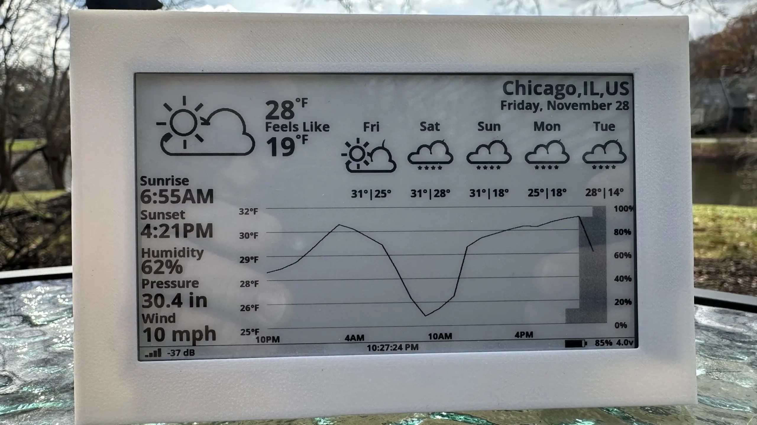
A graphing weather display is a dedicated screen that visualizes current and historical weather conditions. Unlike a basic thermometer or a weather widget, it does not merely say, “It is 72°F.” It shows how the temperature changed over the past hour, day, or week. It can also graph humidity, barometric pressure, rainfall, wind speed, air quality, indoor comfort, forecast highs and lows, and even sunrise or sunset times.
The display can pull data from local sensors, online weather APIs, or both. A local sensor gives you hyperlocal conditions from your porch, balcony, greenhouse, garage, attic, workshop, or backyard. A weather API adds forecasts, alerts, radar context, and regional observations. Combining both is where things get spicy: your display can compare “official” weather with what is happening at your actual location, which is often more useful than a forecast station ten miles away and living a completely different microclimate lifestyle.
Why Build One Instead of Buying a Weather Station?
Commercial weather stations are convenient, but they usually come with fixed screens, limited graphing, cloud accounts, app dependency, or design choices that seem to have been approved by a committee of beige printers. Building your own gives you control over the data, layout, refresh rate, display type, and sensors.
A DIY graphing weather display can be tailored for specific needs. Gardeners may care about overnight lows, humidity, rainfall, and soil temperature. Commuters may want forecast precipitation, wind, and temperature trends. Homeowners may track indoor humidity to avoid dry winter air or mold-friendly dampness. Makers may simply enjoy turning tiny sensors into a dashboard that looks like mission control for a very dramatic patio.
The other advantage is education. This project teaches practical skills: I2C wiring, sensor calibration, JSON APIs, time-series databases, MQTT, Python, JavaScript, dashboard design, enclosure planning, and basic weather interpretation. You do not just get a display. You get a small laboratory that occasionally tells you to bring an umbrella.
Core Parts You Need
The exact parts depend on whether you want a simple countertop display or a more advanced weather station. Start with the basics and expand later. Weather projects love expansion. One day you are graphing temperature; the next day you are explaining to guests why there is a rain gauge zip-tied to a fence post.
1. A Controller or Mini Computer
The brain of the project can be a Raspberry Pi, ESP32, ESP8266, Arduino-compatible board, or another single-board computer. For a full dashboard with rich graphs, a Raspberry Pi is the easiest choice. It can run a browser in kiosk mode, store data locally, and display a web dashboard on a touchscreen.
An ESP32 is better for low-power builds. It has Wi-Fi, supports many sensors, and can drive small OLED, TFT, or e-paper displays. It is ideal when you want a compact unit that wakes up, updates readings, refreshes the screen, and goes back to sleep like a tiny meteorological raccoon.
2. A Display
A display should match how often the information changes. A 7-inch touchscreen is excellent for a full weather dashboard with multiple graphs. A small TFT screen works well for compact color charts. OLED displays are crisp and inexpensive but better for simple graphs and current readings. E-paper displays are fantastic for low-power wall displays because they remain visible without constant power, though they refresh more slowly.
For indoor dashboards, brightness and viewing angle matter. For a hallway or kitchen counter, a screen that can be read at a glance is more useful than one that looks great only when you crouch at exactly 37 degrees like you are decoding a spy message.
3. Weather Sensors
A basic environmental sensor such as the BME280 or SHT31 can measure temperature, humidity, and barometric pressure. These sensors are popular because they are small, inexpensive, and easy to connect over I2C. For more advanced builds, add a rain gauge, anemometer, wind vane, light sensor, UV sensor, particulate matter sensor, or soil moisture probe.
Temperature and humidity sensors should be shielded from direct sun and rain while still receiving airflow. A sensor baking in sunlight will report “surface of Mercury” instead of actual air temperature. A small radiation shield or ventilated enclosure makes readings much more realistic.
4. Power Supply
Indoor displays are simplest with USB power. Outdoor sensor nodes may use batteries, solar panels, or a protected low-voltage supply. If you build a battery-powered ESP32 node, choose deep sleep modes, reduce Wi-Fi connection time, and avoid power-hungry displays unless they are used sparingly.
5. Enclosure and Mounting
Weather electronics must be protected from water, heat, insects, dust, and the universal law that cables always find the worst possible angle. Use a weather-resistant enclosure for outdoor components, add cable glands, keep sensors ventilated, and avoid placing electronics where rain can pool. Indoors, a 3D-printed case, wooden stand, or picture-frame mount can make the display look intentional rather than “science fair escaped into the living room.”
Choose Your Build Style
Option A: Raspberry Pi Dashboard
A Raspberry Pi weather display is the best route if you want attractive graphs and a larger screen. The Pi can collect data from local sensors, call public weather APIs, store readings in a database, and show dashboards through a browser. A common setup uses Python for data collection, InfluxDB or SQLite for storage, and Grafana or a custom web page for visualization.
This build is powerful because it separates data from display. You can log readings every minute, build daily and weekly graphs, compare indoor and outdoor conditions, and add forecast panels. It also works well with a 7-inch touchscreen or any HDMI monitor.
Option B: ESP32 With Local Display
An ESP32 weather display is compact, affordable, and efficient. It can read sensors directly, fetch forecast data over Wi-Fi, and draw simple graphs on a small display. Libraries for OLED, TFT, and e-paper screens make it possible to create line charts, icons, and numeric readouts.
This version is great for a desk, nightstand, workshop, greenhouse, or garage. It is less suited to complex dashboards unless you enjoy squeezing large ideas into small screens like packing a camping tent back into its original bag.
Option C: Sensor Node Plus Web Dashboard
A very flexible design uses one or more sensor nodes that transmit data to a central dashboard. The outdoor node can be an ESP32 publishing readings over MQTT. A Raspberry Pi, home server, or cloud service receives the data, stores it, and displays graphs. This approach scales nicely: add a greenhouse node, attic node, basement node, or shed node without rebuilding the whole system.
How the Data Flow Works
A reliable graphing weather display follows a simple pipeline:
- Measure: Sensors capture temperature, humidity, pressure, rainfall, wind, or other data.
- Timestamp: Each reading gets a time so it can be graphed accurately.
- Store: Data is saved in a time-series database, local file, or cloud platform.
- Process: Software calculates averages, trends, min/max values, and comfort indicators.
- Display: Graphs and numbers appear on a screen, dashboard, or web page.
Do not skip storage. Without history, your display is just a prettier thermometer. With stored data, it becomes a trend machine. You can see how fast pressure dropped, when the humidity peaked, how much warmer the attic is than the living room, or whether yesterday’s “chance of rain” had commitment issues.
Best Weather Data to Graph
Temperature
Temperature is the obvious starting point. Graph outdoor temperature, indoor temperature, daily highs and lows, and rate of change. A 24-hour line graph is often the most useful view because it shows overnight cooling, afternoon peaks, and sudden weather fronts.
Humidity
Humidity matters for comfort, health, plants, wood furniture, instruments, and mold prevention. Indoor humidity graphs are especially helpful in winter, when heated air can become dry, and in basements, where moisture can creep upward like a villain in a horror movie.
Barometric Pressure
Pressure trends are one of the most interesting graphs. Falling pressure often suggests worsening weather, while rising pressure usually points to clearing conditions. The absolute number matters less than the trend. A smooth pressure graph can make your display feel like a tiny forecasting station.
Rainfall
A tipping-bucket rain gauge lets you track rain per hour, daily totals, weekly totals, and storm totals. For gardeners, this can answer the eternal question: “Do I need to water, or did the sky handle payroll?”
Wind
Wind speed and direction add complexity but make the display more complete. Wind graphs help with outdoor planning, cycling, grilling, drone flying, and deciding whether patio cushions are about to visit another ZIP code.
Forecast and Alerts
Public weather APIs can provide forecasts, alerts, and regional observations. For a U.S.-based project, the National Weather Service API is a strong choice because it provides forecasts, alerts, and observation data in modern web-friendly formats. Other services can add global coverage, historical data, air quality, or extended forecasts.
Software Stack Options
Simple Python and SQLite
For beginners, Python plus SQLite is a friendly setup. A Python script reads the sensor, records values into a database, and a small web app displays graphs with JavaScript. This keeps everything local and understandable.
InfluxDB and Grafana
For a polished dashboard, InfluxDB and Grafana are a popular pair. InfluxDB is designed for time-stamped data, while Grafana is excellent at turning that data into dashboards with line graphs, gauges, thresholds, and time-range controls. This combination is especially good when you want a display that looks professional without designing every chart from scratch.
Node-RED
Node-RED is useful if you prefer visual flows over writing every line of code. It can collect data from APIs, MQTT topics, sensors, and databases, then route that data into dashboards or automations. For many makers, it is the “duct tape, but somehow elegant” option.
Custom Web Dashboard
If you enjoy front-end work, build your own dashboard using HTML, CSS, and JavaScript charting libraries. A custom page gives complete control over layout, colors, icons, and mobile responsiveness. It also lets you design a display that matches your room instead of looking like a server room had a baby with a spreadsheet.
Step-by-Step Build Plan
Step 1: Define the Display Goal
Before buying parts, decide what the screen should answer at a glance. A good goal might be: “Show indoor and outdoor temperature, humidity, pressure trend, today’s forecast, and a 24-hour graph.” Avoid starting with every possible metric. Weather data is addictive, and dashboards can become cluttered faster than a junk drawer in a thunderstorm.
Step 2: Pick the Hardware
For a beginner-friendly full display, use a Raspberry Pi with a touchscreen and a BME280 sensor. For a compact build, use an ESP32 with a 2.9-inch e-paper display or a small color TFT. For a more advanced setup, use ESP32 sensor nodes that send data to a Raspberry Pi dashboard.
Step 3: Connect the Sensor
Most environmental sensors connect through I2C, which typically requires power, ground, SDA, and SCL. Keep wires short when possible, check voltage requirements, and confirm the sensor address. If the sensor does not respond, do not immediately accuse the universe. Check wiring, pull-up resistors, address conflicts, and whether the board is powered correctly.
Step 4: Log Readings
Set a reasonable sampling interval. For indoor temperature and humidity, one reading per minute is usually enough. For battery-powered outdoor nodes, every five minutes may be more practical. Pressure trends do not need second-by-second updates unless your house is inside a tornado simulator, in which case please stop reading and seek shelter.
Step 5: Build the Graphs
Start with one clean temperature graph, then add humidity and pressure. Use consistent time ranges, readable labels, and enough contrast for quick viewing. Avoid tiny legends, excessive decimals, and rainbow color schemes that make the dashboard look like it lost a fight with a box of markers.
Step 6: Add Forecast Data
Once local readings work, add forecast data. Pull current conditions, hourly forecasts, daily highs and lows, precipitation probability, and alerts. Cache API responses appropriately so the display is responsive and respectful of the data service.
Step 7: Mount and Refine
Place the display where it becomes part of daily life: kitchen counter, entryway, desk, workshop wall, or greenhouse shelf. After a week, adjust what you show. The best dashboard is not the one with the most data; it is the one that answers your actual questions quickly.
Graph Design Tips That Make the Display Better
Use large current readings and smaller historical graphs. People usually want the current temperature first, then the trend. Put urgent information, such as weather alerts or freezing warnings, near the top. Use icons sparingly; they help when they clarify, not when they turn the dashboard into a sticker book.
For time ranges, include a 24-hour view and a 7-day view. The 24-hour graph shows daily rhythm. The 7-day graph reveals patterns. If storage allows, monthly views can be fascinating, especially for gardeners, home energy tracking, or indoor comfort analysis.
Use smoothing carefully. A rolling average can make noisy sensor data readable, but too much smoothing hides real changes. For temperature and humidity, modest smoothing is fine. For rainfall, show actual totals. For wind, consider both average speed and gusts, because gusts are what relocate lawn furniture.
Calibration and Accuracy
DIY weather displays do not need laboratory-grade accuracy to be useful, but they do need consistency. Compare your readings with a trusted nearby source for a few days. If your temperature is always 2°F high, apply an offset. If humidity seems strange, check placement and airflow. If pressure readings are off, adjust for altitude when necessary.
Sensor placement is the biggest accuracy factor. Keep outdoor temperature sensors out of direct sunlight, away from walls that radiate heat, and above surfaces like asphalt or concrete that store warmth. For indoor sensors, avoid placing them near vents, windows, lamps, computers, or coffee machines unless you specifically want to graph “espresso-adjacent climate.”
Common Problems and Fixes
Readings Jump Around
Use averaging, check wiring, reduce cable length, and make sure the sensor is not exposed to sudden drafts or direct heat. Cheap sensors can be noisy, but sloppy placement is often the real culprit.
Display Is Too Cluttered
Remove half the panels. Seriously. A dashboard should be glanceable. Put detailed historical data on a secondary page and keep the main display simple.
Outdoor Node Dies Quickly
Reduce update frequency, use deep sleep, disable unnecessary LEDs, improve battery capacity, or switch to solar charging. Wi-Fi can consume significant power, so connect, transmit, and sleep quickly.
Forecast Does Not Match Local Conditions
That is normal. Forecasts cover an area; your sensor covers your actual location. The difference is part of the value of the project. Your backyard may be cooler, wetter, windier, or more dramatic than the official station.
Practical Example: A Kitchen Weather Dashboard
Imagine a Raspberry Pi mounted behind a 7-inch touchscreen in the kitchen. A local BME280 sensor measures indoor temperature, humidity, and pressure. An outdoor ESP32 sensor node sends temperature and humidity over Wi-Fi. The Pi pulls forecast data from a public weather API every 15 minutes and stores local readings every minute.
The main screen shows large current indoor and outdoor temperatures, humidity, pressure trend, today’s forecast, and precipitation chance. Below that are three small graphs: temperature over 24 hours, humidity over 24 hours, and pressure over 48 hours. A small alert area turns prominent only when freezing temperatures, storms, heat advisories, or heavy rain are expected.
This setup is practical because it does not demand attention. It quietly becomes part of the house. You glance at it before walking the dog, watering plants, opening windows, or deciding whether the laundry should go outside or remain in the dryer’s warm little cave of procrastination.
Advanced Ideas
Once the basic display works, add features that match your life. Gardeners can graph soil temperature and moisture. Homeowners can compare attic, basement, and living-room humidity. Energy-conscious users can compare indoor temperature with HVAC activity. Makers can add a rain alarm, frost warning, heat-index calculation, dew point, or “open the windows now” indicator.
You can also add historical summaries: warmest hour of the day, coldest night of the week, rainfall this month, average humidity, pressure change over six hours, or comfort score. These small calculations make the display more useful than raw sensor numbers.
Security and Reliability
A weather display may seem harmless, but it still lives on your network. Change default passwords, keep software updated, avoid exposing dashboards directly to the public internet, and use API keys responsibly. If you want remote access, use a secure VPN or trusted remote-access method.
For reliability, design the system to recover after power loss. Enable automatic startup scripts, browser kiosk mode, and database backups. Keep a spare SD card image if using a Raspberry Pi. Weather is already unpredictable; your boot process should not join the chaos.
Experiences From Building and Living With a Graphing Weather Display
The first thing you learn after building a graphing weather display is that weather is more interesting when it leaves a trail. A regular weather app gives you a snapshot. A graph gives you a story. You begin noticing patterns: the house warms before the outdoor air does, humidity spikes after cooking, pressure dips before rain, and the garage has its own mysterious climate system that may require a passport.
One of the most useful experiences is discovering how different “nearby” weather can be. The official forecast may say 76°F, while your shaded backyard sensor says 72°F and your driveway feels like a skillet. That does not mean the forecast is wrong. It means your environment has microclimates. Trees, buildings, pavement, elevation, shade, and wind exposure all change local readings. A graphing display makes those differences visible instead of theoretical.
Another lesson is that placement beats expensive hardware. A budget sensor in a good shaded, ventilated spot can be more useful than a pricier sensor mounted badly. Put a temperature sensor in direct sun and it will tell tall tales. Put it too close to a wall and it will inherit the wall’s heat. Put it near a dryer vent and congratulations, you have built a laundry detector. The best sensor position is boring: shaded, ventilated, protected, and stable.
The dashboard itself also evolves. Most builders start by putting everything on the screen because more data feels more powerful. Then reality steps in. Tiny numbers become hard to read. Graphs compete for attention. The display becomes less like a weather station and more like an airplane cockpit having a panic attack. After a few days, you learn to simplify. Large current readings, a few meaningful graphs, and clear alerts are better than twelve panels of visual confetti.
Graph time ranges matter more than expected. A one-hour graph is good for sudden changes. A 24-hour graph shows the rhythm of the day. A 7-day graph reveals trends. Longer views are useful for seasonal curiosity, but they do not need to dominate the main screen. The best setup often has a clean main display and a deeper dashboard available from a browser when you want to investigate.
There is also a satisfying emotional side to the project. A homemade graphing weather display feels alive without being annoying. It updates quietly. It rewards observation. It turns invisible changes into visible curves. You may find yourself checking pressure trends before storms, comparing indoor humidity after opening windows, or proudly explaining dew point to someone who absolutely did not ask. That is part of the fun.
The biggest practical benefit is decision-making. You stop guessing whether to water plants, open windows, run a humidifier, cover seedlings, or bring cushions inside. The display becomes a small household instrument. It does not replace professional forecasts, but it adds local truth. And local truth is powerful, especially when the sky looks suspicious and your graph says, “Yes, friend, something is coming.”
In the end, the best graphing weather display is not the fanciest one. It is the one you keep using. Start simple, make the readings accurate, design the screen for quick understanding, and improve it over time. The weather will provide endless test data, because unlike many projects, this one never runs out of input. Clouds are basically free beta testers.
Conclusion
Building yourself a graphing weather display is a practical DIY project with a big payoff. It turns ordinary weather data into useful insight, gives you hyperlocal readings, and helps you understand trends instead of staring at isolated numbers. Whether you choose a Raspberry Pi dashboard, an ESP32 e-paper display, or a full sensor network with database-backed graphs, the project can grow with your skills and needs.
Start with temperature, humidity, and pressure. Add forecast data. Then refine the display until it answers the questions you actually ask every day. A good weather display does not need to be complicated; it needs to be readable, reliable, and honest about what is happening outside your door. Bonus points if it looks cool enough that visitors ask about it and you get to say, with completely earned smugness, “I built that.”