Most people see a spilled glass of red wine and immediately begin searching for paper towels, salt, club soda, or someone else to blame. Serbian artist Sanja Janković saw the same kind of stain and discovered an entirely new palette.
Through her project known as Winerelle, Janković transforms wine into delicate portraits, cinematic scenes, landscapes, and playful reinterpretations of famous artworks. Her paintings look a little like watercolors that attended a vineyard wedding and came home with better stories. Burgundy shadows, pale blushes, purple washes, and warm sepia tones flow across white paper, creating images that feel elegant, nostalgic, and wonderfully unpredictable.
The 36 paintings featured in this collection demonstrate far more than a clever party trick. They reveal how an unconventional material can shape an artist’s technique, influence the mood of an image, and continue changing long after the final brushstroke has dried.
Meet Sanja Janković, the Artist Behind Winerelle
Sanja Janković, who now also works under the name Sanja Kovačević, is a formally trained visual artist with bachelor’s and master’s degrees in painting. She grew up in Serbia’s Srem district, a region strongly associated with vineyards and winemaking. Wine tastings were therefore not exotic cultural expeditions for her. They were a familiar part of life.
Her wine-painting story began in 2015, when red wine spilled across a white tablecloth during a tasting. Instead of seeing only a mess, Janković noticed the depth of the stain, the irregular edges, and the way its color shifted as the liquid spread through the fabric.
That small accident inspired a series of experiments on paper. After enough testing, layering, drying, and probably a few paintings that looked more like crime-scene evidence than fine art, Winerelle was born.
The name combines wine with the airy feeling of watercolor. It also describes the central idea behind the project: wine is not merely the subject of the artwork. It is the actual painting medium.
Painting With Wine Is Like Watercolor With a Wild Streak
Wine behaves somewhat like watercolor because it is a thin, transparent liquid that soaks into paper. An artist can use diluted washes for pale areas, concentrate pigment for shadows, and build depth through repeated layers. That is where the similarity ends.
Conventional watercolor paint is manufactured to provide reasonably predictable color and handling. Wine, on the other hand, was created to be fermented, poured, discussed at dinner, and occasionally described with the phrase “notes of forest floor.” It was not designed to cooperate with a paintbrush.
The Natural Pigments Inside the Bottle
The color of red wine comes largely from anthocyanins, natural pigments found in grape skins. Tannins, acidity, oxygen exposure, fermentation, grape variety, and aging can all influence the appearance and stability of that color.
On paper, these compounds create tones ranging from soft pink and dusty lavender to deep garnet, plum, rust, and brown. Because the medium remains transparent, every layer interacts with the paper and the stains underneath it. The artist cannot simply cover a mistake with an opaque patch and pretend it was part of the plan.
Different Wines Create Different Personalities
Janković has worked with varieties including Riesling, Chardonnay, Sauvignon Blanc, Merlot, Pinot Noir, Cabernet Sauvignon, Marselan, Petit Verdot, Saperavi, and Shiraz. Each bottle offers a slightly different balance of warmth, coolness, intensity, and transparency.
A Cabernet Sauvignon may contribute a warmer, richer red, while Pinot Noir can produce cooler purple notes. White wines are far subtler, sometimes leaving pale gold or nearly invisible washes. Rosé can add delicate warmth without overpowering the composition.
The wine’s price is not the only concern. Sugar content and other characteristics affect how the liquid dries. Some inexpensive or sweet wines may leave sticky residue or crystalline deposits, which is charming on a dessert and considerably less charming on a portrait.
How a Wine Painting Is Built
A finished Winerelle painting may appear spontaneous, but its softness depends on patience and control. The process generally begins with a light drawing that establishes the subject’s proportions and major shapes.
Wine is then applied in transparent washes. Pale areas come first, followed by increasingly dark layers. Each application must dry before another is placed over it. Adding too much liquid too quickly can disturb the paper, create uncontrolled blooms, or turn carefully modeled shadows into one large merlot-shaped cloud.
Layering Creates Depth
Since the palette is limited, Janković relies heavily on valuethe difference between light and dark. A portrait’s cheekbone, eye socket, curl of hair, or fold of fabric may be defined through several thin stains rather than one heavy stroke.
The darkest passages can require numerous layers. At the same time, the artist must preserve untouched areas of white paper for highlights. Once those areas absorb wine, restoring their original brightness is difficult.
Controlled Accidents Add Energy
Not every drip or splash is a mistake. Wine’s tendency to spread can become part of the composition. Circular glass marks, splatters, feathery edges, and uneven pools add motion around a carefully painted face or figure.
This combination of precision and chance gives the work its distinctive appeal. The subject may be meticulously drawn, while the surrounding stains appear to have arrived during a particularly enthusiastic toast.
What Makes the 36 Wine Paintings So Compelling?
The collection moves comfortably between art history, popular culture, portraiture, fantasy, and original imagery. That variety proves wine painting is not limited to pictures of grapes, bottles, and suspiciously cheerful dinner parties.
Famous Faces and Pop-Culture Characters
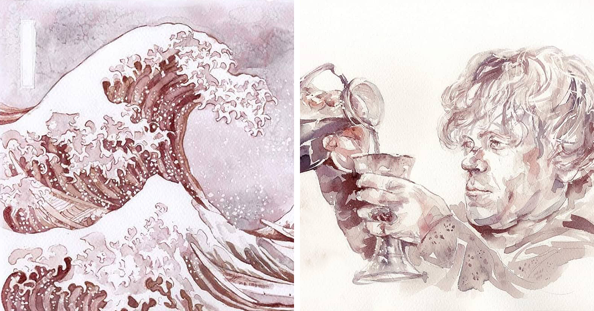
Some pieces portray recognizable screen characters and celebrities. Janković has painted figures inspired by Game of Thrones, including Khaleesi and Cersei, as well as scenes or characters connected with Interstellar. A wine-painted Marilyn Monroe appears especially appropriate: glamorous, luminous, and surrounded by enough burgundy splashes to suggest that the party continued after the photographer left.
These subjects work well because viewers already know their visual identities. The pleasure comes from seeing familiar faces reconstructed through an unfamiliar material.
Art History Gets a Vineyard Makeover
Janković also reinterprets major works from art history. Leonardo da Vinci’s Mona Lisa becomes the cleverly titled “Winelisa.” His Lady with an Ermine receives a similarly fluid transformation, while Johannes Vermeer’s The Lacemaker is rebuilt through translucent stains.
Asian art also appears in the collection. Katsushika Hokusai’s famous wave becomes “The Great Wave of KanagaWine,” a title that deserves at least a respectful groan. A work inspired by Utagawa Hiroshige’s camellia and bush warbler shows how well the medium suits delicate botanical forms and traditional compositions.
Original Figures, Landscapes, and Fantasy
Other images include a ballerina, a Chinese dragon, a queen associated with wine, and a boat moving through a riverside landscape. These pieces reveal the medium’s range. Wine can suggest skin, silk, clouds, water, smoke, hair, and distant terrain without requiring a full rainbow of pigments.
The most successful compositions do not fight the limited palette. They embrace it, allowing mood and structure to become more important than literal color.
The Power of a Limited Color Palette
Restricting an artist to wine-colored tones might sound like asking a pianist to perform with half the keys missing. Yet limitation often encourages invention.
Without bright blues, greens, or yellows competing for attention, viewers focus on expression, gesture, texture, and tonal contrast. A few deep marks can establish a pair of eyes. A pale wash can suggest a face emerging from light. A broad stain can become a background, dress, wave, or cloud depending on the shapes around it.
The white paper is not merely empty space. It becomes one of the most important “colors” in the composition. Janković uses untouched areas to define highlights, separate forms, and keep dense wine stains from overwhelming the subject.
The resulting images often feel dreamlike. Their muted burgundy and sepia tones resemble old photographs, faded letters, antique illustrations, or memories that have softened around the edges.
These Paintings Continue to Age
A wine painting is not completely frozen at the moment of completion. Exposure to oxygen and light can continue altering the pigments. Rich reds and purples may gradually move toward warmer brown, brick, or sepia shades.
In conventional painting, an unexpected color shift may be considered a conservation problem. In Winerelle art, controlled aging is part of the concept. The image behaves a little like the beverage that created it: its character develops over time.
That does not mean the artwork should be hung in full sunlight and encouraged to “mature” beside a steamy bathroom. Works on paper are sensitive to strong light, moisture, heat, and unstable humidity. Wine pigments can be especially vulnerable because they were never engineered for archival permanence.
How Wine Paintings Can Be Protected
Janković has explained that completed works are sealed to help preserve the pigments. Careful framing also matters. UV-filtering glazing, acid-free mounting materials, moderate humidity, and placement away from direct sunlight can reduce fading and paper damage.
Collectors should understand that some evolution may still occur. That change is not necessarily a flaw. It is part of owning an artwork made from a living, chemically complex material rather than paint squeezed from a standardized tube.
Why Unconventional Art Materials Matter
Artists have long experimented with materials that were never intended for fine art. Coffee, tea, beer, smoke, rust, soil, food, textiles, discarded packaging, and natural dyes have all found their way into studios.
An unusual medium attracts attention, but novelty alone cannot sustain an artwork. Pouring cabernet onto paper does not automatically produce a masterpiece, just as owning an expensive camera does not instantly turn someone into a celebrated photographer.
Janković’s work succeeds because her academic training supports the experiment. She understands drawing, composition, anatomy, value, and visual rhythm. Wine supplies the personality; skill gives that personality somewhere useful to go.
The material also connects the artwork to place and ritual. A particular bottle carries associations with grape variety, soil, climate, craft, celebration, and social life. Transforming it into an image allows those associations to remain present even when the subject is a film character or Renaissance portrait.
What Viewers Should Look for in the 36 Pictures
When browsing the full collection, it helps to look beyond the initial surprise of learning that the paintings were made with wine.
- Study the tonal range: Notice how many levels of light and dark can be produced from one family of colors.
- Follow the edges: Some lines are sharp and deliberate, while others dissolve into the paper.
- Look for untouched paper: White areas often create highlights and define the subject more effectively than additional brushstrokes.
- Compare warm and cool stains: Different wines produce shifts from rusty red to violet and plum.
- Observe the splashes: Decorative marks often balance the central figure or create a sense of movement.
- Imagine the aging process: The picture visible today may become slightly warmer and more subdued in the future.
These details turn the gallery from a collection of visual curiosities into a lesson in disciplined, material-driven painting.
Why Wine Painting Feels So Memorable
Part of the appeal comes from contradiction. Wine is temporary: it is poured, consumed, spilled, and gone. Painting is usually created with permanence in mind. Janković brings those ideas together, preserving a fleeting substance while allowing it to continue changing.
The paintings are also instantly understandable without being ordinary. A viewer does not need an advanced degree in art theory to appreciate the transformation. The basic idea can be explained in five words“She painted it with wine”yet the finished work rewards much closer attention.
That combination makes Winerelle art highly shareable online and engaging in person. The unusual process opens the door, but the elegance of the images persuades viewers to stay.
Conclusion: Raising a Glass to Creative Experimentation
Sanja Janković’s wine paintings demonstrate what can happen when an artist looks at an accident with curiosity instead of frustration. A stain on a tablecloth became a painting experiment. The experiment became Winerelle. Winerelle developed into a recognizable practice encompassing portraits, landscapes, pop-culture characters, historical masterpieces, live demonstrations, and workshops.
The 36 pictures are playful, but they are not shallow. They explore transparency, aging, unpredictability, and the relationship between natural materials and human control. They also remind us that artists do not always need more supplies. Sometimes they need to reconsider the supplies already sitting on the table.
So the next time someone spills red wine, pause before declaring the evening ruined. Hand them a sheet of watercolor paper. Worst case, the stain remains a stain. Best case, someone has just discovered a new career.
A Wine Painting Session: What the Experience Really Feels Like
Trying wine painting for the first time changes the way you look at both art supplies and the contents of a glass. The setup appears simple: watercolor paper, a few brushes, small containers, clean water, paper towels, and several wines with noticeably different colors. Then the brush touches the first puddle of cabernet, and simplicity quietly leaves the room.
The initial surprise is how pale the first stroke can appear. A wine that looks nearly black in a glass may produce a transparent pinkish mark on paper. Beginners often respond by loading the brush with more liquid, which creates a large wet area rather than a darker line. The lesson arrives quickly: darkness comes from patient layering, not from flooding the page like a tiny burgundy river.
The smell makes the process unusual, too. Traditional watercolor paint has little connection to taste or social memory. Wine carries aroma. Depending on the bottle, the studio may smell fruity, earthy, floral, spicy, or like someone has opened dinner before anyone finished working. That sensory quality makes the session feel less clinical and more connected to an occasion.
A simple subject works best for a first attempt. A grape cluster, wineglass, flower, mountain silhouette, or side-profile portrait provides enough structure without demanding dozens of tiny details. After making a light pencil sketch, the palest wine can be brushed across the broadest shapes. The paper may buckle slightly as it absorbs moisture, and the edges of the wash may spread farther than expected.
Waiting becomes the hardest technical step. A layer that looks dry may still contain moisture below the surface. Brushing over it too soon can lift pigment, create blooms, or merge two carefully separated forms. The temptation to “fix” a wet passage usually makes it more dramatic. Wine painting teaches the valuable studio skill of stepping away and allowing chemistry to finish its shift.
As the layers accumulate, differences between wines become easier to see. One may dry as a dusty rose, another as cool violet, and another as warm brown-red. Mixing them directly can produce subtle variations, although too many overlapping washes may create a muddy patch. The goal is not to reproduce every natural color. It is to describe form through value and temperature.
Accidents are unavoidable, but they often become the most enjoyable part. A stray droplet can be echoed with additional splashes. A circular glass stain can frame the subject. A run of pigment can become a branch, shadow, fold of fabric, or abstract background. Instead of forcing the wine to behave exactly like manufactured paint, the artist begins negotiating with it.
The final image may look lighter and less polished than expected, especially while still wet. After drying, some passages sharpen while others soften. Additional layers can deepen the focal points, but stopping at the right moment is important. Wine paintings benefit from breathing room. Covering every inch of paper removes the luminous contrast that makes the technique attractive.
Even an imperfect first attempt provides a memorable experience. The process slows observation, rewards restraint, and makes every bottle feel like a possible palette. It also gives new meaning to the phrase “a good finish”although sealing and framing the artwork is considerably more effective than drinking the remaining materials and hoping for the best.