Some dinnerware whispers. Some dinnerware shouts. And then there is the Chez Panisse Collection at Heath, which does something far more interesting: it makes the table feel as if it has been quietly edited by someone with excellent taste, a good farmer’s market tote, and strong opinions about soup.
The latest colors from Heath’s Chez Panisse Line bring a fresh sense of warmth, earthiness, and California ease to a collection already beloved by design fans, cooks, hosts, and anyone who has ever looked at a plate and thought, “Yes, I do need my salad to look more poetic.” Designed in collaboration with Alice Waters and Christina Kim, the collection carries the spirit of Chez Panisse, the legendary Berkeley restaurant known for seasonal cooking, thoughtful sourcing, and the kind of casual elegance that makes a ripe tomato feel like a main character.
What makes these new covetable colors so appealing is not simply that they are pretty, although they are absolutely that. It is that they feel useful, livable, and deeply connected to food. These are not showroom-only shades that look stunning until a roasted carrot enters the room. They are colors made for actual meals: lentil soup, citrus salad, grilled fish, thick toast, scrambled eggs, jammy berries, and all the imperfect, delicious things that happen at a real table.
Why the Chez Panisse Collection Still Feels So Fresh
The Chez Panisse Collection has always stood apart because it blends restaurant intelligence with home-table friendliness. Restaurant dinnerware needs to work hard. It must frame food beautifully, hold up to constant use, stack sensibly, and avoid stealing the show from the meal. Home dinnerware needs all of that too, but with a softer emotional job: it should make Tuesday leftovers feel less like a surrender and more like a tiny ceremony.
Heath Ceramics, founded in California in 1948, has long been known for durable, handcrafted tableware with a modern yet grounded sensibility. Its pieces are not fussy. They do not beg for a tablescape consultant. They have weight, texture, and an appealing honesty that feels very West Coast without trying too hard. The Chez Panisse Line fits naturally into that world because it is built around the same values: simplicity, material integrity, and the pleasure of everyday use.
The New Colors: Earthy, Elegant, and Easy to Mix
The current palette expands the Chez Panisse Collection beyond the expected neutral dinnerware zone. Heath’s core shades include grounded tones such as Slate and Sand, joined by newer neutrals like Sorrel and Levain. Accent glazes, including Indigo, Bluejay, Fennel, and Redwood, bring more expressive color to pieces such as bowls. The result is a palette that looks collected rather than matched, which is exactly why it works.
Slate: The Moody Neutral That Makes Food Glow
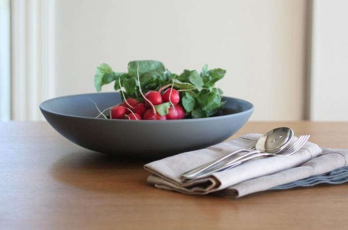
Slate is the dinnerware equivalent of a perfectly tailored charcoal jacket. It is dark enough to feel dramatic but soft enough to remain approachable. On a Slate plate, pale foods look luminous: burrata, poached fish, soft cheeses, buttered noodles, and roasted cauliflower all get a quiet visual boost. It also works beautifully with rustic meals, especially anything involving grains, greens, or olive oil.
Sand: The Warm Neutral That Never Tries Too Hard
Sand is warm, relaxed, and endlessly useful. It has the calm of natural linen and the flexibility of a good wooden cutting board. This is the shade that makes a simple breakfast look intentional. Toast, eggs, fruit, and coffee suddenly feel like they belong in a sunlit kitchen, even if the actual kitchen contains one suspicious drawer and a sink full of “soaking” pans.
Sorrel: A Garden-Inspired Neutral with Personality
Sorrel brings in a gentle botanical note. It is not loud green; it is more like the memory of green after a walk through an herb garden. That makes it especially good for vegetable-forward meals. Think asparagus, peas, lettuces, salsa verde, pesto, roasted zucchini, or a salad that took twelve minutes to assemble but somehow deserves applause.
Levain: The Bread-Basket Shade We Did Not Know We Needed
Levain has a soft, doughy warmth that feels naturally linked to bread, butter, grains, and slow meals. The name itself suggests fermentation, patience, and the beautiful domestic drama of a loaf cooling on the counter. It is an easy color to live with because it flatters almost everything, from soup to fruit to roasted chicken.
Indigo, Bluejay, Fennel, and Redwood: Accents with Range
The accent colors are where the collection becomes more playful. Indigo and Bluejay bring cool depth and freshness, working especially well with citrus, seafood, yogurt, and bright salads. Fennel adds a greenish herbal quality, while Redwood introduces warmth and richness. Used in bowls, these shades can make a table feel layered without becoming chaotic. It is color, but color with manners.
Why These Colors Work So Well with Food
The smartest thing about the Chez Panisse palette is that it understands food does not need a competing backdrop. A glossy red tomato, a golden omelet, a pile of figs, or a bowl of white beans already has plenty to say. The role of the plate is to frame, not interrupt.
Earthy dinnerware colors are especially effective because they echo the natural world: clay, stone, bark, herbs, soil, flour, water, and sky. That connection makes seasonal food look more alive. A salad on a green-leaning bowl feels garden-like. Soup in a warm neutral bowl feels cozy. Blue accents can make creamy, orange, and yellow foods pop. Slate adds contrast without the starkness of pure black.
This is why designers and chefs often prefer restrained dinnerware. It gives the eye a place to rest. It also lets the texture of food become more noticeable: the torn edge of bread, the shine of olive oil, the blister on a roasted pepper, the steam rising from a bowl. In other words, the plate becomes part of the meal’s atmosphere, not just the object holding the meal.
How to Style the Chez Panisse Collection at Home
You do not need a restaurant budget or a Berkeley backyard full of lemon trees to make these pieces work. The collection is at its best when used with a relaxed hand. Mix the neutrals, add one or two accent bowls, and let the food do the decorating.
Build a Base with Neutrals
Start with plates in Slate, Sand, Sorrel, or Levain. A neutral base makes the collection flexible for breakfast, dinner parties, holidays, and everyday meals. It also prevents the table from looking too coordinated, which can sometimes feel less “effortless host” and more “the plates are supervising us.”
Use Accent Bowls for Energy
Accent bowls are an easy way to bring personality to the table. Use Bluejay for yogurt and berries, Indigo for soup, Fennel for olives or herbs, and Redwood for nuts, roasted vegetables, or warm dips. Small color moments feel more natural than an entire table screaming one shade.
Pair with Natural Materials
The collection looks especially good with wood, linen, stainless steel, handblown glass, woven baskets, and simple flowers. A table with Heath ceramics does not need a centerpiece the size of a shrub. A small vase of herbs, a bowl of lemons, or a loaf of bread on a board is enough.
The Design Appeal: Classic Shapes, Modern Mood
The beauty of the Chez Panisse Collection lies in restraint. The shapes are classic but not stiff. The glazes feel contemporary without chasing trends. That balance matters because dinnerware lives with us for years. Trendy plates can feel exciting at first and then strangely exhausting, like a song you loved for one week and now skip with panic.
Heath’s approach is more durable emotionally as well as physically. The colors are distinctive, but they are not novelty colors. They can move between seasons: Sand in summer, Slate in winter, Sorrel in spring, Levain all year long. The accent shades can be dialed up or down depending on the meal.
Who Will Love These New Covetable Colors?
This collection is ideal for people who care about food, design, and the small rituals of daily life. It suits the home cook who wants a bowl that makes soup feel special. It suits the design lover who wants color but not chaos. It suits the host who prefers a table that feels warm, layered, and quietly beautiful.
It is also a strong choice for anyone building a long-term dinnerware collection. Because the colors mix well, you do not have to buy everything at once. You can start with a few plates or bowls, then add pieces over time. That slow-collection approach feels very aligned with the spirit of Heath and Chez Panisse: thoughtful, intentional, and not in a frantic relationship with trends.
Buying Tips: How to Choose the Right Pieces
If you are new to the Chez Panisse Line, begin with the pieces you use most. For many households, that means main plates, salad plates, and bowls. Bowls are especially practical because modern meals often lean bowl-friendly: grain bowls, noodle soups, salads, beans, pasta, yogurt, fruit, and leftovers that have been rebranded as “a rustic lunch.”
For a cohesive table, choose two base colors and one accent. For example, Sand and Slate with Bluejay feels crisp and balanced. Levain and Sorrel with Redwood feels warm and earthy. Slate and Levain with Fennel feels calm but interesting. If you prefer a more collected look, choose several colors within the same tonal family and repeat them across the table.
Why This Collection Feels Bigger Than Dinnerware
The Chez Panisse Collection at Heath is not just about plates. It represents a particular California idea: that beauty belongs in everyday life, that meals matter, and that objects can carry values without making a speech. The collaboration connects craft, food, farming, design, and community in a way that feels natural rather than branded to pieces.
That is the quiet power of these new colors. They remind us that a table does not need to be extravagant to be memorable. It needs texture, warmth, good food, and pieces that invite people to settle in. The right plate will not save a bad dinner party, of course. But it can make a good one feel even more generous.
Experience Notes: Living with the Colors, Meal by Meal
The real test of covetable dinnerware is not how it looks in a product photo. Product photos are charming little fantasies where crumbs do not exist and nobody has ever asked, “Is there more salad?” The true test is how the pieces feel during ordinary use: breakfast before work, lunch at the kitchen counter, soup on a rainy night, friends around the table, and that one person who insists on using a tiny spoon for everything.
In daily life, the Chez Panisse colors shine because they make meals feel composed without requiring performance. A Sand plate under a slice of toast with ricotta and honey looks simple and generous. A Slate bowl filled with tomato soup creates instant contrast, making the red feel deeper and richer. Sorrel brings out the freshness in greens, herbs, and vegetables, while Levain softens the look of grains, bread, and roasted foods.
One of the most enjoyable ways to use the collection is to let the meal guide the color. For a spring lunch, Sorrel bowls with crisp lettuces, radishes, boiled eggs, and lemony dressing feel bright but not loud. For a cool-weather dinner, Slate plates with roasted mushrooms, farro, and chicken feel grounded and comforting. For brunch, Levain and Sand create a warm backdrop for pastries, eggs, fruit, and coffee. The colors do not demand a theme; they simply create a mood.
These pieces also encourage a more relaxed style of hosting. Instead of worrying whether every plate matches perfectly, you can treat the table like a composition. Repeat one neutral, scatter in accent bowls, use linen napkins, add a pitcher of water, and let the meal unfold. A table with mixed Heath colors feels lived-in and intentional, as if it belongs to someone who knows exactly where the good olive oil is kept.
Another practical pleasure is how well the colors handle imperfect food. Not every meal is a glossy magazine spread. Sometimes the stew is brown. Sometimes the salad is enthusiastic but uneven. Sometimes dessert is store-bought cookies placed on a plate with confidence. Earthy ceramics are forgiving. They bring texture and depth to foods that might otherwise look plain. This is a very underrated quality in dinnerware, especially for people who cook often and do not garnish every dish with microgreens and ambition.
The collection also changes beautifully with light. In morning light, the softer shades feel airy and calm. At dinner, under warmer lighting, the deeper colors become more intimate. That flexibility makes the palette useful across seasons and occasions. It can feel casual at breakfast, elegant at dinner, and festive with the addition of flowers, candles, or colorful produce.
Most of all, living with these colors can subtly change how you think about the table. You may find yourself plating food more thoughtfully, not because you are trying to impress anyone, but because the pieces invite care. A bowl of beans gets a drizzle of oil. Fruit gets placed instead of dumped. Bread gets torn and shared. The meal slows down by a few degrees. In a world of hurried eating, that is no small thing.
Conclusion: A Palette Made for Real Tables
The new covetable colors from the Chez Panisse Collection at Heath prove that dinnerware can be both beautiful and deeply practical. With grounded neutrals, expressive accents, and shapes designed for everyday meals, the collection offers a thoughtful way to bring warmth, color, and craft to the table.
Whether you are building a full dinnerware set or adding a few accent bowls, the palette rewards mixing, layering, and actual use. It is elegant without being fragile, colorful without being noisy, and timeless without being dull. In short, it is dinnerware for people who believe that even a simple meal deserves a good plateand perhaps a second helping.