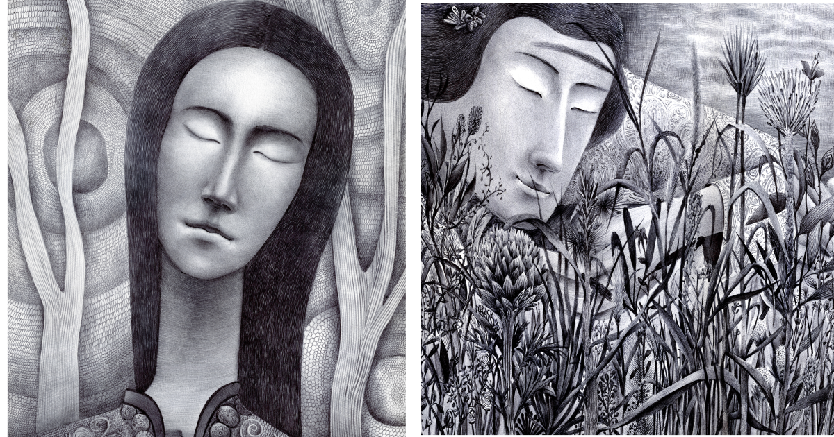
Some people meditate. Some people go for a run. I make a mess of my feelings with a black ball pen and call it “art practice” so it sounds professional.
And honestly? It works.
There’s something wildly honest about drawing abstract emotion with a pen that most people use to sign receipts. No fancy brushes. No giant studio. No dramatic soundtrack (although I do recommend one for maximum main-character energy). Just a black pen, a page, and whatever is rattling around in your chest that day.
This article is my deep dive into how I approach abstract emotional drawing with a black ball pen: why the medium is so powerful, how I build images from line and rhythm, what techniques help create depth and intensity, and how I turn messy feelings into strong compositions. If you’ve ever stared at a blank page thinking, “I don’t know what I feel, but it’s definitely… a lot,” this one is for you.
Why a Black Ball Pen Is My Favorite Tool for Emotional Abstract Drawing
A black ball pen feels humble, which is exactly why I love it. It doesn’t show up with a lot of ego. It just writes, scratches, glides, and occasionally betrays me with a blob of ink if I move too fast. Very relatable.
For abstract drawing, that simplicity is gold. Black ink forces me to think in contrast, line weight, density, texture, and space instead of relying on color to do all the emotional heavy lifting. When I remove color from the equation, I pay closer attention to mood-making tools like pressure, repetition, and rhythm. A page can feel anxious, calm, crowded, lonely, sharp, or soft using only black marks.
Another reason the black ball pen works so well: commitment. You can’t erase it. (Well, technically you can try, but then the paper looks like it went through a minor life crisis.) That permanence makes every mark feel intentional. Even mistakes become part of the emotional language. A slip can become tension. A blot can become a focal point. A crooked line can become the most honest thing on the page.
I also like the physical behavior of ball pens. They reward patience and layering. Instead of dumping a huge dark mark all at once, they let me build tone gradually. That makes them perfect for slow emotional drawing, where the image reveals itself one line, one hatch, one tiny decision at a time.
What “Abstract Emotional Drawing” Means in My Sketchbook
Let me clear something up: “abstract” does not mean random. It also doesn’t mean “I scribbled because I was sad and now it’s modern art, trust me.” Abstract art can still be structured, intentional, and deeply personal.
In my sketchbook, abstract emotional drawing means I’m not trying to draw a realistic face, room, or landscape. I’m trying to draw a feeling state. I translate emotions into visual elements: lines, pressure, repetition, spacing, shapes, and value. I might start with a memory or a mood, but I finish with marks.
For example:
- Anxiety becomes tight, overlapping lines with very little breathing room.
- Grief becomes slow downward curves, open space, and heavy dark areas that feel like weight.
- Relief becomes wider spacing, soft loops, and lighter pressure.
- Anger becomes sharp diagonals, aggressive crosshatching, and abrupt direction changes.
- Hope becomes repetition that opens up instead of collapsing inward.
The point is not to make a “pretty” drawing. The point is to make an honest one.
The Visual Language I Use to Turn Feelings into Marks
1) Line Is Mood
Line is the backbone of my work. In fact, line is basically my emotional vocabulary.
When I sit down to draw, I ask myself: what kind of line does this feeling want?
- Long, continuous lines feel reflective, steady, and controlled.
- Broken lines feel uncertain or interrupted.
- Spirals can feel obsessive, hypnotic, or healing depending on spacing.
- Jagged diagonals feel urgent and loud.
- Parallel lines create rhythm and structure.
- Curved contour-like lines can feel gentle, bodily, and alive.
I also pay attention to line speed. Fast lines carry energy. Slow lines carry thought. If I rush through a page, it usually looks like I was trying to outrun my own brain. If I slow down, the drawing starts to breathe.
2) Hatching and Crosshatching Create Emotional Weight
Hatching is one of my favorite tools in black pen work. Closely spaced lines can build tone, texture, and form without filling everything into a flat black shape. Crosshatching lets me deepen that tone and create intensity.
What I love most is that hatching is expressive and structural. If I follow the curve of an imagined form, the drawing feels dimensional, almost like the emotion has a body. If I keep the hatching rigid and mechanical, it creates emotional distance. Same technique, different psychological effect.
I use hatching when I want the drawing to feel layered, patient, or heavy. I use dense crosshatching when I want the page to feel compressed or overwhelmed. And I leave areas completely untouched when I want silence.
3) Repetition Is How I Draw Thoughts
Emotions are repetitive. Thoughts loop. Memories echo. So I let the drawing repeat on purpose.
Repeated marks (tiny arcs, dots, short slashes, wave patterns, grids) mimic the way a feeling keeps returning. The trick is to vary them just enough so the page doesn’t go dead. I change pressure, spacing, or direction to keep the drawing alive. Think of it like a drumbeat with subtle changes, not a photocopier.
4) Negative Space Is the Pause Button
When I first started, I filled every inch of the page because I thought “more marks = more emotion.” Wrong. Sometimes more marks = visual traffic jam.
Now I treat empty space like part of the drawing. White areas create contrast, rhythm, and breathing room. They also make dark areas feel darker. If the page is all intensity, nothing feels intense.
Negative space is especially important in emotional abstraction because it can represent absence, distance, numbness, calm, or release. In other words, blank space is not “unfinished.” It’s speaking.
My Black Ball Pen Drawing Setup (Simple but Strategic)
I keep my setup minimal, but I do pay attention to materials because they change how the drawing behaves.
Pens
I usually work with black ball pens for the main drawing, but I also test fineliners and artist pens when I want different line consistency or archival qualities. The key factors I care about are:
- How smooth the pen writes
- Whether the ink smears after layering
- Whether the line skips on textured paper
- How dark the black looks
- How much pressure I need to build value
If I’m making a piece I want to keep long-term, I also think about paper quality and ink permanence. Some artist pens are specifically designed to be waterproof, fade-resistant, and archival, which is helpful when you’re building layered ink work or storing drawings over time. But for raw sketchbook emotion? A regular black ball pen still does a lot of heavy lifting.
Paper
Paper matters more than most beginners think. A rough page can catch the ballpoint and make the line feel scratchy (sometimes cool, sometimes annoying). A smoother page gives cleaner detail and more controlled hatching.
For this style, I prefer a smooth, heavier paper that can handle repeated passes without pilling or tearing. Acid-free paper is also nice if you care about keeping the drawings in good shape over time. Think of the page as your dance floor: if it’s too bumpy, your lines trip.
Optional Extras
- A scrap paper sheet to test line pressure before starting
- A tissue under my drawing hand to reduce smudging
- A timer (10–20 minutes) if I want to use drawing as an emotional reset
- Music or silence, depending on whether I need to amplify or calm the mood
My Step-by-Step Process for Abstract Deep Emotional Drawings
Step 1: I Name the Feeling First
Before I draw, I write one word at the top of the page (or in my head): “restless,” “grief,” “stuck,” “jealous,” “lighter,” “overwhelmed,” “relief.” Naming the feeling gives the drawing direction.
If I can’t find one word, I write a phrase like: “I am tired but my brain won’t shut up.” That usually does it.
Step 2: I Choose a Mark Family
Instead of jumping around randomly, I pick a small set of marks that fit the mood. For example:
- Curves + dots + open circles for sadness or memory
- Sharp diagonals + short hatches for tension
- Parallel waves + soft crosshatching for reflection
This keeps the drawing cohesive, even when it’s emotional.
Step 3: I Start with an Anchor Shape
I begin with one central shape or movement: a spiral, a vertical split, a clustered oval, a drifting line path. This is the “spine” of the drawing. It doesn’t need to look like anything recognizable. It just needs to hold the page together.
Once the anchor is there, I let everything else react to it.
Step 4: I Build Tone Slowly
This is where black pen magic happens. I use hatching, crosshatching, repeated loops, or layered directional lines to build darker areas gradually. I almost never go straight to solid black unless I need a dramatic focal point.
Gradual build-up gives the piece depth and emotion. It also lets me change my mind mid-drawing, which is important because emotions are rarely polite enough to stay in one lane.
Step 5: I Create Contrast on Purpose
Every emotional drawing needs contrast. Quiet next to chaos. Light next to dense. Smooth next to scratchy. Order next to disruption.
If the drawing feels flat, I ask:
- Where is the darkest area?
- Where is the eye supposed to rest?
- What can I leave blank?
- What line type is missing?
Usually, the answer is not “add more everywhere.” It’s “edit with intention.”
Step 6: I Stop Before I Over-Explain
The hardest part is stopping. I used to keep adding marks until the drawing looked like it had been chased by bees.
Now I stop when the page feels emotionally true, not when every space is filled. If I can still feel the original mood in the drawing, I’m done.
Common Mistakes I Made (So You Don’t Have To)
Trying to Draw a “Good” Abstract Instead of an Honest One
If your main goal is to make something that looks like it belongs in a gallery catalog, your hand will get stiff. Focus on emotional clarity first. Style comes later.
Using the Same Pressure for Everything
One pressure = one mood. Emotional drawings need variation. Light pressure whispers. Heavy pressure shouts. You need both.
Ignoring Paper Quality
Cheap paper is fine for quick sketches, but if you’re doing dense hatching and layering, a stronger smooth page will make your life easier and your lines cleaner.
Filling Every Space
Leave room. White space is not laziness. It’s composition. It’s rhythm. It’s emotional oxygen.
Thinking This Has to Be Therapy to Be Valid
Personal expressive drawing can be calming, clarifying, and deeply meaningful. But it’s also okay to call it what it is: your art practice. If you want therapeutic support, that’s where a credentialed art therapist comes in. Both things matter. They’re just not the same thing.
10 Abstract Black Pen Prompts I Use When I Don’t Know What to Draw
- Draw your stress as weather using only lines (no symbols, no faces).
- Make a page of one repeated mark and gradually shift the pressure.
- Split the page in two moods (before/after, fear/relief, noise/quiet).
- Draw a memory as a map using paths, clusters, and empty zones.
- Use only curves and create one dark focal point with hatching.
- Use only straight lines and build tension through overlap.
- Start in the center and draw outward like a pulse.
- Start at the edges and leave the center mostly blank.
- Translate a song into marks without drawing objects.
- Draw the same feeling twice: once chaotic, once controlled.
500-Word Experience Add-On: What These Drawings Have Taught Me
The biggest surprise in my black ball pen drawing practice is that the drawings often tell the truth before I can. I’ll sit down thinking I’m “fine,” start making neat parallel lines, and ten minutes later the page looks like a thunderstorm that learned geometry. That’s usually my clue that I’m not actually fine, I’m just organized about being overwhelmed.
One night, after a long day, I made a drawing that began with small circles in the top corner. I kept repeating them, tighter and tighter, until they turned into a dense black knot. Around that knot, I added long drifting lines that barely touched it. When I stepped back, I realized I had basically drawn the feeling of trying to stay calm while one part of my brain was spiraling. It wasn’t a masterpiece. It wasn’t meant to be. But it was accurate, and that accuracy felt like relief.
Another time, I drew with almost no pressure at all. Just faint curves, loose spacing, and a lot of open paper. I remember thinking the page looked unfinished. My old habit would have been to “fix” it by adding more contrast and texture. But I left it alone. The next morning, I looked at it again and understood why it needed so much empty space: I had been emotionally exhausted, and the drawing reflected that quiet depletion better than any dramatic black hatching ever could. It taught me that low-energy emotions are still valid subjects.
I’ve also learned that repetition can be strangely comforting. When my thoughts are noisy, repeating a line pattern gives my hands something steady to do. A row of arcs. A field of slanted hatches. Tiny loops wrapping around an invisible shape. The body settles first, then the mind catches up. It’s not magic, and it doesn’t solve everything, but it creates a small pocket of order. Sometimes that’s enough to reset my evening.
There are days when the pen fights me. It skips. My hand cramps. The page smudges. I make a mark I hate and immediately consider abandoning the whole drawing career I built in my head five minutes ago. But those moments helped me stop treating mistakes like disasters. In abstract work, a “bad” mark is often just a mark that arrived before I understood where it belonged. If I keep going, it usually finds its role. A blot becomes weight. A scratch becomes texture. A crooked line becomes tension. The page teaches me patience whether I asked for the lesson or not.
What I love most, though, is the record these drawings create. Weeks later, I can flip through my sketchbook and see emotional patterns I missed in real time. I can tell when I was anxious by the crowded line density. I can tell when I felt hopeful because the compositions start opening up. I can see where I was clinging to control and where I finally let the marks breathe. It’s like a diary written in line, pressure, and shadow.
That’s why I keep coming back to black ball pen abstraction. It’s simple, direct, affordable, and honest. No setup excuses. No perfection pressure. Just a page, a pen, and a chance to listen to what my hand has been trying to say all along.
Conclusion
My abstract deep emotional drawings using black ball pen are not about perfection, realism, or making something “impressive” in one sitting. They’re about translating inner noise into visual form. Through line, hatching, repetition, contrast, and negative space, a simple black pen can carry surprising emotional depth.
If you want to start, don’t overthink it. Pick a feeling. Pick a mark. Let the page respond. Build slowly. Leave space. Stop when it feels true.
That’s the whole practice. And some days, that’s exactly enough.