Mid Lead Colour (114) Paint is the kind of gray that does not walk quietly into a room. It arrives wearing a tailored coat, nods politely, and immediately makes the trim, doors, cabinetry, and walls look more expensive than they were yesterday. Officially known as Mid Lead Colour No. 114 by Little Greene, this heritage-inspired paint color sits in that beautifully useful zone between classic gray, warm charcoal, and architectural neutral.
Despite the word “lead” in the name, Mid Lead Colour is not a suggestion to decorate your home with something from a Victorian safety manual. The name refers to the historic appearance of lead-toned gray, a color once associated with durable exterior details, doors, ironwork, and woodwork. In modern decorating, it offers depth without the heaviness of black, elegance without stiffness, and enough personality to keep a room from looking like it was painted by a committee.
With an approximate Light Reflectance Value of 29, Mid Lead Colour is a medium-to-dark gray. That means it absorbs more light than it reflects, creating a grounded, cozy, and sophisticated effect. Used correctly, it can make a front door feel historic, kitchen cabinets feel custom, a powder room feel jewel-box dramatic, or interior trim feel intentionally designed rather than simply “painted gray.”
What Is Mid Lead Colour (114) Paint?
Mid Lead Colour (114) is a warm gray paint shade from Little Greene, a premium paint company known for historically informed colors and deeply pigmented finishes. The color belongs to the family of gray tones that feel substantial, classic, and slightly moody. It is darker than a soft silver gray but not as intense as a near-black charcoal.
The most important thing to understand is that this paint has an architectural personality. Some grays are background colors; they politely disappear. Mid Lead Colour does not disappear. It frames a space. It gives doors, skirting boards, paneling, stair rails, cabinetry, and feature walls a deliberate, designed look.
Its warmth keeps it from feeling icy. Many modern grays lean blue or cold, especially in rooms with northern light or cool LED bulbs. Mid Lead Colour has enough softness to work in traditional homes, transitional spaces, and modern interiors that need a little soul. Think “historic townhouse library” rather than “airport waiting area.”
Why Designers Love Warm Gray Paint Colors
Gray has been one of the most flexible interior paint categories for years, but not all grays are created equal. Cool gray can look crisp and modern, but it can also feel flat or chilly. Warm gray, on the other hand, often feels more livable because it contains subtle earthy undertones that work well with wood, stone, brass, aged metals, linen, leather, and natural textures.
Mid Lead Colour sits comfortably in this warmer gray category. It brings the drama of a darker neutral while remaining easier to use than pure black. That makes it especially useful for homeowners who want contrast but are not ready to paint a room in full midnight mode.
The Difference Between Gray and “Good Gray”
A good gray has dimension. It changes through the day, responds to light, and plays nicely with other finishes. A bad gray looks like wet cement under one bulb and sad printer paper under another. Mid Lead Colour has enough pigment and depth to avoid that lifeless effect. It can appear softer in daylight, stronger in shadow, and richer beside warm whites or muted earth tones.
Best Places to Use Mid Lead Colour (114)
Because Mid Lead Colour has a medium-dark value, placement matters. It is not a one-size-fits-all wall color for every room, but it is incredibly effective when used with intention.
1. Interior Doors
Interior doors are one of the best places to use Mid Lead Colour. A white wall paired with gray doors creates instant contrast and structure. This works especially well in hallways, mudrooms, bedrooms, and older homes with detailed millwork. Instead of replacing plain doors, paint them this shade and pretend it was a designer decision all along. Because it probably should have been.
2. Trim and Baseboards
Painting trim in Mid Lead Colour gives a room a tailored look. It is a smart alternative to standard white trim, particularly if your walls are painted in warm white, pale taupe, muted green, dusty pink, or soft beige. Darker trim can highlight architectural details, sharpen corners, and add a quiet sense of craftsmanship.
3. Kitchen Cabinets
Mid Lead Colour can be a beautiful cabinet color for kitchens where black feels too bold and pale gray feels too predictable. On lower cabinets, it grounds the room. On a full set of cabinets, it creates a classic, furniture-like appearance. Pair it with white quartz, marble, butcher block, soapstone, unlacquered brass, polished nickel, or aged bronze hardware.
4. Bathroom Vanities
A bathroom vanity in Mid Lead Colour feels upscale without being flashy. It works with white tile, stone floors, brass mirrors, black fixtures, and warm wood accents. In a small bathroom, this color can make the vanity look more intentional, especially when the walls remain light.
5. Front Doors
Historically inspired gray shades are excellent for doors, and Mid Lead Colour has the right amount of weight for an entry. It feels classic but not boring. If your exterior has brick, limestone, cream siding, white trim, or natural wood, this gray can act as a handsome bridge between traditional and modern.
6. Accent Walls and Paneling
Mid Lead Colour can work on an accent wall, but it shines even more on paneling, wainscoting, built-ins, alcoves, and fireplace surrounds. Because it is a darker shade, using it on textured or detailed surfaces gives the color something to grab onto visually.
How Mid Lead Colour Looks in Different Lighting
Lighting is the bossy friend of paint color. It tells paint what to do, when to behave, and occasionally makes everyone regret skipping the sample pot. Mid Lead Colour is no exception. Before committing, test it in the room where it will actually live.
North-Facing Rooms
North-facing rooms often receive cooler, softer light. In these spaces, Mid Lead Colour may look deeper and slightly more serious. To keep the room from feeling too heavy, pair it with warm whites, layered lamps, woven textures, and natural materials.
South-Facing Rooms
South-facing rooms usually get warmer, brighter light. Here, Mid Lead Colour can look more balanced and approachable. It may reveal more of its warm gray character, especially during the afternoon.
East-Facing Rooms
East-facing rooms get bright morning light and cooler afternoon light. Mid Lead Colour may feel lively in the morning and moodier later in the day. This can be a benefit in bedrooms, breakfast rooms, or studies where you want the color to shift gently.
West-Facing Rooms
West-facing rooms often become warmer in the late afternoon. Mid Lead Colour can look rich and inviting in that golden light, especially when paired with wood, leather, antique brass, or creamy textiles.
Best Color Pairings for Mid Lead Colour (114)
The secret to using a darker gray successfully is pairing it with colors that either soften it, contrast it, or give it a reason to exist. Mid Lead Colour works with several palettes, from traditional to contemporary.
Warm Whites
Warm white is the safest and most elegant partner. It keeps the scheme bright while allowing Mid Lead Colour to provide contrast. Use warm white on walls with Mid Lead Colour trim, or reverse the idea by using Mid Lead Colour on cabinetry and warm white on surrounding walls.
Muted Greens
Gray and green are natural friends, especially when the green is olive, sage, moss, or eucalyptus. The combination feels grounded and organic. It is excellent for kitchens, studies, mudrooms, and bedrooms.
Dusty Pinks and Plaster Tones
Soft pink, faded terracotta, and plaster-inspired shades can warm up Mid Lead Colour beautifully. This pairing feels stylish without shouting. It works well in bedrooms, powder rooms, and creative spaces.
Deep Reds and Burgundy
For a richer, more dramatic palette, try Mid Lead Colour with oxblood, burgundy, or deep muted red. The result can feel historic, cozy, and slightly theatrical in the best possible way.
Natural Wood
Oak, walnut, pine, and reclaimed wood all pair well with warm gray. Wood brings warmth and texture, preventing the gray from looking too formal. This is a particularly strong combination for cabinetry, staircases, built-ins, and dining rooms.
Choosing the Right Paint Finish
Color is only half the story. Finish determines how the paint behaves, how much light it reflects, and how easy it is to clean. Mid Lead Colour can look very different depending on whether it is used in a matte, eggshell, satin, or gloss finish.
Matte Finish
A matte finish gives Mid Lead Colour a soft, chalky, elegant appearance. It is ideal for walls, bedrooms, studies, and low-traffic spaces. Matte finishes hide small wall imperfections better than shinier options, but they may require more care in busy areas.
Eggshell Finish
Eggshell is a practical choice for woodwork, cabinetry, doors, and trim. It provides a slight sheen, enough durability for everyday use, and a refined look that does not feel too glossy.
Satin Finish
Satin has more sheen than eggshell and can be useful in high-traffic areas. It is a good option for hallways, bathrooms, kitchens, and family spaces where surfaces need to be wiped more often.
Gloss Finish
Gloss can make Mid Lead Colour look dramatic and polished. Use it sparingly on doors, furniture, railings, or architectural details. Glossy dark gray can be stunning, but it also highlights surface flaws, so preparation matters.
Preparation Tips Before Painting
Premium paint rewards good preparation and punishes shortcuts. If your surface is dirty, glossy, flaky, or uneven, even the most beautiful paint color will look like it got into a fight with the wall and lost.
Clean First
Wash surfaces before painting, especially doors, trim, kitchen cabinets, and bathroom vanities. Grease, dust, fingerprints, and old polish can prevent paint from bonding properly.
Sand Smooth Surfaces
Light sanding helps paint adhere, especially on previously painted woodwork or glossy surfaces. You do not need to sand like you are restoring a ship, but you do need to dull shiny finishes.
Use the Right Primer
Primer is important when painting bare wood, patched walls, stained surfaces, dark-to-light transitions, or slick materials. For cabinetry and trim, a suitable primer can make the difference between a durable finish and a future peeling situation that ruins your weekend.
Apply Two Coats
Deep colors often look best with two coats. The first coat builds coverage; the second coat delivers richness and consistency. Let each coat dry according to the manufacturer’s instructions.
Does “Lead Colour” Mean the Paint Contains Lead?
No. The word “lead” in Mid Lead Colour refers to the traditional gray tone associated with lead-colored surfaces, not to a recommendation that the paint contains lead. Modern residential paints are manufactured under strict regulations, and reputable paint companies formulate products for contemporary safety expectations.
However, the word is a useful reminder for anyone renovating an older home. In the United States, homes built before 1978 may contain old lead-based paint beneath newer layers. If you are sanding, scraping, or disturbing old paint in a pre-1978 property, use proper lead-safe practices and consider professional testing. Painting a new color is fun. Accidentally creating hazardous dust is not fun, and it is definitely not a charming DIY memory.
Mid Lead Colour in Modern Interior Design
One reason Mid Lead Colour feels so current is that it fits into the larger movement toward warmer, more character-rich neutrals. Homeowners are moving away from flat, chilly gray boxes and toward layered interiors with texture, contrast, and softer historical references.
Mid Lead Colour works especially well in designs that combine old and new. Picture shaker cabinets with modern hardware, a traditional staircase with contemporary lighting, or a classic fireplace surround styled with abstract art. The color does not force a room into one era. It simply adds backbone.
For Traditional Homes
In traditional homes, this shade feels natural on trim, doors, paneling, and built-ins. It respects historic architecture without making the space feel like a museum. Add warm white walls, antique rugs, brass fixtures, and framed art for a timeless effect.
For Modern Homes
In modern interiors, Mid Lead Colour can add depth and prevent minimal spaces from looking sterile. Pair it with clean lines, pale oak, matte black accents, linen upholstery, and sculptural lighting.
For Small Spaces
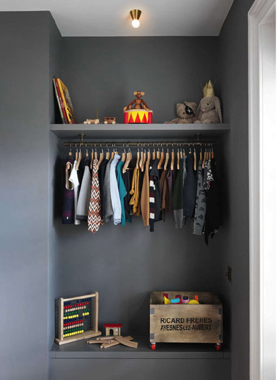
Small spaces can handle dark colors when used intelligently. A powder room, closet office, entry nook, or reading corner painted in Mid Lead Colour can feel intimate and intentional. Add a mirror, warm lighting, and one lighter element so the room does not feel boxed in.
Common Mistakes to Avoid
Mid Lead Colour is versatile, but it still needs a thoughtful plan. Avoid these common mistakes before you open the tin and start painting with the confidence of a home makeover show host on a tight deadline.
Skipping the Sample
Never judge this color only from a screen. Screens lie. Paint chips also lie, just more politely. Test a real sample on the surface and view it during morning, afternoon, and evening light.
Using the Wrong White
Bright blue-white can make warm gray look dull or disconnected. Choose a softer white, chalky off-white, or warm neutral for a more harmonious scheme.
Ignoring the Sheen
A matte wall and a gloss door in the same color can look surprisingly different. Decide whether you want softness, durability, drama, or wipeability before choosing the finish.
Painting Poorly Prepared Cabinets
Cabinets require careful prep. Clean, sand, prime, and allow proper curing time. A beautiful cabinet color cannot save a rushed paint job from chips around handles and edges.
Is Mid Lead Colour (114) Right for Your Home?
Choose Mid Lead Colour if you want a gray with presence, warmth, and heritage character. It is best for people who like classic interiors with a little drama, modern rooms with depth, or architectural details that deserve attention.
It may not be the best choice if you want a pale, airy gray or if your room has very limited natural light and no layered lighting plan. In those cases, use it on doors, trim, furniture, or cabinetry rather than all four walls.
For many homes, Mid Lead Colour is most successful as a contrast color. It turns ordinary details into design features. It gives white walls a frame. It makes hardware stand out. It says, “Yes, this was intentional,” which is one of the highest compliments a paint color can earn.
Real-Life Experiences With Mid Lead Colour (114) Paint
One of the most memorable ways to experience Mid Lead Colour is on interior doors. Imagine a hallway with warm white walls, natural wood floors, and several plain doors that currently blend into the background. After painting those doors in Mid Lead Colour, the hallway suddenly feels designed. The color adds rhythm from room to room, and even basic doors take on a more custom appearance. It is a relatively small change, but visually it behaves like a much larger renovation.
In a kitchen, Mid Lead Colour can be surprisingly flexible. On lower cabinets, it creates a grounded base while upper cabinets or walls stay lighter. This approach works beautifully when the kitchen has white countertops, subway tile, brass pulls, or wood shelving. The gray does not compete with food, flowers, dishes, or decor. Instead, it provides a calm background. Even a pile of mail on the counter looks slightly more dignified, though sadly the paint will not pay the bills for you.
Another excellent experience comes from using Mid Lead Colour on a bathroom vanity. Many bathrooms are dominated by white tile, white sinks, white tubs, and chrome fixtures. That much white can feel clean, but it can also feel unfinished. A vanity painted in this warm gray gives the room an anchor. Add a framed mirror, a small vintage rug, and warm bulbs, and the space feels more like a boutique hotel than a basic bathroom.
For homeowners who enjoy older houses, Mid Lead Colour feels especially appropriate. It has enough historical character to sit comfortably with original trim, paneled doors, old fireplaces, and aged wood floors. In a century-old home, it can make new repairs or replacement pieces feel more integrated. A newly installed built-in bookcase, for example, can look as if it has always belonged when painted in this kind of heritage gray.
In modern apartments, the experience is different but just as useful. Many newer spaces have plain white walls, simple trim, and limited architectural detail. Painting a media wall, floating shelves, or a compact office nook in Mid Lead Colour can create a focal point without requiring construction. It gives a rental-like space a sense of permanence and taste. If the room has black metal, pale wood, cream upholstery, or textured curtains, the color feels balanced rather than heavy.
The biggest lesson from using Mid Lead Colour is that lighting matters. In a bright room, it can appear refined and calm. In a dim room, it becomes moodier and more dramatic. That is not a flaw; it is part of the color’s charm. The trick is to decide whether you want that mood. If you do, embrace it with lamps, mirrors, warm whites, and layered textiles. If you do not, use the color in smaller doses.
Another practical experience: this color rewards clean edges. Because it is deeper than the average neutral, sloppy cutting-in is more noticeable. Painter’s tape, a good angled brush, and patience are your friends. This is not the color for a rushed “I’ll just finish this before dinner” project unless dinner is scheduled for tomorrow.
Overall, Mid Lead Colour (114) Paint offers the satisfaction of a classic gray with more personality than the usual safe neutral. It works best when treated as an architectural tool, not just a wall color. Use it to frame, ground, define, and elevate. Whether on doors, trim, cabinets, vanities, or feature walls, it brings quiet drama and a sense of permanence to a room. In a world full of forgettable grays, Mid Lead Colour has excellent manners, strong opinions, and very good shoes.
Conclusion
Mid Lead Colour (114) Paint is a sophisticated warm gray for homeowners who want depth, contrast, and timeless character. Its medium-dark value makes it especially powerful on doors, trim, cabinetry, vanities, built-ins, and architectural details. While it can work on walls, it is most successful when balanced with warm whites, natural wood, muted greens, soft plaster tones, or rich accent colors.
The name may sound historical, but the look feels highly relevant for today’s interiors. It offers a refined alternative to black, a richer option than pale gray, and a more characterful neutral for spaces that need structure. Test it in your lighting, choose the right finish, prepare surfaces properly, and Mid Lead Colour can turn ordinary rooms into spaces with real presence.
Note: This article is written for editorial and SEO publishing purposes. Always test paint samples in your own space before purchasing full quantities, because color can shift depending on lighting, surface texture, sheen, and surrounding materials.