Modern home trends move fast. One minute everyone wants an all-white kitchen, a boucle chair, and open shelves filled with perfectly stacked bowls. The next minute, interior designers are quietly side-eyeing the entire room like it just committed a crime against proportion.
The truth is not every viral design idea deserves a permanent place in your home. Some modern home trends look amazing in a staged photo but turn into dust-collecting, budget-draining, personality-erasing chaos in real life. Interior designers are not against trends; they are against homes that look like they were assembled by an algorithm with a beige throw blanket addiction.
So, let’s talk about the modern home trends designers find annoying, why they often fail, and what to do instead. Consider this a friendly intervention with better lighting.
Why Interior Designers Get Annoyed by Certain Modern Home Trends
Designers usually dislike trends for three reasons: they ignore function, they age quickly, or they flatten personal style. A beautiful home should support daily life. If a kitchen looks gorgeous but has nowhere to hide cereal boxes, the cereal boxes win. If a living room has a cloud sofa so large it swallows the architecture, the sofa becomes the landlord.
Good interior design balances beauty, scale, comfort, materials, and lifestyle. Bad trend-chasing often asks, “Will this photograph well?” instead of “Can actual humans live here without needing a velvet rope?”
45 Modern Home Trends Interior Designers Find Annoying
1. All-White Kitchens With No Soul
White kitchens can be timeless, but the cold, glossy, all-white version has been overdone. Designers increasingly prefer warm woods, mixed materials, and richer colors that make a kitchen feel lived-in rather than laboratory-adjacent.
2. Open Shelving Everywhere
Open shelving looks dreamy when every plate matches and nobody owns vitamins, travel mugs, or a rogue bag of chips. In real homes, it often becomes visual clutter with a dust subscription.
3. Tiny Area Rugs
A rug that floats under only the coffee table makes the room feel smaller and unfinished. Designers usually recommend sizing up so at least the front legs of major furniture pieces sit on the rug.
4. Over-the-Range Microwaves
This kitchen shortcut saves space, but it can instantly date a room and interrupt the range wall. Designers often prefer a concealed microwave drawer, pantry placement, or built-in solution.
5. Pot Fillers Nobody Uses
Pot fillers sound fancy until you realize the pot still has to be carried back to the sink when full of hot water. They also add cost, plumbing complexity, and another potential leak point.
6. Double Kitchen Islands
Unless the kitchen is truly enormous and carefully planned, double islands can feel like a furniture showroom obstacle course. One hardworking island usually beats two awkward ones.
7. Split-Level Kitchen Islands
Raised bars and multi-level counters can chop up the kitchen visually and make cleaning harder. A single-level surface feels cleaner, more flexible, and easier to use.
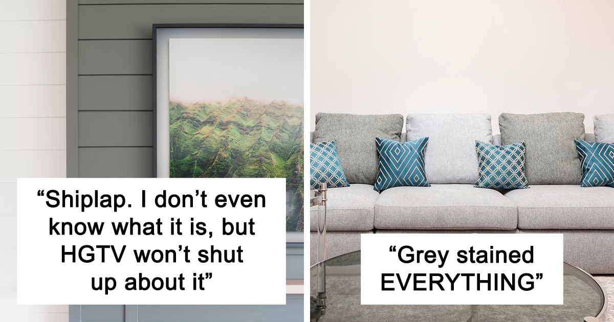
8. Gray Everything
Millennial gray had a long run, but full gray rooms now often feel flat and chilly. Designers are leaning toward warmer neutrals, earthy tones, and layered textures.
9. Cold Minimalism
Minimalism can be elegant. But when it removes comfort, art, color, and evidence of human life, it becomes less “serene retreat” and more “waiting room for a very stylish dentist.”
10. Mass-Produced Wall Art
Generic prints with no personal connection can make a room feel staged instead of meaningful. Designers prefer art that reflects travel, family, local artists, vintage finds, or personal taste.
11. Word Art Signs
“Gather,” “Relax,” and “Live Laugh Love” have worked overtime. Designers usually prefer art, photography, or objects that create mood without literally announcing the room’s assignment.
12. Matching Furniture Sets
A matching bedroom or living room set can feel flat and showroom-like. Mixing finishes, eras, and shapes makes a room look collected rather than ordered in one panic purchase.
13. Fake Plants That Look Fake
High-quality faux greenery can work in dark corners, but dusty plastic plants with neon leaves fool nobody. If maintenance is the issue, designers often suggest dried branches, preserved moss, or sculptural objects.
14. Faux Wood Paneling
Real wood adds warmth and texture. Faux wood paneling often looks thin, flat, and dated, especially when it darkens a room without adding authentic character.
15. Faux Stone and Cheap Faux Finishes
Manufactured stone, peel-and-stick marble, and imitation textures can save money, but poor versions age badly. Honest materials usually look better than fake luxury.
16. Too Much Boucle
Boucle can be cozy and chic, but when every chair, pillow, and ottoman looks like a fashionable sheep convention, the texture loses its charm.
17. Cloud Sofas That Eat the Room
Oversized, shapeless sofas are comfortable, but they can overwhelm architecture and make a living room feel blob-like. Designers like comfort with structure, not a marshmallow takeover.
18. Accent Walls With No Purpose
An accent wall can work when it highlights architecture. But one random navy wall in a plain box room often feels like the room got dressed in a hurry.
19. Open-Concept Everything
Open layouts can be great for entertaining, but not every wall deserves demolition. People still need quiet zones, storage, sound control, and places to hide kitchen mess after dinner.
20. Barn Doors in Non-Farmhouses
Barn doors had a moment, but they often provide poor sound privacy and feel disconnected from modern interiors. A well-detailed pocket door or classic hinged door usually ages better.
21. Shiplap Overload
Shiplap can add charm in the right setting. Covering every wall with it, however, can make a home feel like it is auditioning for a coastal farmhouse role it never asked for.
22. Edison Bulbs Everywhere
Exposed Edison bulbs once looked cool and industrial. Now they often create harsh glare and tired restaurant energy. Designers prefer layered lighting with warmth, dimmers, and shade.
23. Bad Lighting Plans
One ceiling light in the center of a room is rarely enough. Great interiors need ambient, task, and accent lighting so the room works at breakfast, movie night, and “where did I put my keys?” o’clock.
24. Stainless Steel Vent Hoods as Default
A stainless hood can work in the right kitchen, but many designers now prefer plaster, wood, stone, or integrated designs that feel more custom and architectural.
25. Island Sinks That Ruin the Gathering Spot
A sink in the island can be practical, but it also places dirty dishes in the social center of the kitchen. Designers often prefer keeping the island clear when space allows.
26. Show Kitchens With No Real Function
A kitchen should not be afraid of cooking. If every surface is too precious to use, the design has missed the point. Beautiful kitchens need storage, ventilation, landing zones, and durable finishes.
27. Floating Vanities With No Storage
Floating vanities can make a bathroom feel airy, but tiny versions often leave no room for hair dryers, towels, or the mysterious army of skincare bottles people somehow accumulate.
28. Vessel Sinks
Vessel sinks can be sculptural, but many are splashy, awkward to clean around, and uncomfortable for daily use. Designers often choose integrated or undermount sinks for practicality.
29. Wallpaper in Wet Bathrooms Without Planning
Wallpaper can be gorgeous in a powder room, but steamy bathrooms require the right material, ventilation, and installation. Otherwise, peeling seams arrive like tiny design lawsuits.
30. Overly Themed Rooms
A beach house does not need anchors on every pillow. A mountain cabin does not need antlers in every corner. Designers prefer suggestion over theme-park commitment.
31. Fast-Furniture Rooms
Buying every trendy piece at once can create a room that looks dated almost immediately. Designers prefer mixing vintage, custom, inherited, and new pieces for longevity.
32. Floating Shelves With No Real Load Capacity
Some floating shelves are beautiful. Others sag under three mugs and a cookbook. Function matters, especially in kitchens, offices, and bathrooms.
33. Black Hardware on Every Surface
Matte black hardware can be sharp, but using it everywhere can feel formulaic. Mixed metals, aged finishes, and softer contrast often create a more layered look.
34. All-Brass Everything
Brass adds warmth, but too much shiny brass can feel like the room swallowed a jewelry counter. Designers like mixing metals with restraint.
35. Oversized Kitchen Pendants
Large pendants can be dramatic, but if they block sightlines or crowd the island, they become decorative traffic cones. Scale is everything.
36. Curtains Hung Too Low
Low curtain rods make ceilings feel shorter. Designers usually hang drapery higher and wider than the window frame to create height and softness.
37. Furniture Pushed Against Every Wall
People often push furniture to the walls to create space, but it can make conversation areas feel disconnected. Floating furniture slightly inward often improves flow.
38. Too Many Throw Pillows
Pillows should add comfort, not require a nightly excavation before bed. When a sofa becomes 70 percent pillow, the design has entered decorative storage crisis mode.
39. No Personal Books or Objects
Perfectly styled shelves with backward books and empty vases can feel soulless. Designers love rooms that show personality through books, collections, art, and meaningful objects.
40. Color Blocking in Expensive Permanent Features
Color blocking can be fun, but using high-contrast trendy colors on cabinetry or tile may date quickly. Paint is easier to change than a full kitchen.
41. Cool White Paint Everywhere
Bright white walls can be fresh, but cool whites may feel sterile in homes without strong natural light. Warm whites, creams, and layered neutrals are often more forgiving.
42. Glass Dining Tables in Busy Homes
Glass tables look light and modern, but fingerprints, smudges, and scratches are relentless. In family homes, they can turn into full-time cleaning hobbies.
43. Oversized Sectionals in Small Rooms
A sectional should fit the room, not conquer it. Designers often prefer a sofa and chairs when a giant sectional blocks movement and limits layout flexibility.
44. Copy-Paste Instagram Interiors
The beige sofa, arched mirror, boucle chair, black vase, and pampas grass combo is not evil. It is just tired when repeated without personality or context.
45. Designing for Resale Instead of Real Life
Neutral choices can be smart, but living for imaginary future buyers can make your current home feel bland. Designers encourage choices that support your life now while staying thoughtful about quality.
What Designers Recommend Instead
The best alternative to trend fatigue is not avoiding trends completely. That would be boring, and boring is not a design philosophy; it is a waiting room with beige carpet. Instead, designers recommend using trends as seasoning, not the whole meal.
Start with function. Ask how the room needs to work before choosing finishes. A kitchen that supports cooking, storage, conversation, and cleaning will age better than one designed only around a viral backsplash. A living room with correctly scaled seating, good lighting, and a rug that anchors the space will feel more expensive even if the furniture is modest.
Next, choose authentic materials where possible. Natural wood, stone, wool, linen, ceramic, and aged metals tend to gain character over time. Cheap imitations often reveal themselves quickly. If the budget is tight, use affordable materials honestly instead of forcing them to pretend to be luxury.
Finally, add personality. A home should reveal something about the people who live there. Vintage lamps, family photos, travel finds, local art, favorite books, and collected objects make a space memorable. Trends may get attention, but personality gives a home a pulse.
Experience-Based Notes: What These Annoying Home Trends Teach Us
After looking at the modern home trends designers complain about most, one pattern becomes obvious: the worst trends usually begin with a good idea. Open shelving started as a way to make kitchens feel lighter and more personal. Then people realized that not every mug deserves to be part of the public record. Minimalism began as a thoughtful rejection of clutter. Then some homes became so empty they looked like someone had moved out emotionally before moving out physically.
The same thing happens with color. Many homeowners choose all-white or all-gray interiors because they feel safe. Safe is understandable. Paint is scary, sofas are expensive, and nobody wants to spend a weekend explaining to relatives why the dining room is suddenly plum. But too much safety can become its own risk. A home without contrast, texture, or personal detail may not offend anyone, but it may not delight anyone either.
In real homes, the most successful spaces usually have a little tension. Old mixed with new. Smooth next to rough. A modern sofa beside a vintage table. A calm wall color paired with bold art. A practical kitchen with one dramatic material moment. That balance is what makes a room feel designed rather than decorated by trend checklist.
Another lesson is that maintenance matters. A trend is not just how something looks on installation day. It is how it behaves after six months of coffee spills, dog hair, backpacks, bills, and late-night snacks. A glass table may look elegant in a photo, but if it shows every fingerprint, it may slowly turn you into a person who sighs at breakfast. White boucle chairs may seem chic until real life introduces denim dye, crumbs, and one guest holding marinara sauce with dangerous confidence.
Scale may be the most underrated design lesson of all. Designers constantly complain about too-small rugs, oversized sofas, giant pendants, and furniture shoved against walls because scale can quietly make or break a room. You can buy beautiful pieces, but if they are the wrong size, the room will feel off. A larger rug can make a living room feel grounded. Curtains hung higher can make ceilings feel taller. A smaller sofa can make a room feel more spacious than a huge one that technically “fits” but spiritually blocks the oxygen.
The experience of living with trends also proves that personal comfort beats online approval. The internet rewards novelty, but homes reward consistency. A viral design moment may get likes, but a comfortable chair, useful storage, flattering lighting, and a kitchen that does not fight you every morning will improve daily life. That is why good designers ask questions before choosing finishes. Who lives here? How do they cook? Where do they drop bags? Do they read at night? Do they host? Do they own pets? Do they hate dusting tiny objects on open shelves? Important questions, all of them.
The smartest approach is to treat your home like a long-term relationship, not a seasonal content strategy. Bring in trends that genuinely fit your taste and routine. Skip the ones that require you to become a different person with better storage habits and fewer charging cables. Design should make life feel more beautiful, not more performative.
Conclusion
Interior designers do not hate modern home trends because they are trend snobs hiding behind fabric samples. They dislike trends that ignore real life, erase personality, or create expensive problems in the name of looking current. The most annoying modern home trends are usually the ones that try too hard: too white, too gray, too fake, too oversized, too matched, too staged, or too dependent on one perfect Instagram angle.
The best homes are not trend museums. They are layered, useful, comfortable, and personal. Use trends carefully. Invest in scale, lighting, storage, texture, and materials. Choose pieces that make sense for your routines. And if a design idea only works when nobody touches anything, eats anything, owns anything, or breathes near it, politely let that trend continue its journey without you.