Some landmarks look so inevitable that it feels as if history simply woke up one morning and said, “Yes, obviously, the Eiffel Tower should be a giant iron lattice and the Sydney Opera House should resemble sails, shells, or very fancy potato chips.” But many of the world’s most iconic structures were not born fully formed. They survived rejected sketches, political arguments, design competitions, budget cuts, engineering headaches, and at least a few ideas that make you want to gently take the pencil away from the architect.
The structures we recognize today could have looked radically different. The Statue of Liberty might have stood in Egypt. The Washington Monument might have been wrapped in a circular temple full of statues. The Lincoln Memorial could have been a pyramid. Mount Rushmore was once imagined with full presidential torsos, because apparently four enormous heads were not ambitious enough.
This list explores 10 famous buildings, monuments, and landmarks whose final forms were shaped by compromise, luck, stubborn genius, and practical reality. These stories prove that architecture is not just about stone, steel, and concrete. It is also about what almost happened.
1. The Statue of Liberty Could Have Been an Egyptian Lighthouse
Today, the Statue of Liberty stands in New York Harbor as one of the most recognizable symbols of freedom in the world. But before Lady Liberty welcomed immigrants and tourists with a torch in hand, sculptor Frédéric Auguste Bartholdi had explored a different idea: a colossal female figure for Egypt, intended near the Suez Canal.
The proposed monument was often associated with the idea of “Egypt carrying the light to Asia.” Instead of standing for American liberty, the figure would have represented progress, navigation, and modern engineering at one of the world’s most important maritime routes. It would have functioned partly as a lighthouse, giving the statue a more literal “light the way” job description. Very practical. Very dramatic. Possibly the most extra lamp in history.
What Changed?
The Egyptian proposal was rejected, largely because of cost. Bartholdi later adapted his interest in colossal symbolic figures into the Statue of Liberty project for the United States. The result was not merely a different location but a completely different cultural meaning. In Egypt, the figure would have been tied to empire, trade, and canal-era modernization. In New York, it became a symbol of republican ideals, immigration, and national identity.
Had the original idea gone forward, New York Harbor might lack its most famous silhouette, and the Statue of Liberty might be remembered as a Suez Canal monument rather than an American icon. That is a pretty big career pivot for a copper statue.
2. The Eiffel Tower Could Have Looked Like a Stark Industrial Pylon
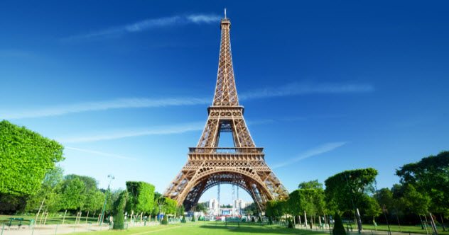
The Eiffel Tower now feels elegant, romantic, and very good at appearing on tote bags. But its first concept was less poetic and more “engineers had a ruler and a dream.” The tower was originally developed by engineers Maurice Koechlin and Émile Nouguier, who worked for Gustave Eiffel’s firm. Their early design was a 300-meter iron tower intended for the 1889 World’s Fair in Paris.
The basic engineering idea was there: a tall, open iron structure with four legs rising toward a narrow top. But early versions were much plainer than the final tower. Gustave Eiffel was reportedly not immediately enchanted by the first proposal, and architect Stephen Sauvestre helped refine the appearance with arches, decorative elements, and a more graceful profile.
What Changed?
The final Eiffel Tower balanced engineering efficiency with visual drama. It still looked shocking to many Parisians at the time, but it had enough architectural finesse to become more than a metal experiment. Without those refinements, it might have been remembered as a temporary industrial scaffold rather than the beloved symbol of Paris.
Ironically, many critics hated the tower anyway. Artists and writers complained that it ruined the skyline. Now people cross oceans to take selfies with it. Architecture has a funny way of winning arguments by simply refusing to leave.
3. The Sydney Opera House Could Have Been a Modernist Box
The Sydney Opera House is famous for its sculptural roof forms, which have been compared to sails, shells, waves, and folded paper. It looks like a building that decided standing still was boring. But when the design competition was held in the 1950s, many entries followed the modernist fashion of the time: clean lines, glassy surfaces, and box-like forms.
Danish architect Jørn Utzon submitted a design that broke from the expected pattern. His proposal was daring, expressive, and difficult to build. The roof geometry became one of the great architectural challenges of the 20th century. At one point, the forms had to be reworked into sections derived from a sphere, creating a buildable system for the dramatic shells.
What Changed?
If a more conventional entry had won, Sydney might have gained a respectable performing arts center rather than a global icon. The city’s harbor would likely feel entirely different without those bright, rising shells at Bennelong Point.
The Opera House also changed during construction. Utzon eventually left the project after political and budget disputes, and parts of the interior were completed without him. So even the building we know is not exactly the building he fully intended. It is an icon, yes, but also a reminder that architectural masterpieces sometimes arrive after a long argument with reality.
4. The Golden Gate Bridge Could Have Been a Clunky Hybrid Bridge
The Golden Gate Bridge is now celebrated for its clean suspension form, Art Deco towers, and unforgettable International Orange color. It looks so right in its setting that it feels almost geological, as if San Francisco fog naturally condenses into bridge cables.
But Joseph Strauss’s early proposal was not the sleek suspension bridge we know today. His preliminary plan combined cantilever and suspension elements, creating a bulkier, more complicated appearance. It was functional but not exactly elegant. Critics found the early design visually awkward, which is a polite architectural way of saying, “Please do not put that in the bay.”
What Changed?
The final design evolved through contributions from engineers and architect Irving Morrow, who helped shape the bridge’s towers, lighting, railings, and overall aesthetic. Morrow also advocated for the now-famous orange color, rejecting more utilitarian paint schemes, including high-visibility striping suggestions.
Had the earlier hybrid design been built, the Golden Gate Bridge might still have been an engineering achievement, but it probably would not have become one of the most beautiful bridges in the world. Sometimes the difference between infrastructure and icon is a consulting architect with taste.
5. The Washington Monument Could Have Had a Circular Temple at Its Base
The Washington Monument is famous for its simple, soaring obelisk shape. It is clean, severe, and impossible to confuse with a shopping mall. Yet Robert Mills’s original design was far more elaborate. His plan included a huge circular colonnaded building at the base, statues of Revolutionary War heroes, and a sculpture of George Washington in a chariot drawn by horses.
In other words, the monument could have looked less like a solemn Egyptian-inspired obelisk and more like an entire patriotic theme park rendered in stone. It would have been grand, crowded, and dramatically different from the minimalist shaft that now anchors the National Mall.
What Changed?
Money changed everything. The original design was expensive, and construction was interrupted for years by funding problems, political disputes, and the Civil War. When work resumed, the design was simplified. The colonnaded temple disappeared, and the obelisk became the monument’s defining feature.
The result may be stronger because of what was removed. The Washington Monument’s power comes from its restraint. It does one thingriseand it does that thing with total commitment. No chariot required.
6. The Lincoln Memorial Could Have Been a Pyramid or Ziggurat
The Lincoln Memorial is modeled after a Greek temple, with 36 exterior columns representing the states in the Union at the time of Abraham Lincoln’s death. The design by Henry Bacon connects Lincoln to democracy, classical ideals, and civic dignity. It is stately, symbolic, and excellent at making visitors lower their voices without being asked.
But not every proposal looked like a Greek temple. Architect John Russell Pope explored alternative designs, including pyramid and ziggurat-like forms. These proposals would have given Lincoln a monument with a very different mood: more ancient tomb, less democratic shrine.
What Changed?
The chosen design emphasized democracy by referencing ancient Greece, often described as the birthplace of democratic government. That symbolism mattered. A pyramid might have felt monumental, but it could also have suggested kingship, mystery, or imperial power. For Lincoln, who preserved the Union and became associated with government “of the people,” the temple form offered a clearer message.
If the pyramid or ziggurat had been built, the National Mall would feel much stranger. Dramatic? Absolutely. But the current memorial’s quiet authority suits Lincoln in a way that a giant stepped structure might not.
7. Mount Rushmore Could Have Featured Western Heroes and Full Bodies
Mount Rushmore is famous for the carved heads of George Washington, Thomas Jefferson, Theodore Roosevelt, and Abraham Lincoln. But the original idea was not necessarily presidential. South Dakota historian Doane Robinson wanted a monument to attract tourists to the Black Hills and initially imagined figures from the American West, such as explorers, Indigenous leaders, and frontier personalities.
Sculptor Gutzon Borglum pushed for a more national theme, choosing presidents instead. Even then, the final monument was supposed to be larger than what we see today. Borglum intended to carve the presidents from head to waist. There were also plans for a Hall of Records behind the figures, a chamber that would preserve major documents and historical explanations.
What Changed?
Funding, time, and Borglum’s death changed the monument. Work ended in 1941, leaving the presidents mostly as heads, with only limited detail below Washington’s chin. The Hall of Records was started but never finished as originally imagined.
The result is iconic, but also incomplete. Mount Rushmore looks finished because we are used to it. In truth, it is a massive unfinished draft carved into a mountain. That is either humbling or comforting, depending on how many unfinished documents are currently sitting on your desktop.
8. The Gateway Arch Could Have Been Almost Anything Else
The Gateway Arch in St. Louis is one of the purest architectural gestures in the United States: a stainless-steel curve rising 630 feet above the Mississippi River. Eero Saarinen’s design is simple, symbolic, and hard to improve. It says “gateway” without needing a sign that says “Gateway.”
But the memorial began as a design competition in the 1940s, and the competition drew many proposals. The site was intended to honor westward expansion, Thomas Jefferson, and the Louisiana Purchase. Designers could have interpreted that theme through statues, plazas, towers, museums, or more conventional memorial forms.
What Changed?
Saarinen’s arch won because it offered a single bold idea. It avoided the clutter that often weighs down commemorative projects. Instead of adding more symbols, it became the symbol. Its shape suggests passage, movement, ambition, and openness.
If another proposal had won, St. Louis might have received a more traditional monument. It could have been handsome, even impressive. But would it be instantly recognizable from a tiny airport souvenir magnet? Probably not. The Arch proves that sometimes the most radical choice is the simplest line.
9. The White House Could Have Looked Like a European Palace
The White House feels familiar because its image appears everywhere: news broadcasts, history books, Christmas ornaments, and the occasional movie where aliens or action heroes behave irresponsibly near Pennsylvania Avenue. Yet the President’s House was chosen through a design competition in the 1790s, and other proposals imagined a very different executive residence.
James Hoban’s winning design drew from classical traditions but remained relatively restrained. Other concepts were more palace-like, reflecting European ideas of grandeur. Thomas Jefferson even submitted a design anonymously. The young United States had to decide what kind of home suited a president: majestic enough for national dignity, but not so royal that it looked as if the Revolution had simply taken a coffee break.
What Changed?
Hoban’s design offered balance. The building was formal, symmetrical, and impressive, but not overwhelmingly imperial. Later additions, including porticoes, altered its appearance, but the basic identity remained.
If a more elaborate palace design had been chosen, the symbolism of the American presidency might feel very different. Architecture does not just house power; it explains power. The White House had to say, “This is important,” without also saying, “Please admire our throne room.”
10. The Guggenheim Museum Could Have Been Red
Frank Lloyd Wright’s Solomon R. Guggenheim Museum in New York is already unusual: a spiraling, sculptural museum that looks more like a white ribbon than a traditional gallery. But it could have been even more visually shocking. Wright explored stronger exterior colors, including red or orange-toned materials, reflecting his affection for earthy, organic colors such as Cherokee Red.
Today, many people imagine the Guggenheim as a pale, almost white spiral beside Central Park. That light exterior has become part of its identity. But a red or reddish museum would have changed the building’s relationship with the city. Instead of appearing like a smooth modern shell, it might have felt warmer, heavier, and more assertive.
What Changed?
The final color choices were shaped by patrons, practical decisions, and later repainting. The building also faced criticism from artists who worried that its curved ramps and tilted walls would compete with the art inside. Wright, being Wright, was not exactly famous for designing buildings that politely disappeared into the background.
If the Guggenheim had been red, it might still be a masterpiece, but a very different one. The current building feels like a swirl of light. The red version might have looked more volcanic, as if modern art had erupted on Fifth Avenue.
Why These Almost-Built Designs Matter
Unbuilt designs are not just architectural trivia. They reveal what societies valued, feared, and argued about at particular moments. A rejected design can show us the limits of technology, the pressure of budgets, the mood of politics, and the power of public taste. It can also remind us that icons are rarely inevitable.
The Washington Monument became stronger when its design was simplified. The Sydney Opera House became unforgettable because a risky concept survived long enough to be built. The Golden Gate Bridge became beautiful because aesthetics were treated as essential, not decorative frosting added after the engineering cake came out of the oven.
These structures also show that compromise is not always failure. Sometimes a budget cut removes clutter. Sometimes a technical problem forces a better solution. Sometimes a rejected sketch becomes the seed of a masterpiece somewhere else. The Statue of Liberty’s earlier Egyptian concept did not vanish; it evolved into a new symbol across the Atlantic.
Experiences Related to Iconic Structures That Almost Looked Different
One of the best ways to experience these landmarks is to look at them twice: once as they are, and once as they almost were. Most visitors take in the final result quickly. They photograph the Golden Gate Bridge, admire the Lincoln Memorial, or stand beneath the Gateway Arch and think, “Yes, this is the famous thing.” But the experience becomes richer when you mentally layer the rejected versions over the real one.
Imagine walking along the National Mall and replacing the Washington Monument’s clean obelisk with Robert Mills’s elaborate circular temple. The entire mood changes. The current monument creates open space around it; the original would have created a destination packed with sculpture and architectural detail. One feels like a silent exclamation point. The other would have felt like a patriotic opera with columns.
At the Lincoln Memorial, knowing about pyramid and ziggurat proposals makes Henry Bacon’s Greek temple feel more deliberate. It was not simply a pretty classical shell. It was a choice about meaning. A stepped pyramid might have emphasized death and eternity, but the temple emphasizes democracy, law, and civic memory. Visitors who know that history may notice how carefully the memorial frames Lincoln not as a king but as a democratic figure seated inside a public shrine.
The Sydney Opera House offers another kind of experience. From a distance, it looks effortless, almost like it floated into place. Learning about its difficult design evolution makes the building feel more human. Those sail-like shells were not easy magic. They required mathematical problem-solving, political endurance, and architectural courage. Suddenly the building is not just beautiful; it is stubborn.
The Gateway Arch is especially powerful when viewed through the lens of competition. Many memorials try to explain themselves with statues, plaques, and symbolic clutter. Saarinen’s arch does something rarer: it trusts one form to carry the idea. Standing beneath it, you feel how a simple curve can suggest movement, expansion, optimism, and risk. It is minimal, but not empty.
For writers, designers, travelers, and history lovers, these near-miss stories are useful reminders. First drafts matter, but they are not destiny. A design can begin as one thing and become another. A rejected idea can migrate to a new context. A practical constraint can sharpen creativity. Even icons had awkward phases.
There is also a lesson for anyone visiting famous places: slow down. Look for visitor center models, early drawings, old competition entries, construction photographs, and unrealized plans. These materials can turn a landmark from a postcard into a story. The building you see is only the visible ending. Behind it is a pile of alternatives, debates, mistakes, revisions, and wild ideas that almost changed the skyline forever.
In that sense, iconic structures are not frozen objects. They are decisions made visible. Every column, curve, color, and missing feature tells us something about the people who imagined the future before it hardened into stone, steel, or copper. The most famous landmarks in the world are not just monuments to what was built. They are also monuments to what was not.
Conclusion
The world’s most iconic structures often look inevitable only because we have seen them too many times to imagine otherwise. Yet behind every famous landmark is a hidden gallery of rejected possibilities: pyramids for Lincoln, a temple around Washington’s obelisk, a red Guggenheim, a clunky Golden Gate Bridge, and a Statue of Liberty that might have guided ships near the Suez Canal instead of greeting arrivals in New York Harbor.
These alternate designs make architecture more fascinating because they show how fragile history can be. One committee vote, one budget decision, one engineering breakthrough, or one stubborn designer can change a skyline for centuries. The structures we celebrate today are not just masterpieces of design. They are survivors of the messy, brilliant process that turns imagination into landmarks.
Note: This article is written in original standard American English and synthesizes historical and architectural information from reputable museum, park, architecture, and cultural-history references. It is prepared for web publication without source-link clutter inside the article body.