Few things test a user’s patience like a blank screen. It sits there, pale and silent, like a website forgot why it invited you over. That tiny waiting moment between clicking and seeing content may seem harmless, but in web design, loading time is where trust can either grow or evaporate faster than free office snacks.
A great loading page design does more than say, “Please wait.” It reassures users that something is happening, sets expectations, reflects the brand personality, and sometimes even makes people smile. Good loading states can reduce perceived waiting time, prevent rage-clicking, and keep visitors engaged long enough for the real content to arrive. In other words, a loading page is not just filler. It is a tiny stage where your product can perform a quick magic trick.
Modern UX design treats loading states as part of the complete user journey. Whether you use skeleton screens, animated progress bars, microcopy, branded illustrations, or playful transitions, the goal is the same: make waiting feel useful, understandable, and less annoying. Below are 10 examples of loading page designs that actually engage users, along with practical analysis you can apply to websites, SaaS dashboards, mobile apps, ecommerce stores, portfolios, and content platforms.
Why Loading Page Design Matters
Users do not judge speed only by the stopwatch. They judge it by perception. A page that gives visual feedback can feel faster than a page that technically loads in the same amount of time but shows nothing. That is why the best loading designs focus on perceived performance, not just technical performance.
A loading page should answer three silent user questions: Is the site working? What is happening? How long will this take? When a design answers those questions clearly, users stay calmer. When it does not, they assume the site is broken, their Wi-Fi is cursed, or the internet has personally betrayed them.
10 Examples of Loading Page Designs That Actually Engage Users
1. Skeleton Screens That Preview the Final Layout
Skeleton screens are among the most effective loading page designs because they show users the shape of the content before the content fully appears. Instead of a spinning circle floating in the middle of nowhere, users see gray boxes where headlines, images, cards, product tiles, or comments will soon load.
This design works well for news sites, ecommerce product grids, social feeds, dashboards, and video platforms. The user immediately understands what type of page is coming. A card layout skeleton says, “Products are on the way.” A paragraph skeleton says, “Article content is loading.” A table skeleton says, “Data is coming, please do not panic and refresh twelve times.”
The key is accuracy. The skeleton should resemble the real interface closely enough to set expectations. If your final page contains three product cards and a sidebar filter, the skeleton should not look like a weather app wearing a trench coat. Keep the shapes simple, subtle, and aligned with the final design.
2. Progress Bars With Clear Percentage Feedback
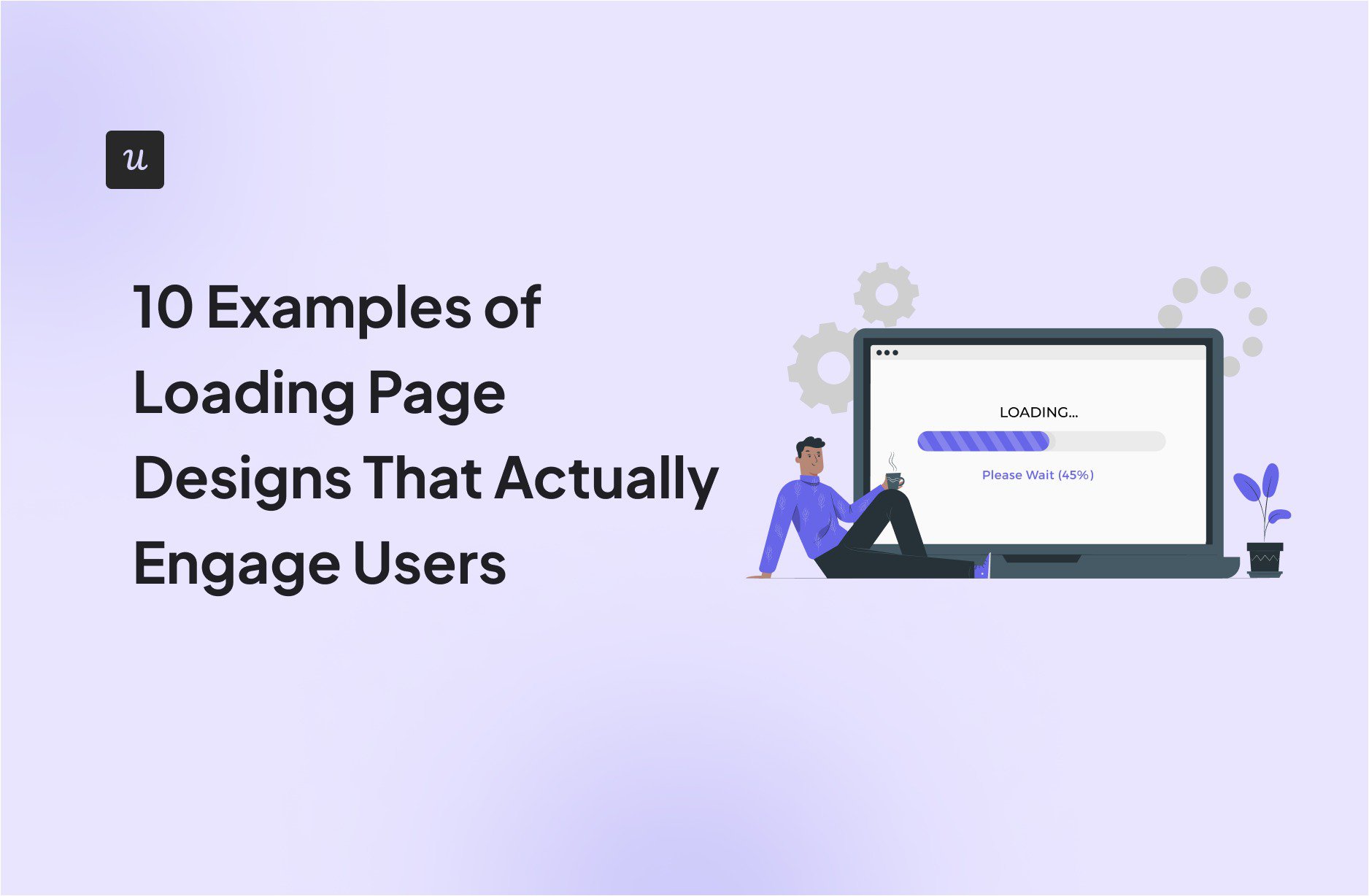
Progress bars are perfect when the system can estimate completion. File uploads, account setup, checkout steps, data imports, and onboarding flows all benefit from a determinate progress indicator. A visible percentage turns uncertainty into a measurable journey.
Instead of a vague “Loading…” message, a better page might say, “Uploading product images 64% complete.” That sentence does two important jobs. It explains what is happening and shows progress. Users are far more patient when they can see the finish line, even if the line is moving at the pace of a sleepy turtle.
Progress bars should be honest. Do not jump from 12% to 95% and then freeze there long enough for the user to question their life choices. If the process has multiple steps, label them. For example: “Checking file,” “Optimizing image,” “Saving changes,” and “Almost done.” Clear labels make the wait feel structured.
3. Branded Logo Animations
A branded logo animation can transform a loading screen into a brand moment. This works especially well for creative agencies, SaaS products, media platforms, fashion sites, fintech apps, and portfolio websites. Instead of showing a generic spinner, the brand mark moves, morphs, pulses, draws itself, or assembles piece by piece.
The best logo loaders are short, lightweight, and purposeful. They do not force users to watch a full cinematic trailer every time they visit the homepage. A loading screen is not the place for a director’s cut. Think of it as a handshake, not a wedding speech.
A well-designed logo loader strengthens recognition. It says, “You are still in our world.” For example, a travel brand might animate a route line around its logo. A music app might make the logo pulse like sound waves. A food delivery app might use a bouncing icon that feels quick, warm, and energetic.
4. Playful Microcopy That Reduces Frustration
Words can carry a loading page when visuals are simple. Microcopy gives users context and personality during a wait. Instead of “Loading,” a project management app might say, “Organizing your chaos into neat little boxes.” A recipe website could say, “Preheating the page.” A travel platform might say, “Packing your search results.”
Good loading microcopy is short, specific, and on-brand. It should not be so cute that it becomes confusing. “Summoning digital unicorns” may be funny once, but if users are waiting for a bank transfer, they probably want reassurance, not mythical livestock.
Use playful copy for low-risk moments, such as browsing, filtering, or refreshing content. Use direct copy for high-risk moments, such as payments, medical forms, account security, or saved changes. The more serious the task, the more transparent the message should be.
5. Illustrated Loading Scenes
Illustrated loading pages can make waiting feel warmer and more human. These designs use small scenes, characters, mascots, or thematic graphics that match the product. For example, a fitness app might show a character stretching, a shipping app might show a delivery van moving across the screen, and an education platform might show books stacking up.
Illustrations are especially effective for apps with a friendly brand voice. They soften the experience and make the delay feel intentional rather than accidental. The user does not see a failure; they see a tiny story.
However, illustration should not slow down the page. The great irony of loading design is that a loading animation can become the reason the page loads slowly. Use optimized SVGs, lightweight motion, and minimal assets. Beautiful design should not arrive wearing a backpack full of unnecessary JavaScript.
6. Interactive Mini-Loaders
Some loading pages let users interact while they wait. This might be a tiny game, a draggable animation, a tap-to-change icon, or a simple playful interaction. These are popular in creative websites, product launches, portfolios, and entertainment platforms.
Interactive loading screens work because they give users a sense of control. Even a tiny action can reduce the feeling of helpless waiting. If your audience expects fun, creativity, or surprise, this design can create a memorable first impression.
The danger is overdoing it. A loading mini-game is delightful only if the wait is long enough to notice but not so long that users wonder whether they accidentally opened an arcade. Keep interactions optional, quick, and accessible. Never hide important navigation behind a gimmick.
7. Step-Based Onboarding Loaders
Onboarding often requires the system to create an account, personalize settings, import data, or build a workspace. This is a perfect opportunity for a step-based loading page. Instead of showing one lonely spinner, the page can display steps like “Creating your workspace,” “Adding starter templates,” “Personalizing your dashboard,” and “Getting things ready.”
This design turns invisible processing into visible progress. It also increases confidence because users can see that the product is actively doing something useful. For SaaS tools, step-based loaders are particularly powerful because they make the setup feel customized.
To make this design stronger, include small checkmarks as steps complete. The checkmarks create a tiny reward loop. Users see progress, feel movement, and are more likely to stay until the final screen appears.
8. Content Teaser Loading Pages
A content teaser loader gives users something useful before the full page is ready. For example, a learning platform might show a quick tip related to the lesson. A finance dashboard might show a short note explaining how to read a metric. A wellness app might show a breathing prompt while loading a session.
This is engagement with a purpose. The loading state becomes educational, not decorative. Users leave the waiting moment with a little more knowledge than they had before. That is a better trade than staring at a spinner and slowly becoming one with the carpet.
Content teaser loaders should be relevant to the page that is loading. Random facts may amuse users, but contextual tips help them succeed. If someone is loading analytics, show a metric tip. If someone is loading a recipe, show a cooking tip. If someone is loading a design tool, show a shortcut or productivity hint.
9. Shimmer Effects for Data-Heavy Interfaces
Shimmer loaders are animated skeleton screens that use a soft light sweep across placeholder blocks. They are common in dashboards, cards, lists, feeds, and mobile apps. The shimmer tells users that content is actively loading, not frozen.
This design is excellent for data-heavy interfaces because it lets the user understand the structure before the numbers, charts, or rows arrive. A dashboard can show placeholder cards, graph blocks, and table rows. Once data loads, each section can populate progressively.
Use shimmer carefully. Too much motion can feel distracting, especially on pages with many components. Keep the animation gentle and respect accessibility preferences such as reduced motion. A good shimmer should whisper, “Working on it,” not shout, “LOOK AT ME, I AM A LASER.”
10. Full-Screen Brand Story Transitions
Full-screen loading transitions work best for premium websites, event pages, product launches, portfolios, and visual storytelling experiences. These loaders often use bold typography, motion graphics, color transitions, cinematic reveals, or short brand messages before the main page appears.
This type of loading page can create anticipation. It is not merely covering a delay; it is setting the mood. A luxury brand might use slow, elegant typography. A gaming site might use energetic motion. A design studio might use an abstract animation that reflects its creative identity.
The important rule is restraint. A full-screen transition should feel like an entrance, not a locked door. Users should not be forced to admire your animation every single time they click a menu item. Save dramatic loaders for meaningful transitions, not every micro-action.
What Makes a Loading Page Truly Engaging?
An engaging loading page is not automatically the fanciest one. It is the one that best matches the user’s task, emotion, and expectation. A playful animation may be perfect for a game app but inappropriate for a tax filing platform. A detailed progress bar may be ideal for uploads but unnecessary for a quick content refresh.
The strongest loading page designs usually share five qualities. First, they provide immediate feedback. Second, they explain what is happening when possible. Third, they match the brand voice. Fourth, they reduce perceived waiting time. Fifth, they do not make the actual loading performance worse.
Designers should also consider accessibility. Motion should be subtle, contrast should be readable, and messages should not rely only on animation. Users with motion sensitivity, screen readers, slower devices, or unstable connections deserve a loading experience that works for them too.
Common Loading Page Design Mistakes
Using a Spinner for Everything
Spinners are useful for short, uncertain waits, but they become frustrating when used for long processes. If a task takes several seconds and has known steps, use a progress bar or step indicator instead.
Showing No Feedback at All
A blank screen is the fastest way to make users suspect something is broken. Even a simple message or skeleton layout is better than silence.
Making the Loader Heavier Than the Page
A loading animation should be lightweight. If your preloader needs its own preloader, the design has officially entered comedy territory.
Being Too Vague
“Please wait” is polite, but not very helpful. “Saving your changes” is better. “Importing 245 contacts” is even better. Specific copy builds confidence.
Ignoring Mobile Performance
Mobile users often deal with slower networks and smaller screens. Loading designs should be responsive, fast, and clear on all devices.
How to Choose the Right Loading Design
Choose the loading page design based on the type of wait. For short waits under a second, you may not need a visible loader at all. For quick actions like submitting a button, use an inline spinner or button state. For page-level content loading, use skeleton screens. For long operations with measurable progress, use a progress bar. For onboarding, use step-based loaders. For brand-driven experiences, use short animated transitions.
The best loading design is the one users barely complain about. That may sound modest, but in UX design, “nobody got annoyed” is often a standing ovation wearing comfortable shoes.
Additional Experience: Lessons From Designing Loading Pages That Users Do Not Hate
One of the biggest lessons in loading page design is that users are more patient when they feel respected. A delay is not always a disaster. Sometimes the system genuinely needs time to fetch data, process files, generate a report, or personalize a dashboard. The problem begins when the interface acts like nothing is happening. Silence turns a three-second wait into a mystery novel, and not the fun kind with a charming detective.
In real projects, skeleton screens often perform better than generic spinners for content-heavy pages. When users see the rough structure of the page, they begin orienting themselves before the final content appears. This is especially useful for ecommerce category pages, blog layouts, search results, and social feeds. Users can predict where images, titles, filters, and buttons will be. By the time the real content loads, they are already mentally prepared to scan it.
Another practical experience is that microcopy can save a loading state from feeling cold. A simple line like “Finding the best matches for you” feels better than “Loading data.” The first version sounds helpful; the second sounds like a robot reading a spreadsheet in a basement. However, tone must match context. For a casual lifestyle app, humor works beautifully. For banking, healthcare, legal, or security products, clarity should beat comedy every time. Nobody wants a payment screen saying, “Convincing your money to move.” Funny? Maybe. Trust-building? Not exactly.
Design teams should also test loading pages on slower connections, not just on powerful office machines with Wi-Fi that could probably stream the moon. A loader that feels elegant on a fast laptop may feel painful on a mid-range phone. Test the experience with throttled speed, older devices, and repeated actions. Look for moments where users might think the system froze. Then add clearer feedback, progressive rendering, or better state messages.
It is also important to avoid designing loading screens as decoration only. Motion should communicate activity, progress, structure, or brand feeling. Random animation may look cool in a design presentation, but users are not visiting a website to admire your spinner collection. They are trying to buy shoes, read an article, check analytics, book a hotel, upload a file, or finish a task before lunch. The loading state should help them keep momentum.
Finally, the best loading page is still a fast page. UX design can make waiting feel better, but it should not become an excuse for poor performance. Compress assets, optimize fonts, reduce render-blocking scripts, improve server response, lazy-load noncritical content, and measure performance regularly. Loading page design is the friendly host who chats with guests while dinner is finishing. It should not be the reason dinner takes two hours.
Conclusion
Loading page designs are small moments with big influence. They can reduce uncertainty, express brand personality, teach users something useful, and make digital waiting feel less like standing in line behind someone writing a check at the grocery store. From skeleton screens and shimmer effects to progress bars, microcopy, illustrations, and full-screen transitions, the best designs share one purpose: they keep users informed and engaged while the system works.
For SEO, conversion, and user experience, loading states deserve real design attention. A visitor who understands what is happening is more likely to stay. A visitor who feels ignored is more likely to bounce. So the next time your website needs a few seconds to load, do not leave users staring into the void. Give them structure, feedback, personality, and maybe one tiny smile.