Photoshop text can be polite, straight, and perfectly well-behaved. That is lovely for resumes, warning labels, and anything approved by a committee. But when you are designing a poster, album cover, YouTube thumbnail, gaming banner, streetwear graphic, surreal collage, or bold social media artwork, polite text often looks like it arrived wearing sensible shoes. That is where distorted text comes in.
Learning how to distort text in Photoshop gives your typography motion, attitude, depth, and personality. You can bend words into an arch, stretch them into perspective, warp them around an object, make them ripple like water, push them into a grunge poster style, or create a dramatic title that looks like it is being pulled through another dimension. Best of all, you do not need to be a Photoshop wizard with a glowing keyboard and three monitors. With the right workflow, you can distort text cleanly, safely, and without turning every letter into pixel soup.
This guide breaks the process into six practical steps. You will learn the best ways to prepare your type layer, use Photoshop’s Warp Text command, apply Free Transform, work with Smart Objects, add advanced distortion effects, and polish the final result so it looks intentional instead of accidentally dropped on the floor. We will also cover common mistakes, professional tips, and real design examples so you can choose the right distortion method for your project.
What Does It Mean to Distort Text in Photoshop?
To distort text in Photoshop means to change the shape, angle, curve, perspective, or surface behavior of a type layer. Distortion can be subtle, such as skewing a word so it matches the angle of a wall, or dramatic, such as bending a title into a wave, stretching letters into a horror-style effect, or making text wrap naturally across fabric.
Photoshop offers several ways to do this. The most beginner-friendly option is Warp Text, which keeps your type editable while applying preset bends such as Arc, Flag, Wave, Fish, Bulge, and Twist. For more control, you can use Free Transform, Transform Warp, Perspective, Skew, Distort, Liquify, Puppet Warp, or Displacement Maps. Each tool has a different personality. Warp Text is the tidy friend. Liquify is the wild cousin. Displacement Maps are the quiet genius in the corner.
Before You Start: Choose the Right Distortion Method
Not every text effect needs the same tool. If you want a clean curved heading, use Warp Text. If you want text to sit on a road, sign, book cover, or building, use Transform, Perspective, or Distort. If you want the letters to follow fabric, skin, paper, stone, or water texture, use a Displacement Map. If you want a liquid, melting, horror, psychedelic, or experimental look, Liquify can do the heavy lifting.
The golden rule is simple: keep the text editable for as long as possible. In Photoshop, live type layers allow you to change the words, font, size, tracking, color, and alignment. Once you rasterize text, it becomes pixels. Pixels are useful for heavy effects, but they are not forgiving when a client suddenly decides that “Summer Blast” should actually be “Autumn Refresh Mega Sale.” Designers have lost years of their lives to last-minute wording changes. Protect yourself.
How to Distort Text in Photoshop: 6 Steps
Step 1: Create a New Document and Add Your Text
Open Photoshop and create a new document. Choose a canvas size that matches your final use. For social media graphics, a square or vertical layout often works well. For posters, use a larger canvas with enough resolution for print. If you are designing for the web, 72 or 96 pixels per inch is usually fine. For print, start at 300 pixels per inch so your final artwork stays crisp.
Select the Type Tool from the toolbar, or press T on your keyboard. Click on the canvas and type your text. For distortion effects, bold fonts usually work better than thin fonts because they have more visual weight. A chunky sans-serif, condensed display font, retro serif, or heavy script can survive stretching and bending better than a delicate hairline typeface. Thin letters can look elegant, but after distortion they may resemble noodles having a difficult day.
Use the Character panel to adjust font size, spacing, leading, and alignment. Before applying any distortion, make sure the text is readable in its normal state. Distortion should enhance the design, not create a secret code only your cat can decode.
Step 2: Duplicate the Text Layer Before Editing
Before you distort anything, duplicate your text layer. In the Layers panel, right-click the type layer and choose Duplicate Layer, or press Ctrl + J on Windows or Command + J on Mac. Hide the original layer by clicking the eye icon. This gives you a clean backup in case you need to start over.
This step may seem boring, but it is one of the most professional habits you can build. Photoshop projects often become little digital jungles, full of experiments, hidden layers, masks, effects, and mysterious objects named “Layer 47 copy final FINAL 2.” Keeping a backup type layer saves time and prevents panic.
If you plan to use transformations beyond basic Warp Text, convert the duplicate text layer into a Smart Object. Right-click the layer and choose Convert to Smart Object. A Smart Object preserves the original text inside a container, which means you can transform and warp the layer more flexibly while still being able to open and edit the original contents later. It is like putting your text in a protective helmet before sending it down a creative waterslide.
Step 3: Use Warp Text for Fast, Editable Distortion
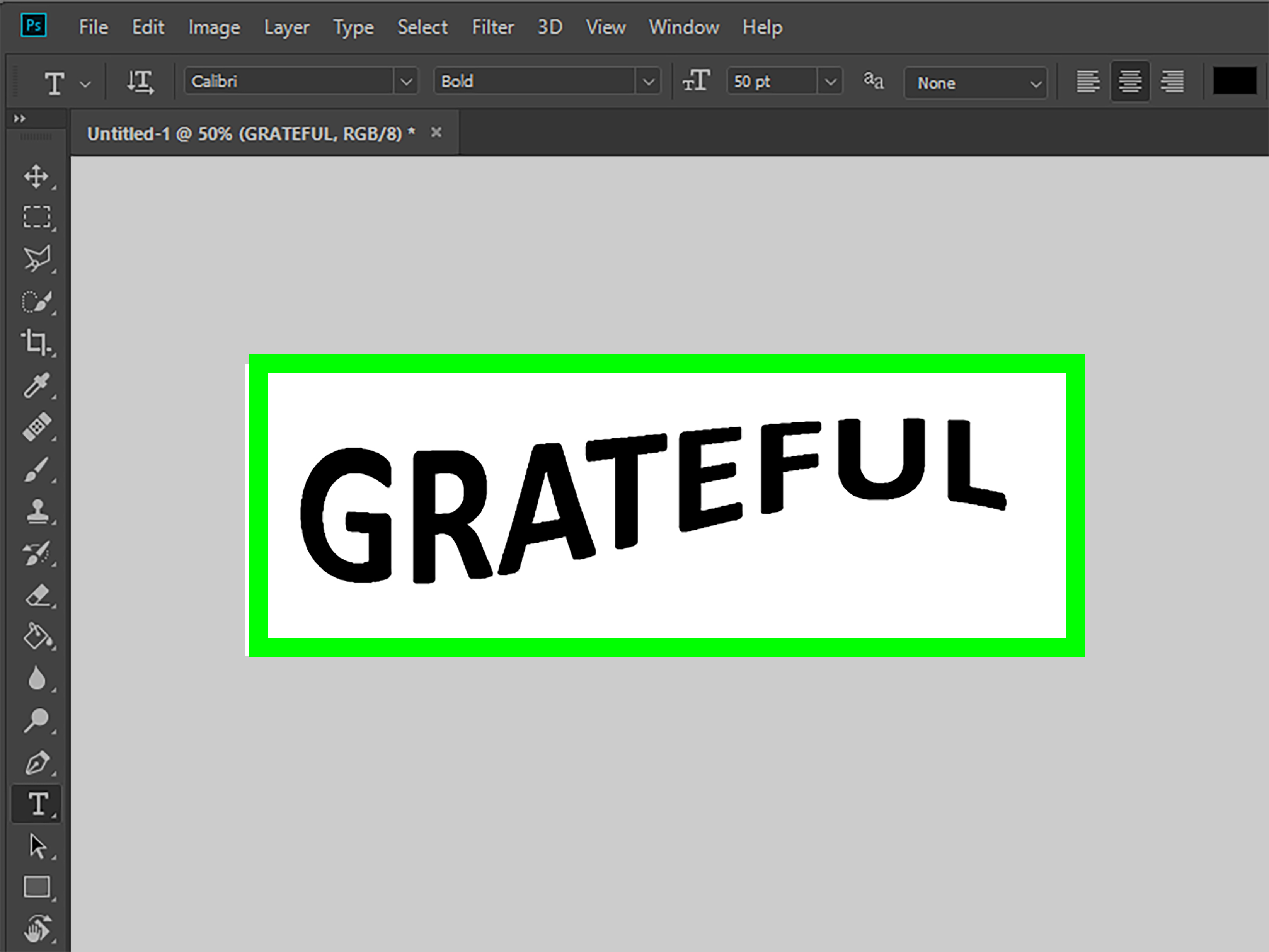
The easiest way to distort text in Photoshop is with the Warp Text command. Select your text layer, activate the Type Tool, and click the Warp Text icon in the Options bar. You can also go to Type > Warp Text.
In the Warp Text dialog box, open the Style dropdown menu. You will see options such as Arc, Arc Lower, Arc Upper, Arch, Bulge, Shell, Flag, Wave, Fish, Rise, Fisheye, Inflate, Squeeze, and Twist. Choose one based on your design goal. For example, Arc works well for badges and logos, Wave is useful for retro and music graphics, Flag creates a banner-like motion, and Bulge can make text feel inflated or closer to the viewer.
Next, adjust the Bend, Horizontal Distortion, and Vertical Distortion sliders. Start small. A Bend value of 15 to 30 percent is often enough for a clean effect. Push it too far and your letters may begin to look like they are auditioning for a haunted funhouse mirror.
The advantage of Warp Text is that your type remains editable. You can still change the wording, font, and color after applying the effect. This makes Warp Text perfect for beginners, quick layouts, and projects where the copy may change later.
Step 4: Use Free Transform, Skew, Distort, and Perspective
For more realistic placement, use Photoshop’s transform controls. Select the text layer or Smart Object and press Ctrl + T on Windows or Command + T on Mac to activate Free Transform. From there, right-click inside the transform box to access options such as Skew, Distort, Perspective, and Warp.
Skew slants the text horizontally or vertically. It is useful when you want a word to lean with attitude, match an angled layout, or create motion. Distort lets you move each corner independently, making it ideal for fitting text onto a flat surface in a photo, such as a billboard, laptop screen, poster wall, package label, or book cover. Perspective adjusts opposite corners together, helping text appear as if it is moving toward a vanishing point.
For example, imagine placing the word “SALE” on a storefront sign photographed from the sidewalk. Regular text would look pasted on. By using Distort or Perspective, you can align the corners of the text with the edges of the sign, making it feel like it belongs in the scene. Add a little blur, noise, or blending afterward, and suddenly your text stops shouting “I was added in Photoshop!”
When using Transform, zoom in and align edges carefully. Small perspective mistakes are easy to notice, especially when text sits on architectural surfaces. Hold Shift, Alt, or Option as needed depending on your Photoshop version and transform behavior, and use guides when precision matters.
Step 5: Try Advanced Distortion with Liquify, Puppet Warp, or Displacement Maps
Once you understand the basic tools, you can move into more dramatic Photoshop text distortion effects. These methods usually work best when the text layer is converted to a Smart Object or rasterized. Use Smart Objects whenever possible because they give you more flexibility and allow certain effects to be applied as editable Smart Filters.
Liquify is excellent for melting, swirling, pulling, or pushing text. Select your text layer or Smart Object and go to Filter > Liquify. Use the Forward Warp Tool to drag parts of the letters. Use Pucker to pinch areas inward, Bloat to swell them outward, and Twirl to rotate shapes. Liquify is great for horror posters, psychedelic album art, glitch-inspired graphics, and surreal designs. Just remember: a tiny drag can look stylish; a giant drag can look like the alphabet got caught in a blender.
Puppet Warp is helpful when you want to bend specific parts of a word with more control. Go to Edit > Puppet Warp, place pins on the text, and move them to reshape the layer. This is especially useful for bending individual letters or creating a handmade, flexible look.
Displacement Maps are powerful when you want text to follow the texture of another surface. For example, you can make text wrap across wrinkled fabric, rough paper, cracked stone, water ripples, or skin. The basic idea is to create a grayscale map from the surface texture and then apply it through Filter > Distort > Displace. Lighter and darker areas push the text in different directions, creating the illusion that the letters are affected by the surface underneath.
For realistic results, combine displacement with blending modes, opacity adjustments, masks, and subtle shadows. The distortion is only half the trick. Matching light, texture, contrast, and sharpness is what sells the illusion.
Step 6: Refine the Effect and Make the Text Look Finished
After distorting the text, polish it. This is where a decent effect becomes a professional-looking design. Start by checking readability. Step back from the screen or zoom out. Can people still read the words quickly? If not, reduce the distortion, increase contrast, adjust spacing, or choose a stronger font.
Next, use layer styles if they support the design. A subtle Drop Shadow can separate warped text from the background. Gradient Overlay can add depth. Stroke can improve readability on busy images. Bevel and Emboss can create a dimensional look, though it should be used carefully unless you are intentionally chasing a retro 2003 energy drink label vibe.
You can also add texture. Place a paper, grain, metal, or fabric texture above the text and clip it to the type layer by pressing Alt or Option between the layers in the Layers panel. Lower the opacity or change the blending mode to Overlay, Soft Light, Multiply, or Screen depending on the effect you want.
Finally, organize your file. Rename layers clearly, keep your backup text layer, and save a layered PSD before exporting. Then export a web-friendly version as JPEG, PNG, or WebP depending on your publishing needs. For transparent text graphics, PNG is often the best option. For full-background images, JPEG or WebP usually keeps file size smaller.
Best Uses for Distorted Text in Photoshop
Distorted text is not just a party trick for typography nerds. It has real design uses across many creative projects. In advertising, warped text can make a headline feel energetic and clickable. In poster design, it can guide the viewer’s eye through the composition. In branding, subtle distortion can make a logo or wordmark feel more custom. In photo manipulation, perspective distortion helps text blend naturally into real-world surfaces.
For social media graphics, curved or wavy text can create stronger visual rhythm. For YouTube thumbnails, bold distorted words can add urgency and movement. For music artwork, especially electronic, punk, metal, hip-hop, or experimental genres, distortion can help communicate mood before anyone reads a single lyric. For apparel design, warped text can make a T-shirt graphic feel less generic and more intentional.
Common Mistakes When Distorting Text
Overdoing the Effect
The most common mistake is pushing the distortion too far. A little bend can create energy. Too much bend can make your headline look like it needs medical attention. Always ask whether the effect supports the message or distracts from it.
Rasterizing Too Early
Rasterizing turns editable text into pixels. Sometimes you need to do it, especially for certain filters or manual painting effects. However, rasterizing too early can create problems if you need to change the copy later. Keep a live text backup or use Smart Objects whenever possible.
Ignoring Readability
Creative typography still has a job: communication. If viewers cannot read the title, the design may fail no matter how cool the effect looks. Use contrast, spacing, and scale to keep the text clear.
Forgetting Perspective and Lighting
If you place distorted text into a photo, match the perspective and lighting. Text on a wall should follow the wall angle. Text on fabric should bend with folds. Text in a dark scene should not glow like it just escaped a dentist’s office.
Professional Tips for Better Photoshop Text Distortion
Start with a strong font. Bold, display-style fonts usually hold up better under distortion than thin fonts. Keep a copy of the original text layer hidden. Use Smart Objects for non-destructive editing. Apply effects gradually rather than all at once. Combine multiple small adjustments instead of one extreme transformation. Use masks to hide parts of the text naturally behind objects. Add texture and grain so the text fits the overall image.
Another useful trick is to distort text in stages. For instance, first use Warp Text to create a broad curve, then convert the layer to a Smart Object, then use Transform Warp for custom shaping, and finally add a subtle Displacement Map for texture. This layered approach produces richer results than relying on a single dramatic effect.
Example: Creating Wavy Poster Text
Suppose you are designing a retro concert poster. Create your document, type the band name in a heavy display font, and choose a bright color. Open Warp Text and select Wave. Keep the Bend moderate, around 20 to 35 percent. Adjust Horizontal Distortion slightly to create movement. Then convert the layer to a Smart Object and use Edit > Transform > Warp to customize the wave by dragging control handles.
Add a paper texture above the text, clip it to the layer, and set the blending mode to Soft Light or Multiply. Add a small shadow or duplicate the text behind itself in a contrasting color for a screen-printed look. The result feels designed, energetic, and much more exciting than plain text sitting stiffly in the center of the page.
Example: Making Text Match a Photo Surface
Imagine adding a slogan to a photographed cardboard box. Type the slogan, convert it to a Smart Object, and use Distort to align the text corners with the box’s surface. Lower the opacity slightly so you can see the box edges while adjusting. Once the perspective looks right, restore the opacity and change the blending mode to Multiply if the text should look printed on the cardboard.
Add a small amount of Gaussian Blur if the photo is not perfectly sharp. Then add a displacement effect based on the cardboard texture if you want extra realism. This combination of perspective, blending, blur, and texture makes the text look physically present rather than digitally pasted.
My Experience with Distorting Text in Photoshop
The first time I tried to distort text in Photoshop, I treated every slider like it was a volume knob at a rock concert. Bend? Turn it up. Horizontal Distortion? Turn it up. Vertical Distortion? Why not launch it into orbit? The result was technically text, in the same way a melted birthday candle is technically still a candle. It had personality, yes, but readability packed a suitcase and left.
Over time, I learned that the best distorted text effects usually come from restraint. The goal is not to prove that Photoshop has tools. The goal is to make the design feel more alive. A headline on a poster may only need a slight arc to feel energetic. A label on a bottle may only need careful perspective adjustment. A surreal album cover may need Liquify, but even then, the most effective areas are often controlled while only a few parts become wild.
One practical lesson is to always design with the final use in mind. Text that looks amazing at full screen may become unreadable as a small thumbnail. This matters for YouTube graphics, Pinterest pins, product images, and blog headers. I like to zoom out early and often. If the distorted title still works at a smaller size, it is probably strong. If it becomes a decorative worm, it needs adjustment.
Another experience-based tip is to separate the creative stage from the cleanup stage. During the creative stage, experiment freely. Try Warp Text presets. Convert copies to Smart Objects. Use Liquify. Push the effect too far just to see what happens. Photoshop is forgiving when you keep backups. During the cleanup stage, become pickier. Remove unnecessary effects, straighten awkward edges, improve spacing, and make sure the text supports the composition.
I have also found that distorted text looks much better when it interacts with its environment. If the text is on a textured background, let some of that texture show through. If it sits behind an object, mask part of it away. If it follows a surface, match the angle and lighting. These small details tell the viewer’s brain, “Yes, this belongs here.” Without them, even a technically perfect distortion can look like a sticker slapped onto an image.
Smart Objects are another habit worth building. They may feel like an extra step at first, but they save projects. When text is inside a Smart Object, you can transform it, warp it, apply filters, and still return to the original content when needed. This is especially helpful for client work, templates, advertising layouts, and any project where the wording may change. And let us be honest: the wording will change. It always changes. Usually five minutes after you export the final file.
Finally, I recommend building a small library of distortion styles. Create test files with curved text, wavy text, perspective text, grunge text, liquid text, and displacement-map text. Label the layers clearly and keep them as references. Over time, you will know which method fits which design problem. Instead of guessing, you will think, “This needs a subtle warp,” or “This needs perspective plus texture,” or “This is definitely a Liquify situation.” That confidence makes Photoshop feel less like a maze and more like a toolbox.
Conclusion
Learning how to distort text in Photoshop is one of the fastest ways to make your typography feel more dynamic, expressive, and custom. Start with clean type, duplicate your layer, and use Warp Text for simple editable effects. Move into Free Transform, Skew, Distort, Perspective, Transform Warp, Liquify, Puppet Warp, and Displacement Maps when your design needs more control or realism. Keep the text readable, work non-destructively, and refine the final look with shadows, texture, blending, and smart layer organization.
Distorted text can be playful, polished, spooky, elegant, chaotic, futuristic, retro, or beautifully strange. The trick is choosing the right amount of distortion for the message. Photoshop gives you the tools; your job is to make sure the letters still know what they are doing.
Note: This article is written as an original, publish-ready guide based on current Photoshop text, transform, warp, Smart Object, Liquify, Puppet Warp, and distortion workflows.