Your home’s exterior color scheme is a little like getting dressed for an important event. The siding is the suit, the trim is the shirt, and the accent color is the pocket square that prevents the whole outfit from looking like it was chosen in the dark. A smart accent can sharpen architectural details, guide attention toward the front door, and give even a familiar neutral exterior a memorable personality.
The most dependable approach is to treat the facade as three visual layers: the main body color, the trim, and one or two accents used on doors, shutters, window sashes, porch railings, brackets, or other details. Designers and paint professionals repeatedly recommend working with the home’s permanent materialsroofing, brick, stone, concrete, and natural woodrather than pretending those colors do not exist. They are already at the party, so they need to be introduced properly.
How to Choose an Exterior Accent Color That Actually Works
Before falling in love with a tiny paint chip under fluorescent store lighting, look at the whole property. Note the undertones in the roof, masonry, driveway, landscaping, and neighboring homes. A charcoal roof may lean blue, green, or brown. Red brick may be orange, burgundy, dusty rose, or all three before lunch. The right exterior accent color repeats, complements, or deliberately contrasts with those fixed tones.
Limit the palette. Four or five visible colorsincluding roofing, masonry, siding, trim, and accentsare usually plenty. A bold front door can energize a quiet facade, while repeated accents on shutters or porch details can create balance. However, painting the door, shutters, garage door, gutters, railings, mailbox, and family dog the same bright turquoise is not a color plan; it is a takeover.
Test Before You Commit
Exterior light is stronger and more changeable than interior light, so colors often appear lighter, cooler, and more intense outdoors. Paint large sample boards or test generous sections in several locations. Check them in morning sun, afternoon shade, cloudy weather, and beside the actual trim. This step is less exciting than buying paint, but considerably more exciting than repainting 20 shutters because “soft sage” turned into “hospital mint.”
1. Gray: The Quietly Capable Accent
Gray earns its place among the best exterior accent colors because it can be cool, warm, pale, smoky, or nearly black. A warm greige-gray softens white siding, complements tan stone, and gives traditional homes a polished look. A blue-gray accent works beautifully with weathered shingles, slate roofs, and coastal palettes.
Use medium gray on shutters, porch columns, window sashes, or a garage door that needs to look intentional without becoming the main attraction. For a modern exterior, charcoal window frames add crisp definition to warm white or light beige walls. Match the gray’s undertone to the home’s permanent materials; otherwise, a perfectly respectable gray can look oddly purple or green once installed.
2. Navy Blue: Classic Drama Without the Megaphone
Navy is bold enough to create contrast but restrained enough to behave like a neutral. It is especially effective on front doors and shutters paired with white, cream, pale gray, light blue, or red brick. Navy also works well with brass hardware, warm wood, copper lighting, and natural stone.
Choose a slightly grayed navy for traditional architecture and a cleaner, inkier navy for modern homes. On a sunny facade, dark blue may read brighter than expected; in deep shade, it can appear almost black. That shape-shifting quality is part of its charm, provided you test it first. Current exterior guidance continues to feature rich navy as a strong accent for warm neutral bodies and nature-inspired palettes.
3. Clear Blue and Teal: Fresh, Friendly, and Full of Character
Medium blue, turquoise, and teal make excellent accents when navy feels too formal. These shades can wake up white siding, warm gray stucco, natural cedar, brown brick, or sandy beige. Teal is particularly useful because its mix of blue and green connects easily with both sky and landscaping.
For a coastal cottage, try a softened aqua door with creamy white trim. On a midcentury ranch, a saturated teal entry can provide the playful focal point the low, horizontal architecture needs. Avoid scattering the color everywhere. One confident blue door often looks more sophisticated than six matching blue accessories lined up like backup dancers.
4. Beige and Taupe: A Softer Alternative to Bright White
Beige is often dismissed as boring, usually by people who have only met the wrong beige. Modern taupes, putties, mushroom tones, and pink-leaning beiges add warmth without shouting. They are useful when crisp white trim creates too much contrast against brick, stone, stucco, or a warm roof.
Use pale beige on trim around a deep green, blue-gray, or brown exterior. A medium taupe can also ground shutters and garage doors on a cream house. The key is undertone: select a beige that relates to the masonry or roof rather than fighting it. Warm neutrals remain widely recommended because they are adaptable, welcoming, and less likely to date a facade than a trendy, highly saturated body color.
5. Red and Burgundy: The Front-Door Power Move
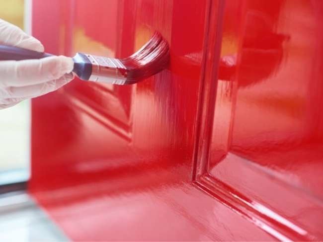
Red has been greeting visitors from front doors for generations, and it still knows how to make an entrance. True red looks energetic against white, gray, navy, or pale yellow. Burgundy and oxblood feel richer and more architectural, especially beside stone, warm gray, cream, or muted green.
Because red naturally attracts attention, reserve it for a feature worth highlighting: the main door, a small pair of shutters, or carefully chosen Victorian details. Blue-based reds generally feel crisp with cool neutrals, while brick reds and rust tones suit warm siding and earthy materials. A red garage door, meanwhile, may announce the car more enthusiastically than the house, so use restraint unless the garage is genuinely the star.
6. Brown: Warm, Grounded, and Better Than It Sounds
Brown accents can echo tree bark, stained wood, soil, brick, and roofing, helping the home settle naturally into its site. Deep espresso shutters look handsome on cream, pale green, blue, or light taupe siding. Medium brown trim can soften a stone-heavy exterior, while a warm wood-tone door brings texture that flat paint cannot imitate.
Brown is particularly effective on Craftsman, Tudor, rustic, and contemporary homes that already feature wood or masonry. Choose a brown with enough contrast to remain visible from the street. A color that matches the body too closely may look less “subtle and layered” and more “we ran out of the first paint.”
7. White and Cream: The Architectural Highlighter
White is the classic trim color because it outlines windows, rooflines, columns, and decorative woodwork with clean clarity. Yet not every exterior needs a brilliant, icy white. Warm white and cream are often easier partners for tan stone, red brick, brown roofs, and earthy siding.
Use crisp white when you want strong contrast against black, navy, gray, or saturated color. Choose cream or off-white when the house contains warm materials or when the sunlight is intense enough to make pure white glare. White trim also provides visual breathing room when the front door or shutters carry a stronger color. It is not flashy, but neither is a good foundationand houses become unhappy when either one is missing.
8. Green: The Accent Color That Already Lives Outside
Green connects a building to its landscape more naturally than almost any other hue. Sage, olive, eucalyptus, forest green, and blue-green can complement gardens, mature trees, stone, brick, and wood. Pale greens feel relaxed and cottage-friendly, while deep greens deliver nearly the same contrast as black with a softer, more organic effect.
Try sage shutters on warm white siding, forest green on a cream Colonial door, or olive trim against natural wood and stone. In areas with dense landscaping, make sure the chosen green remains distinct from the foliage. The goal is harmony, not camouflage worthy of a nature documentary. Earthy and botanical greens continue to appear in contemporary exterior palettes because they feel grounded, calm, and versatile.
9. Yellow and Golden Ochre: A Small Dose of Sunshine
Yellow is cheerful, visible, and slightly mischievous. Used carefully, it creates an inviting front door, brightens porch furniture, or adds charm to a cottage. Softer yellows, muted golds, and ochres are generally easier to coordinate than lemon-bright shades because they share warmth with brick, wood, cream, brown, and olive.
A yellow door can enliven gray or white siding, while golden ochre looks sophisticated against deep green, navy, or charcoal. Always test yellow in direct sun; it intensifies quickly and can shift toward neon or mustard depending on its undertone. Recent exterior color reporting has highlighted mid-tone yellow for small curb-appeal projects such as doors, planters, and benches rather than whole-house coverage.
10. Black and Soft Black: Crisp Contrast With Staying Power
Black is one of the most versatile exterior accents available. It can sharpen white siding, modernize brick, frame windows, define porch railings, and make traditional shutters look instantly more tailored. Soft black, charcoal-black, and black-green provide similar depth with less severity.
Use black where the architecture benefits from a strong outline. It performs especially well on window frames, doors, gutters, sconces, and small metal details. On very large garage doors or broad trim bands, however, black may dominate the facade and absorb substantial heat in direct sun. A lighter body color and warm natural materials help keep the result welcoming rather than fortress-like.
Where to Use Accent Colors for the Biggest Impact
Front Door
The front door is the safest place to experiment because it is a natural focal point and requires relatively little paint. Red, navy, green, teal, black, yellow, and stained wood can all work when they connect to the larger palette.
Shutters and Window Sashes
Shutters look best when their color creates visible contrast while still supporting the siding. Dark shutters on a light facade are classic; a tone just darker than the siding produces a quieter, layered result. Window sashes can carry the darkest color to emphasize the glass and create depth.
Trim, Railings, and Decorative Details
Use trim to clarify the architecture, not to outline every surface indiscriminately. White, cream, beige, gray, and black are reliable choices. On Victorian or Craftsman homes, small touches of red, green, gold, or blue can reveal brackets, shingles, beams, and gable details that would otherwise disappear.
Real-World Exterior Color Experiences: Lessons Homeowners Learn Fast
Exterior accent projects tend to teach the same lessons, regardless of whether the home is a brick ranch, a white farmhouse, or a bungalow with more roof than wall. The first lesson is that the smallest sample creates the biggest false confidence. A two-inch chip may suggest “quiet blue,” while a full front door reveals “competitive swimming pool.” Homeowners who test a large movable board can carry it from the sunny side of the porch to the shaded side and see the color change before spending a weekend sanding, priming, and questioning every life choice.
Another common experience involves undertones hiding in permanent materials. A family may choose a fashionable charcoal shutter color, only to discover that the roof contains warm brown and the brick mortar leans beige. The new gray then looks blue and disconnected. The more successful fix is often not a different color family but a warmer version of the original idea. Once the accent repeats a tone already present in the roof, stone, or brick, the facade suddenly looks planned rather than assembled from three unrelated online inspiration photos.
Scale also changes perception. A bright red that feels lively on a front door can become visually exhausting across a double garage. This is why experienced color planning gives the most saturated hue to the smallest important surface. The door says hello; the garage should not deliver a 40-minute speech. Conversely, a timid accent used only on a narrow door may disappear from the curb. Repeating it oncein a planter, bench, or small architectural detailcan create rhythm without turning matching into a competitive sport.
Finish matters almost as much as color. Many homeowners prefer satin or semi-gloss on doors and trim because these finishes add definition and are easier to clean than flat paint. Yet a glossy dark door exposes dents, brush marks, and imperfect preparation with the enthusiasm of a high-definition television. Careful sanding, proper primer, compatible exterior paint, and thin coats usually produce a better result than one heroic coat applied before a forecasted thunderstorm. Exterior-grade products and suitable weather conditions are not glamorous, but neither is peeling paint six months later.
Neighborhood context is another practical reality. A bold teal door can give a neutral home memorable charm, while an entire teal facade may conflict with historic guidelines, homeowners association rules, or surrounding architecture. Successful homeowners usually look for personality within context: a daring color on a replaceable feature, a refined dark accent on a traditional facade, or a nature-inspired green that links the building to its landscaping. Restraint is not the enemy of creativity; it is often what makes creativity visible.
Finally, the best accent color is the one that still feels right after the trend cycle moves on. Current palettes may favor warm neutrals, botanical greens, deep burgundies, softened blacks, and earthy blues, but a home is not a seasonal throw pillow. Choosing a color that respects the architecture, works with fixed materials, and genuinely pleases the people who see it every day is more valuable than chasing a forecast. Trends can provide ideas. The house gets the final vote.
Conclusion: Let the Accent Support the Architecture
The best exterior accent colors do more than add decoration. They organize the facade, highlight craftsmanship, connect the house to its surroundings, and make the entrance feel intentional. Gray, navy, blue, beige, red, brown, white, green, yellow, and black each offer a different level of contrast and personality, but none works in isolation.
Begin with the roof, masonry, siding, and landscape. Decide which feature deserves attention, then choose an accent with an undertone that belongs in the existing palette. Test it outdoors, observe it throughout the day, and repeat it only where repetition improves balance. Done well, an accent color makes the entire exterior look more expensive. Done poorly, it makes the ladder look like a long-term resident.
Note: Paint names and formulas vary by brand and may appear different under local light conditions. Always test a large sample on the actual exterior before purchasing the full quantity.