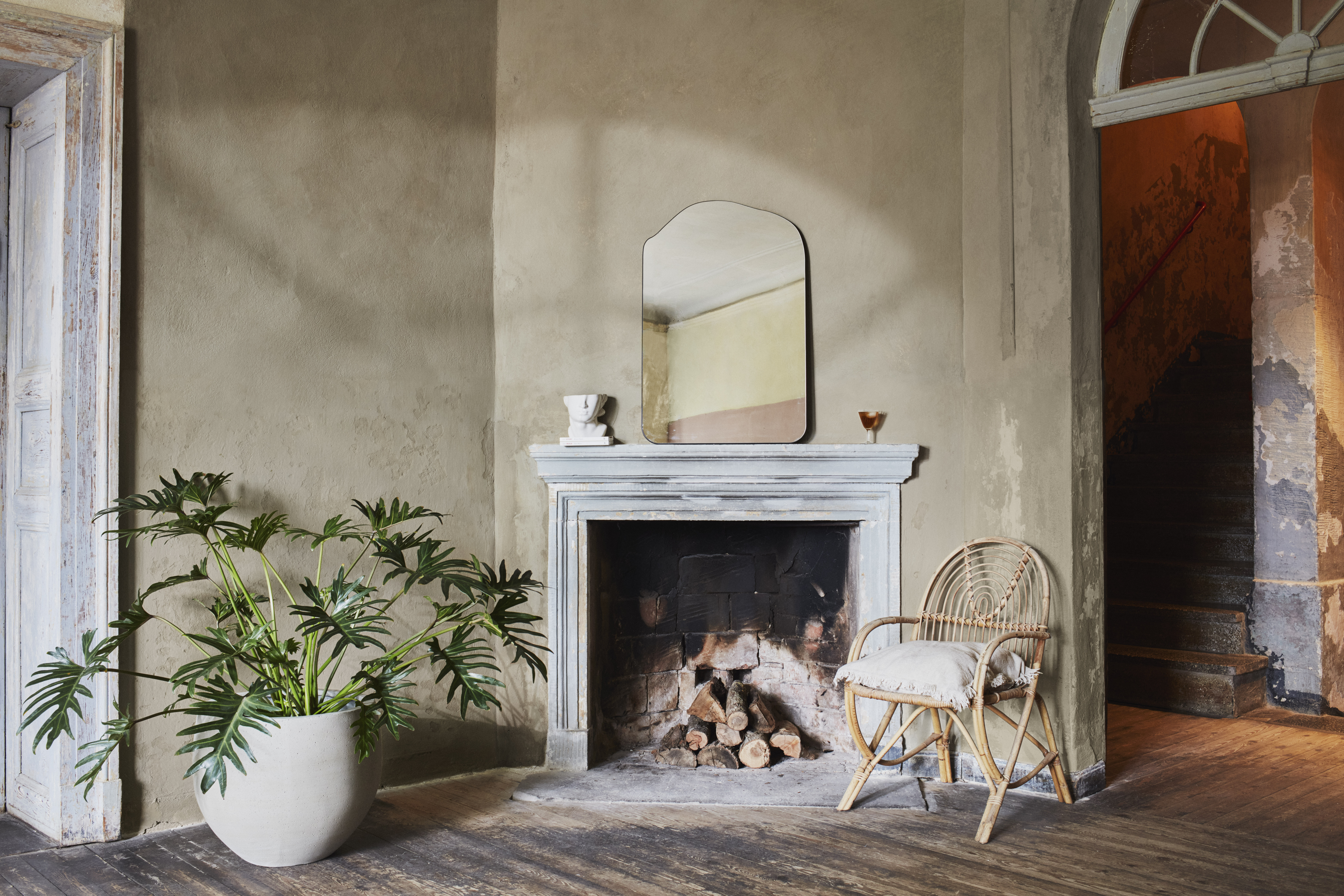
Some paint collections politely enter the room. The Hoxton x Bauwerk Neighbourhood Collection strolls in wearing linen trousers, carrying a vintage hotel key, and somehow smelling faintly of espresso, sea air, and old stone streets. This collaboration between The Hoxton, its in-house design team AIME Studios, and Bauwerk Colour is not simply another “here are some nice wall colors” moment. It is a travel story told in limewash paint.
The collection features nine all-natural limewash paints inspired by four European Hoxton locations: Barcelona, Edinburgh, Amsterdam, and Berlin. Instead of chasing generic neutrals or trendy shades that expire faster than an avocado, the palette looks at neighborhoods: their facades, light, waterfronts, architecture, patina, and mood. The result is a group of colors that feels collected rather than manufactured, like a passport full of stamps but without the airport security line.
For homeowners, designers, boutique hotel lovers, and anyone who has ever stared at a blank wall and thought, “Could you please have a personality?”, this collection lands at the right time. Limewash paint has been gaining attention because it creates depth, softness, and movement that regular flat paint often cannot deliver. It is mineral-based, matte, breathable, and beautifully imperfect. Translation: it makes walls look like they have a life story, not just a barcode from the paint aisle.
What Is the Hoxton x Bauwerk Neighbourhood Collection?
The Hoxton x Bauwerk limewash paint collection is a curated palette of nine shades designed to capture the atmosphere of specific Hoxton hotel neighborhoods. Bauwerk Colour is known for natural limewash paints with layered, chalky texture, while The Hoxton is known for hotels that lean deeply into local character rather than copy-and-paste lobby design.
The collaboration makes sense. The Hoxton builds hotels that feel rooted in their surroundings. Bauwerk makes paint that looks rooted in time. Put them together and you get a collection that does not scream “theme.” It whispers “well-traveled,” which is much more expensive-sounding and less likely to make your living room resemble a souvenir shop.
The collection includes the shades House, Casa, Poblenou, Haymarket, Moss, Docklands, Koning, Charlottenburg, and Kino. Each color connects to one of four European city moods, with House acting as a soft neutral thread running through the entire palette.
Why Limewash Paint Feels Different from Regular Paint
Limewash is not just regular paint trying on a rustic hat. Traditional limewash is made from limestone that has been fired, mixed with water, and often tinted with mineral pigments. Unlike many conventional paints that sit on the surface as a uniform film, limewash absorbs into porous surfaces and creates a soft, cloud-like finish. It can appear slightly different depending on lighting, brush movement, wall texture, and the number of coats applied.
This is exactly why designers love it. Limewash gives walls subtle variation without needing wallpaper, plaster, or a dramatic mural of a heron wearing sunglasses. It creates a lived-in effect that works especially well in bedrooms, dining rooms, powder rooms, boutique-style lounges, and spaces where a flat wall would feel too plain.
The Beauty Is in the Movement
One of the biggest appeals of limewash interior paint is movement. When applied with a brush, limewash creates gentle tonal shifts. The finish can look smoky, cloudy, velvety, mineral-rich, or sun-aged. In daylight, a shade may feel airy and soft; in evening light, it may become deeper and moodier.
This quality is central to the Hoxton x Bauwerk collection. The colors are not designed to behave like plastic-coated swatches. They are intended to respond to a room. That is also why sampling matters. A color inspired by Barcelona’s sun-washed streets may look peachy and warm in a bright room, while the same color in a north-facing space could become softer and more muted.
A Closer Look at the European City-Inspired Palettes
The strongest idea behind the Hoxton x Bauwerk collaboration is that color can describe place. Not in an obvious postcard way, but through atmosphere. A neighborhood is not only buildings and streets. It is weather, light, stone, storefronts, rooftops, water, and the feeling you get while walking around with no plan except finding coffee and pretending that counts as cultural research.
Barcelona: Casa, Poblenou, and House
The Barcelona palette is inspired by The Hoxton, Poblenou, located in a seaside neighborhood known for its mix of industrial history, creative energy, and modern architecture. The colors here feel warm, open, and sunlit.
Casa is a peach-pink shade that suggests sun-bleached storefronts and Mediterranean buildings softened by heat and time. It is warm without becoming sugary, which is important because no one wants a living room that looks like melted candy unless they are decorating a very ambitious cupcake shop.
Poblenou brings in a cooler, modern note. Inspired by the neighborhood’s evolution from factories and mills into a lively urban waterfront, it feels fresh and architectural. Think blue skies reflected in glass, sea air, and contemporary design softened by limewash texture.
House, the collection’s shared neutral, grounds the Barcelona colors. It is a soft gray that works as a bridge between warmth and restraint. In practical design terms, House is the shade you call when the room needs to calm down but still have excellent table manners.
Edinburgh: Moss, Haymarket, and House
The Edinburgh palette draws from The Hoxton in Haymarket, an area known for elegant stone architecture, historic facades, and a quieter kind of drama. This palette is more pared-back, sophisticated, and grounded.
Moss takes inspiration from green patina and organic tones that appear around older stonework. It is earthy and mature, the sort of green that does not shout “trend color” but instead says, “I read hardcover books and own a proper wool coat.”
Haymarket is a nod to Regency stonework and Georgian facades. It has that timeless mineral quality that works beautifully in rooms with wood, linen, vintage furniture, brass accents, or black-framed artwork. It can make a new-build room feel less like it was assembled yesterday and more like it has quietly existed for a century.
Again, House helps tie the palette together. In an Edinburgh-inspired scheme, House can be used on adjoining walls, ceilings, hallways, or trim-adjacent surfaces to soften the transition between deeper, moodier shades.
Amsterdam: Docklands, Koning, and House
The Amsterdam palette is inspired by The Hoxton, Lloyd Amsterdam, located in the Eastern Docklands. This group of colors leans into maritime history, waterfront views, and the romantic grit of old travel routes.
Docklands reflects the calm and depth of waterways. It is a shade for people who want a room to feel composed, cool, and slightly cinematic. Used in a bedroom or reading room, it can create a restful backdrop without slipping into blandness.
Koning, meaning “king” in Dutch, has a rich, mellow character inspired by seafaring adventure, vintage travel trunks, and worn floors. It brings warmth and history into the palette. It is easy to imagine Koning paired with leather, walnut, aged brass, woven shades, and art collected from places where you definitely overpaid for coffee but still remember the view.
House balances the Amsterdam palette by giving the deeper tones a neutral companion. If Docklands or Koning feels too strong for all four walls, House can provide a quieter surround while letting the bolder color shine on an accent wall, alcove, niche, or ceiling.
Berlin: Kino, Charlottenburg, and House
The Berlin palette is inspired by The Hoxton, Charlottenburg, an area associated with golden-era glamour, cabarets, cinemas, ornate architecture, and the rose-toned Charlottenburg Palace. This is the most theatrical group in the collection, but theatrical in a tasteful “velvet booth” way, not in a “community theater prop closet exploded” way.
Kino, meaning “cinema” in German, is a bold shade with a stylized, dramatic feel. It nods to Berlin’s cultural past, especially the world of theaters, film houses, and nightlife. Kino is ideal for spaces where mood matters: dining rooms, powder rooms, lounge areas, creative studios, or a small office that needs to stop looking like a tax document.
Charlottenburg is a pinkish shade inspired by local facades and the district’s famous palace. It brings warmth, elegance, and a touch of romance without becoming overly sweet. Limewash texture helps keep it sophisticated because the mineral finish adds depth and shadow.
House once again acts as the anchor. With Berlin’s more expressive tones, this neutral gray becomes especially useful. It can prevent the palette from feeling too theatrical while preserving the layered, boutique-hotel feeling.
Why This Collection Works for Modern American Homes
Although the Hoxton x Bauwerk collection is inspired by European cities, it translates surprisingly well to American homes. Why? Because many U.S. interiors are currently moving toward warmer, more personal, more textured spaces. After years of ultra-flat white walls and gray-on-gray rooms, homeowners are craving surfaces that feel human. Limewash offers exactly that.
In a Brooklyn apartment, Docklands could add depth to a compact bedroom. In a California bungalow, Casa could warm up a sunroom without overwhelming it. In a Chicago condo, Haymarket could soften exposed brick and modern furniture. In a Texas dining room, Kino could create a moody evening atmosphere that makes even takeout feel plated.
The collection is also flexible because the shades are nuanced. They are not basic beige, loud blue, or pink-for-the-sake-of-pink. They have undertones, mineral softness, and visual variation. That makes them easier to layer with real homes, where rugs, sofas, books, pets, and suspiciously permanent laundry piles already contribute plenty of visual information.
How to Use Hoxton x Bauwerk Limewash Paint at Home
Limewash rewards thoughtful application. It is not difficult, but it behaves differently from standard wall paint. The goal is not machine-perfect coverage. The goal is softness, depth, and a finish that looks crafted by hand.
Start with the Right Room
Bedrooms, living rooms, dining rooms, entryways, powder rooms, and reading corners are excellent places to start. If you are new to limewash, begin with one room or one feature wall. A bedroom is especially forgiving because limewash naturally creates a calm, cocoon-like feel.
Sample Before Committing
Always test limewash in the actual room. Look at it in morning light, afternoon light, and evening light. The same shade can change depending on exposure, wall texture, and nearby finishes. A color that looks gentle online may become richer in person, while a darker shade may look softer once brushed out.
Use Natural Materials Around It
Limewash pairs beautifully with linen, cotton, wool, rattan, cane, clay, stone, aged brass, oak, walnut, and handmade ceramics. The Hoxton x Bauwerk collection is especially good with materials that already have texture. If your room has a vintage rug, woven pendant, plaster lamp, or slightly imperfect wood table, limewash will probably get along with it immediately.
Think Beyond Accent Walls
Accent walls are useful, but limewash can be even more powerful when wrapped around a room. Painting all walls in one shade creates a soft envelope. Painting the ceiling too can make the room feel immersive and boutique-hotel cozy. This technique works especially well with House, Haymarket, Casa, or Docklands.
Color Pairing Ideas for the Collection
Casa works with creamy whites, terracotta, pale oak, unlacquered brass, warm stone, and soft olive. It is a strong choice for bedrooms, breakfast corners, and spaces that need warmth without visual noise.
Poblenou pairs well with white oak, black accents, brushed steel, sandy neutrals, and glass. It can make a room feel breezy and modern without becoming cold.
Moss loves walnut, tobacco leather, ivory textiles, stoneware, botanical prints, and antique frames. It is excellent for libraries, dining rooms, and quiet bedrooms.
Haymarket is a natural partner for linen, aged wood, dark bronze, marble, and traditional architectural details. It is one of the easiest shades for creating timeless elegance.
Docklands works with navy, charcoal, warm brown, oatmeal linen, and blackened metal. Use it where you want calm drama.
Koning pairs beautifully with cognac leather, vintage trunks, warm woods, brass lighting, and patterned rugs. It is the color equivalent of a well-stamped passport.
Kino is ideal with deep green, black, burgundy, smoked glass, velvet, and dramatic lighting. It is not shy, but it has manners.
Charlottenburg works with cream, taupe, oxblood, walnut, antique gold, and muted florals. It can be romantic, historic, or modern depending on the styling.
House is the quiet genius of the collection. Use it with almost any shade when you need balance, softness, and continuity.
Design Analysis: Why Boutique Hotel Color Palettes Appeal to Homeowners
Hotel-inspired interiors have become popular because they offer an emotional shortcut. A great hotel room feels edited, comfortable, atmospheric, and just unfamiliar enough to feel special. The Hoxton brand has built much of its identity around local storytelling, layered interiors, and neighborhood character. Bringing that approach into paint makes sense because walls are the largest mood-setting surfaces in a room.
The Hoxton x Bauwerk collection does not ask homeowners to copy a hotel suite exactly. Instead, it offers a framework: choose colors with a sense of place, use texture to create depth, and let rooms feel layered over time. This is a more enduring approach than chasing isolated trends. A wall inspired by Georgian stone, maritime docklands, or sun-washed Barcelona streets has more staying power than a color chosen only because it appeared in three viral kitchen videos last Tuesday.
Practical Tips Before Painting with Limewash
Preparation matters. Limewash performs best on suitable mineral or porous surfaces, though many brands provide primers or prep coats for previously painted walls. Before starting, clean the surface, repair cracks, protect floors and trim, and read the manufacturer’s instructions carefully. Limewash is usually applied with a brush rather than a roller because the brushwork helps create its signature movement.
Plan for at least two coats in most interiors. The first coat may look uneven. Do not panic. Limewash often looks awkward before it looks beautiful, which frankly makes it relatable. As additional coats dry, the finish becomes more layered and dimensional.
Also remember that matte mineral finishes can be more delicate than scrubbable acrylic paints. In high-splash or high-traffic areas, consider whether a protective finish is recommended. Kitchens, bathrooms, kids’ rooms, and busy hallways may require extra planning.
Extended Experience: Living with a European-Inspired Limewash Palette
The first thing people notice after using limewash is not always the color. It is the atmosphere. A regular painted wall often says, “Here is the color you selected.” A limewashed wall says, “Here is a room with weather, light, and a personality that might own a linen napkin.” That difference becomes especially clear after living with the finish for a few weeks.
Imagine using Haymarket in a small dining room. During the day, the walls may appear soft, stony, and quiet. At night, under warm lamps, the surface gains shadow and depth. Dinner feels more intimate. The chairs look more intentional. Even a simple bowl of pasta seems to have studied abroad. This is the magic of limewash: it changes the emotional temperature of a room without demanding that every other object be replaced.
In a bedroom, Casa can create a gentle warmth that feels sunny without being bright. It works especially well with off-white bedding, woven shades, light wood nightstands, and a ceramic lamp. The room feels relaxed and personal, not staged. If traditional pink feels too sweet, Casa’s limewash texture helps pull it back into grown-up territory. It has softness, but not frosting.
Docklands offers a different experience. Used in a study or guest room, it can make the space feel restful and deep. The shade’s maritime inspiration gives it a quiet confidence. Pair it with oatmeal curtains, dark wood, and a few black accents, and the room starts to feel like a calm harbor after a long day. Add too many shiny finishes, though, and the mood can become less “Amsterdam dockside” and more “corporate aquarium,” so natural textures are your friend.
Kino is for the brave but not necessarily the reckless. A powder room, bar nook, media room, or dining alcove can handle its drama beautifully. Because limewash absorbs and reflects light unevenly, a bold shade can feel less flat and more atmospheric. Add low lighting, framed art, and maybe a small marble shelf, and suddenly your tiny powder room has more charisma than most cocktail lounges.
The most useful lesson from the Hoxton x Bauwerk collection is that color should not be isolated from story. When a shade is connected to stonework, waterfronts, old cinemas, palace facades, or sunlit streets, it becomes easier to decorate around it. You are not just choosing “green” or “pink.” You are choosing a mood. That mood can guide furniture, fabric, lighting, and art.
For homeowners who feel overwhelmed by paint choices, this is refreshing. Instead of browsing five hundred nearly identical swatches called things like Whispering Fog, Foggy Whisper, and Fog With Commitment Issues, the Hoxton x Bauwerk palette narrows the field to colors with identity. Each one has a job. Each one brings a place into the room.
Living with limewash also teaches patience. The finish has variation, and that is the point. Tiny shifts in tone are not flaws; they are the charm. If you want a wall that looks sprayed, sealed, and identical from every angle, limewash may not be your soulmate. But if you want a home that feels warmer, slower, more tactile, and more connected to material history, this collection is a compelling place to begin.
Conclusion
The Hoxton x Bauwerk Neighbourhood Collection proves that paint can do more than cover a wall. It can suggest a city, hold a memory, soften architecture, and turn ordinary rooms into places with atmosphere. Inspired by Barcelona, Edinburgh, Amsterdam, and Berlin, the collection offers nine limewash shades that feel layered, natural, and deeply considered.
For anyone interested in European city-inspired limewash paints, this collaboration is both stylish and practical. It brings together Bauwerk’s mineral-rich finish and The Hoxton’s neighborhood-driven design philosophy, resulting in colors that feel personal rather than mass-produced. Whether you are drawn to Casa’s sun-warmed softness, Moss’s earthy elegance, Docklands’ watery depth, or Kino’s cinematic drama, the collection offers a refined way to make walls feel alive.
Note: This article is written for web publication in original American English and synthesizes real product and design information about the Hoxton x Bauwerk Neighbourhood Collection, limewash paint characteristics, and current interior design usage.