Cartoon characters are a little like old family photos: familiar, charming, and occasionally alarming when you notice how different everyone used to look. Mickey Mouse once looked more like a mischievous rubber-hose troublemaker than the polished global icon we know today. Bugs Bunny took a few test hops before becoming the smooth carrot-chewing wise guy of animation history. Snoopy began as a more ordinary dog before discovering that standing on a doghouse and fighting imaginary air battles was far more interesting than behaving like a regular beagle.
The evolution of cartoon character appearance is not just about prettier drawings. It reflects changes in animation technology, audience taste, branding, television formats, merchandising, cultural expectations, and the simple fact that artists keep refining their work. A character may begin as a quick sketch, then slowly become cleaner, rounder, brighter, more expressive, or easier to animate. In other words, cartoon characters grow up tooalthough, unlike humans, they usually get fewer wrinkles and better licensing deals.
In this guide, we will explore how popular cartoon characters have evolved in appearance, why those changes happened, and what their redesigns reveal about the history of animation. From black-and-white shorts to streaming-era revivals, the visual journey of famous cartoons shows that great character design is never frozen in ink. It is alive, flexible, and sometimes wearing very large yellow shoes.
Why Cartoon Characters Change Over Time
Cartoon characters evolve for many practical reasons. Early animation was expensive and time-consuming, so artists often relied on simple shapes: circles, tubes, dots, gloves, and bold outlines. These designs were easier to draw frame by frame and easier to read on old theater screens. That is why many early characters had pie-cut eyes, white gloves, bendy arms, and bodies made from circles. The goal was not anatomical accuracy. The goal was movement, personality, and speed.
As animation improved, characters gained more detail. Color changed everything. Television changed everything again. Then digital animation arrived and politely kicked the old production pipeline in the shins. A design that looked great in a 1930s theatrical short might need adjustments for a Saturday morning cartoon, a toy shelf, a mobile game, or a high-definition streaming series.
Animation Technology Shapes Character Design
Early cartoons were built for motion. Characters needed silhouettes that audiences could understand instantly. Later, when studios moved from black-and-white to color, designers could use clothing, skin tones, and palettes to strengthen identity. Mickey’s red shorts, SpongeBob’s yellow body, and The Simpsons’ bright yellow skin became visual shortcuts. You do not need a narrator to say, “Hey, that is SpongeBob.” Your eyes already shouted it.
Brand Recognition Matters
As cartoon characters became commercial icons, their designs had to remain recognizable across posters, toys, lunch boxes, theme parks, games, and social media. A character can change, but not so much that people ask, “Who is this stranger and why is he holding Mickey’s pants?” Successful redesigns preserve the essential silhouette while updating the details.
Mickey Mouse: From Rubber-Hose Rebel to Polished Icon
Mickey Mouse is one of the best examples of cartoon character evolution. His early appearance in the late 1920s reflected the rubber-hose animation style: simple circular shapes, flexible limbs, black-and-white contrast, and expressive movement. In early shorts such as Steamboat Willie, Mickey had a scrappier, more mischievous look. His body was simpler, his eyes were basic, and his personality leaned closer to a cheeky performer than a squeaky-clean brand ambassador.
As Disney’s animation became more sophisticated, Mickey’s design softened. His eyes became more expressive, his body more dimensional, and his clothing more standardized. The famous red shorts, yellow shoes, and white gloves turned him into one of the most recognizable figures in visual culture. By the time Mickey appeared in more polished productions such as Fantasia, he had moved far beyond his earliest black-and-white form.
The biggest lesson from Mickey’s redesign is that simplicity can survive luxury treatment. Even when modern versions give him smoother lines or 3D-friendly proportions, the core design remains clear: round ears, cheerful face, gloves, shorts, and an instantly readable silhouette. Mickey has changed a lot, but he still looks like Mickey. That is character design doing a victory lap.
Bugs Bunny: From Wild Prototype to Cool Trickster
Bugs Bunny did not appear fully formed with a carrot in one hand and a sarcastic comeback in the other. Before the classic Bugs design settled into place, Warner Bros. experimented with earlier rabbit characters. These prototypes were wilder, less refined, and sometimes less visually balanced. Over time, Bugs developed into a taller, sleeker, more confident figure with long ears, a relaxed posture, expressive eyes, and that unmistakable “What’s up, Doc?” attitude.
His appearance reflects his personality. Bugs is not just a rabbit; he is a performer. His lean body, half-lidded expressions, and casual poses tell the audience he is already three steps ahead of everyone else. While Mickey became rounder and friendlier, Bugs became sharper and cooler. He looks like he knows the punchline before the scene starts.
Modern Looney Tunes projects often update the line work, color, and timing, but they usually return to the classic visual formula: gray body, white muzzle, tall ears, and an elastic face capable of turning annoyance into comedy gold. Bugs Bunny proves that a cartoon character’s appearance works best when it supports the character’s attitude.
Snoopy: From Simple Dog to Imagination Machine
Snoopy’s visual evolution is quieter than Mickey’s or Bugs Bunny’s, but it is just as important. In early Peanuts strips, Snoopy looked more like a small, ordinary dog. His proportions were stockier, and his role was simpler. As Charles M. Schulz developed the strip, Snoopy became more expressive, more abstract, and more central to the emotional and comic world of Peanuts.
Over the years, Snoopy’s body became leaner and more flexible. His face grew more iconic, with a simple black nose, black ears, and minimal features that could carry a surprising amount of emotion. Eventually, Snoopy could stand, dance, type novels, become the World War I Flying Ace, and deliver entire emotional weather reports without saying a word out loud.
Snoopy’s design shows the power of reduction. He is not detailed, but he is deeply expressive. His appearance evolved toward visual poetry: a few clean lines doing the work of an entire acting class. Not bad for a dog who spends a suspicious amount of time on top of his house.
The Simpsons: Yellow, Jagged, and Instantly Recognizable
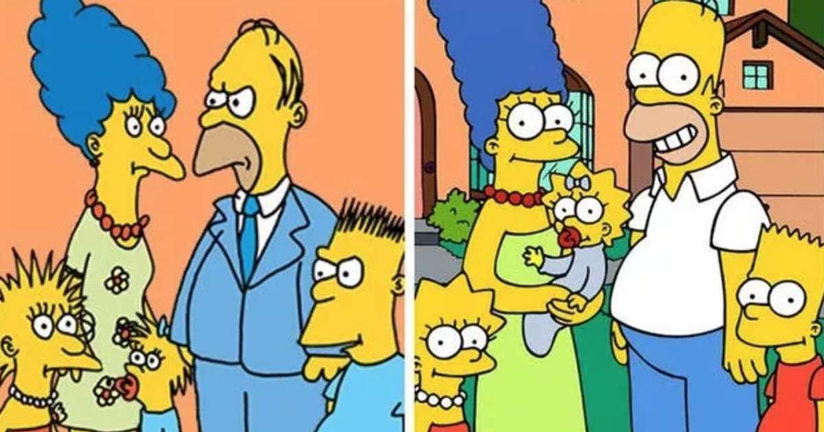
When The Simpsons moved from short segments on The Tracey Ullman Show to a full prime-time series, the characters became more polished, but they did not lose their strange charm. Early versions of Homer, Marge, Bart, Lisa, and Maggie looked rougher and looser. Their movements were less refined, and the drawings had a handmade awkwardness that became part of the show’s early identity.
As the series matured, the animation became cleaner. The characters’ proportions stabilized, facial expressions became more controlled, and Springfield developed a more consistent visual language. Yet the show kept its boldest design choice: yellow skin. That color helped the characters stand out immediately on television. In an age of channel surfing, a flash of yellow was practically a tiny billboard yelling, “Springfield is on!”
The Simpsons’ appearance proves that “beautiful” is not always the goal of character design. Distinctive is often better. The family’s overbites, round eyes, spiky hair, and bright skin created a look that could survive decades of jokes, guest stars, and couch gags.
SpongeBob SquarePants: A Kitchen Sponge Becomes a Pop Icon
SpongeBob SquarePants is a masterclass in turning a simple shape into a personality. Creator Stephen Hillenburg, who had a background in marine science and animation, developed a character that was both sea-themed and visually absurd. Instead of making SpongeBob look like a realistic sea sponge, the final design leaned into the shape of a kitchen sponge: square, yellow, porous, and hilariously ready for work.
Early concepts connected SpongeBob to ocean education, but the final design became more comedic and instantly marketable. His square pants, white shirt, red tie, tube socks, and huge eyes made him look like an eager little employee who somehow wandered into a surreal underwater universe. The design is simple enough for children to draw but flexible enough for extreme expressions, wild poses, and some truly heroic levels of screaming.
Later versions of SpongeBob have become cleaner in digital production, with brighter colors and smoother animation. Still, the essential design remains nearly impossible to mistake. He is yellow. He is square. He is wearing office clothes under the sea. The logic may be questionable, but the branding is flawless.
Scooby-Doo: The Imperfect Great Dane That Became Perfect
Scooby-Doo’s appearance is funny because he is intentionally not a perfect Great Dane. His original designer, Iwao Takamoto, famously pushed against the ideal traits of a show-quality dog. Scooby has a sloped back, bow legs, a long tail, spots, and a goofy face. Those “wrong” features made him visually right.
Since his 1969 debut, Scooby’s appearance has been updated many times. Some versions make him softer and more rounded for younger viewers. Others make the Mystery Inc. gang sleeker, more angular, or more modern. In live-action and CGI adaptations, Scooby became a computer-generated character, which required translating his loose cartoon features into a more dimensional form.
Despite all those changes, Scooby keeps his essential ingredients: brown fur, black spots, blue collar, expressive eyes, and a body language that says, “I would solve this mystery, but there is a sandwich nearby.” His evolution shows how imperfection can become iconic when it serves comedy and personality.
Pikachu: From Chubby Mascot to Streamlined Superstar
Pikachu’s early design was rounder and chunkier, especially in the earliest Pokémon games and promotional art. That softer, “chubby Pikachu” look still has a nostalgic fan base because it feels cute, cozy, and delightfully snack-shaped. Over time, Pikachu became slimmer, more athletic, and easier to animate in action scenes.
The modern Pikachu has sharper proportions, more flexible movement, and a cleaner silhouette. The ears, tail, red cheeks, and yellow body remain consistent, but the overall shape has shifted from plush toy energy to energetic mascot energy. This made sense as Pokémon expanded into television, movies, games, merchandise, and global branding.
Pikachu’s evolution shows how character design often adapts to function. A mascot must look good in a battle scene, on a trading card, as a stuffed toy, in a video game, and on a backpack. Pikachu somehow does all of this while saying only one word, which is either adorable or an extremely efficient public relations strategy.
Betty Boop: From Jazz-Age Caricature to Retro Fashion Icon
Betty Boop emerged from early sound-era animation, and her appearance reflected the jazz age: short curls, big eyes, tiny mouth, short dress, and theatrical gestures. Her original look was more exaggerated and connected to the rubber-hose style, but she gradually became a symbol of vintage glamour and playful confidence.
Over time, Betty’s design was softened and standardized for merchandise, television appearances, and nostalgia branding. Modern versions often emphasize her retro appeal: the curls, lashes, red dress, and confident pose. She is a reminder that some cartoon characters evolve by becoming symbols of an era. Betty Boop does not just look like a character; she looks like the 1930s remembered through a wink.
Teenage Mutant Ninja Turtles: From Gritty Comics to Toy-Shelf Heroes
The Teenage Mutant Ninja Turtles began with a darker, rougher comic-book style. The original turtles had a grittier underground-comics look, with heavier shadows and a more intense tone. When they moved into animated television, their appearance became brighter, friendlier, and much more toy-ready.
Color-coded masks helped children tell the turtles apart quickly: Leonardo in blue, Raphael in red, Donatello in purple, and Michelangelo in orange. Later versions changed their heights, builds, facial shapes, gear, and animation style to fit each new generation. Some designs lean muscular and action-heavy; others are rounder, funnier, and more expressive.
The turtles show how adaptation can transform a niche comic concept into a mainstream franchise. Their core ideamutant turtles trained in martial artsremains wonderfully ridiculous. Their evolving appearance makes that ridiculous idea work for different audiences.
What Makes a Cartoon Redesign Successful?
A successful cartoon redesign respects the character’s visual DNA. That means keeping the features audiences recognize first: Mickey’s ears, Bugs Bunny’s ears and attitude, SpongeBob’s square body, Snoopy’s black-and-white simplicity, Scooby’s goofy shape, Pikachu’s cheeks and lightning-bolt tail. Change the polish, not the soul.
Good redesigns also understand the medium. A character for a black-and-white theatrical short has different needs than a character for a 4K streaming show. A toy-friendly design may need cleaner shapes. A video game design may need readable movement. A modern reboot may need to appeal to both children and adults who still remember watching cartoons in pajamas while eating cereal with the seriousness of a professional athlete.
Recognizable Silhouette
The best cartoon characters can be recognized in shadow. Mickey’s ears, Marge’s hair, Snoopy’s profile, and SpongeBob’s square body all pass the silhouette test. This is why major redesigns rarely change a character’s basic outline too dramatically.
Emotional Flexibility
Cartoons must perform. A character needs to smile, panic, scheme, cry, celebrate, and occasionally get flattened by a piano. Designs with flexible faces and clear expressions last longer because they give animators more room to play.
Balance Between Nostalgia and Freshness
Fans love familiar designs, but new audiences need fresh energy. That is the tightrope every redesign walks. Lean too hard into nostalgia and the character feels dusty. Change too much and fans start guarding the old model sheets like sacred treasure maps.
How Audience Expectations Changed Cartoon Appearance
Audiences once accepted rougher animation because the novelty of movement and sound was enough to amaze them. Today, viewers expect visual consistency, strong color design, and polished motion. At the same time, many modern cartoons intentionally return to rougher or retro styles because audiences now appreciate handmade charm.
This is why some new versions of classic characters look sleek while others deliberately imitate older animation. The evolution of cartoon appearance is not a straight line from “simple” to “realistic.” It is more like a dance between technology, nostalgia, comedy, and branding. Sometimes the best update is not more detail. Sometimes it is the right detail.
Personal Experiences and Observations: Why These Changes Matter
Watching cartoon characters evolve can feel surprisingly personal. Many people first meet these characters as children, then rediscover them years later in new designs. The experience can be funny, nostalgic, and occasionally confusing. You may remember a softer, older version of Pikachu, then see a modern version sprinting through a battle like it has been doing cardio since 1998. You may remember early SpongeBob episodes with slightly rougher animation, then see the cleaner digital look and realize the sponge has somehow aged better than most people with skincare routines.
One of the most interesting experiences is noticing how much a character can change while still feeling familiar. Mickey Mouse is a perfect example. The early black-and-white Mickey has a different energy from the modern Mickey seen in theme parks, merchandise, and newer animated shorts. Yet the emotional connection remains. The ears do a lot of heavy lifting. Those two circles are basically the Olympic champions of brand recognition.
Another common experience is realizing that older designs often carry more chaos. Early cartoons were looser, stranger, and sometimes more mischievous. Bugs Bunny’s prototypes, early Mickey shorts, and vintage rubber-hose animation all have a wild energy that modern polished designs sometimes smooth out. That roughness can be charming because it reminds us that iconic characters were not born perfect. They were tested, adjusted, stretched, simplified, and refined by artists solving real production problems.
For fans, character redesigns can also spark strong opinions. A small change in eye shape, body proportion, color, or line thickness can cause endless debate. That reaction makes sense. Cartoon characters are visual memories. Changing them can feel like someone rearranged your childhood bedroom without asking. But redesigns are also necessary. Without evolution, many characters would remain trapped in formats that no longer fit modern screens, animation tools, or storytelling styles.
From a creative point of view, studying cartoon evolution is useful for writers, designers, animators, and marketers. It teaches that strong characters need a clear identity before they need detail. Snoopy is mostly simple shapes, but he carries enormous personality. SpongeBob is a rectangle with holes, but he is more expressive than many live-action heroes. The Simpsons are not traditionally pretty, but they are unforgettable. That is the magic: great design is not about making a character look fancy. It is about making the character impossible to confuse with anyone else.
There is also a lesson for anyone building a brand, website, mascot, or visual identity. The best designs can adapt without disappearing. They have a core that survives different formats. A logo, character, or illustration style should be flexible enough to evolve but strong enough to remain recognizable. Cartoon history proves this again and again. The characters that last are not always the most detailed. They are the ones people can recognize instantly, imitate easily, and emotionally remember years later.
Ultimately, the evolution of popular cartoon characters is a story about creativity under pressure. Artists had to meet deadlines, work with new technology, satisfy studios, sell toys, entertain children, amuse adults, and keep characters alive across decades. The fact that Mickey, Bugs, Snoopy, SpongeBob, Scooby, Pikachu, and many others still matter today is not an accident. Their designs were built to move, adapt, and survive. Not bad for a bunch of drawings that began with pencils, ink, and probably several exhausted animators muttering, “Just one more frame.”
Conclusion
Popular cartoon characters have evolved in appearance because animation itself has evolved. Early designs favored simplicity and motion. Later versions embraced color, polish, branding, digital tools, and global recognition. Yet the most successful characters did not abandon their roots. Mickey kept his ears. Bugs kept his cool. Snoopy kept his quiet genius. SpongeBob kept his square optimism. Scooby kept his lovable awkwardness. Pikachu kept the cheeks that could power both a battle and a merchandise empire.
The history of cartoon character design proves that change does not have to erase identity. When done well, evolution makes a character stronger, more flexible, and more ready for the next generation. And if a cartoon mouse, rabbit, dog, sponge, and electric creature can keep reinventing themselves for decades, maybe there is hope for the rest of us after all.