Gold paint has a public-relations problem. Choose the wrong shade, and your elegant conso Apply too much, and a tasteful mirror frame begins auditioning for a music video. Yet when the color, sheen, surface preparation, and application method are right, metallic gold paint can make an ordinary object look quietly expensive.
The real design secret is that the perfect gold is rarely the brightest gold on the shelf. It is usually softer, slightly gray, and restrained enough to interact with light rather than shout at it. One particularly convincing example is Modern Masters Warm Silver, the misleadingly named shade identified in the original Remodelista design investigation. Despite its name, it produces a subdued, warm metallic finish that can read as aged gold or pale brass. p>This guide explains how to recognize that elusive shade, select the right formula, prepare different surfaces, and apply gold paint without drips, stripes, or accidental trophy-store energy.
Why Finding the Perfect Gold Paint Is Surprisingly Difficult
Gold is not simply yellow with glitter mixed into it. A convincing metallic finish depends on color temperature, particle size, sheen, texture, lighting, and the color underneath. Change any one of those variables, and the result can shift from antique brass to polished jewelryor from sophisticated to suspiciously plastic.
Some gold paints are far too yellow
Bright yellow-gold can work for costumes, holiday crafts, and theatrical decorations. In an interior, however, it often looks artificial because real aged metals contain more visual complexity. Brass, bronze, gilt wood, and timeworn gold leaf usually show traces of brown, gray, green, copper, or black.
For home projects, look for descriptions such as warm silver, champagne, antique gold, soft brass, pale gold, or aged bronze. The shade name may seem less glamorous, but your finished project will look more convincing.
Metallic paint changes as you move
Flat wall paint reflects light relatively evenly. Metallic paint contains reflective pigments that respond to the angle of the surface and the direction of the light. That is why a sample may appear muted from one side and noticeably brighter from another.
The effect also explains why application marks matter so much. If metallic particles settle in several directions, a wall or tabletop can look striped even when the color coverage is technically complete. Sherwin-Williams recommends controlled rolling and consistent finishing strokes for metallic treatments because particle orientation affects the uniformity of the result.
More shine does not always mean more luxury
Mirror-like gold can be dramatic, but it also reveals every scratch, dent, brush mark, and uneven patch beneath it. A satin or softly reflective metallic finish is more forgiving and often looks more expensive because it resembles aged architectural metal rather than polished plastic.
The Design Sleuth Discovery: Warm Silver That Looks Like Gold
The most interesting clue in the search for perfect gold paint is a color called Warm Silver. The name sounds like a contradiction, but that ambiguity is precisely why the shade works.
Warm Silver sits between pale brass, muted champagne, and weathered gilt. It is neither strongly yellow nor coldly gray. In daylight, it can look softly golden. In shadows, the gray undertone appears and gives the finish depth. Under warm lamps, it becomes richer without turning orange.
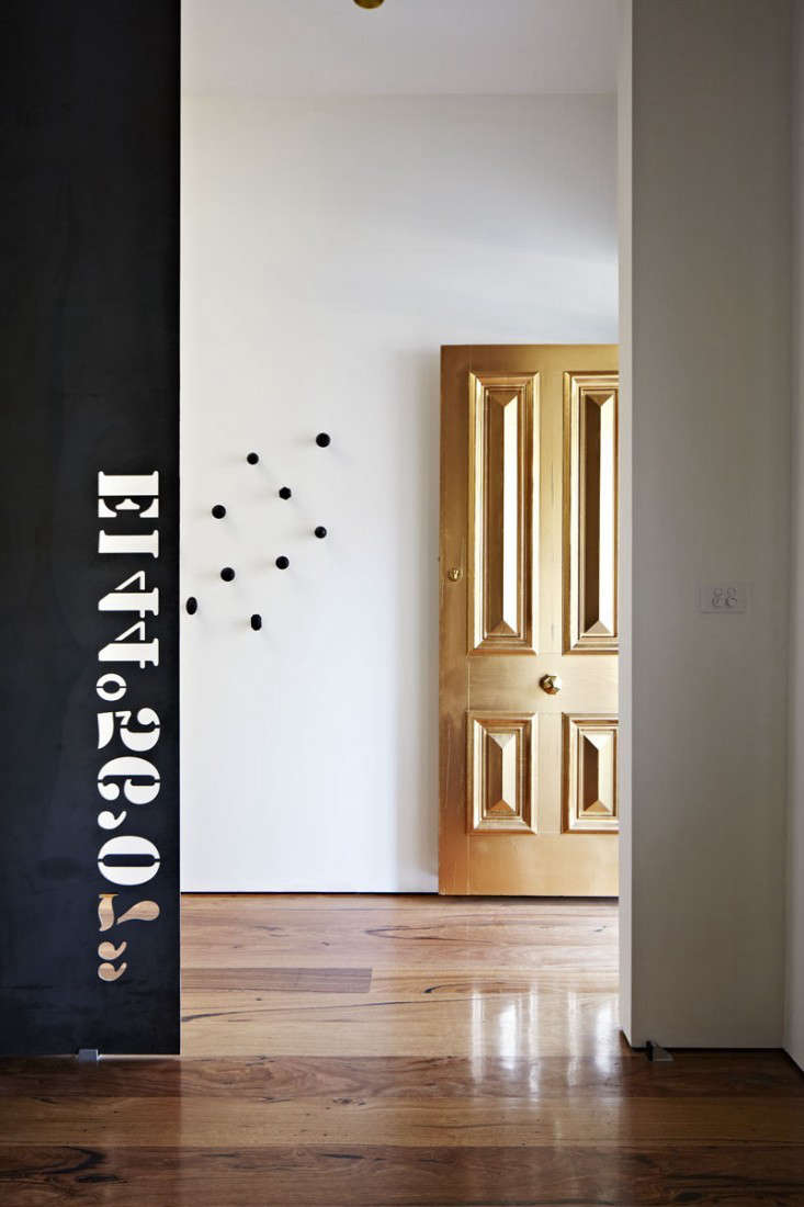
This is especially effective on a front door, fireplace screen, mirror, cabinet hardware, or decorative panel. Large gold surfaces can easily dominate a room, but a restrained shade functions almost like a neutral. It contributes warmth and reflection while allowing the architecture to remain the main attraction.
Why the undertone matters
A gray undertone reduces the visual sweetness of yellow gold. A touch of brown makes the color feel older. A slight green cast suggests unlacquered brass. A copper undertone creates warmth but can become orange under incandescent lighting.
For a broadly versatile result, choose gold paint with a balanced neutral base. It will pair more easily with marble, oak, walnut, blackened steel, painted cabinetry, and both warm and cool whites.
Test the paint before committing
Never choose metallic paint solely from a printed chip or online photograph. Paint a sample board, prime it exactly as you plan to prime the final object, and apply at least two coats. Then move the board around the room during the morning, afternoon, and evening.
Benjamin Moore likewise advises testing paint in the actual space because color changes under different lighting conditions. With reflective finishes, that advice becomes even more important. ection>
Choosing the Right Type of Gold Paint
Water-based metallic paint
Water-based metallic paint is a strong choice for furniture, walls, trim, doors, and decorative architectural details. It is generally easier to brush or roll than aerosol paint, cleans up with soap and water, and gives you more control over large areas.
Specialty formulas commonly use pearlescent pigments or fine metallic particles to create depth. Some are designed to be opaque, while others work best over a coordinated base coat. Always read the technical directions rather than assuming metallic paint behaves like standard latex.
Metallic spray paint
Spray paint is ideal for small objects with curves, carvings, or narrow openings. Picture frames, lamp bases, planters, chair legs, vents, and decorative hardware are easier to coat with a spray can than with a brush.
Benjamin Moore lists metallic aerosol finishes for metal, wood, ornamental pieces, frames, and crafts, while Krylon offers metallic formulas for surfaces including metal, wood, plastic, laminate, glass, and ceramic. Product compatibility varies, so the labelnot optimismshould make the final decision.
Wax, gilding paint, and rub-on metallic finishes
Metallic wax is useful when you want to highlight raised edges, carved details, or molding without covering the entire object. Apply it sparingly with a finger, cloth, or small brush, then buff it after it sets.
Traditional metal leaf creates the richest and most authentic result, but it requires adhesive size, careful placement, and patience. Metallic paint is more practical for everyday projects, especially when the goal is tasteful transformation rather than museum-grade gilding.
How to Match Gold Paint to Your Interior
For minimalist rooms
Choose champagne, pale brass, or warm silver. Use the color on one architectural feature or a few small accents. A gold-painted door, thin mirror frame, or pair of sconces can warm a minimalist space without disrupting its calm character.
For traditional rooms
Antique gold, ochre gold, or dark brass works well with detailed molding, framed artwork, mahogany, leather, and patterned textiles. A darker glaze over the metallic finish can settle into carved recesses and create the illusion of age.
For modern rooms
Look for a low-texture satin metallic rather than a heavily distressed finish. Clean-lined furniture and simple geometric objects help gold feel intentional. Black, charcoal, white, navy, and deep green provide especially effective contrast.
Gold sits visually between yellow and orange, so deep blues, purples, forest greens, black, and crisp whites can either balance or emphasize its warmth.
For bohemian or eclectic rooms
Mix aged gold with woven materials, vintage textiles, dark woods, ceramics, and collected objects. Slight variation and visible brush texture can add character here. The goal is not laboratory perfection; it is controlled imperfection that looks accumulated rather than manufactured last Tuesday.
Surface Preparation: The Un glamorous Part That Saves the Project
Gold paint is reflective, and reflective finishes are enthusiastic informants. They will report every dent, greasy fingerprint, sanding scratch, and forgotten patch of dust. Preparation determines whether the finish looks like metal or like paint attempting to impersonate metal.
Clean thoroughly
Remove grease, wax, polish, dirt, and soap residue. Use an appropriate cleaner for the material, rinse when required, and allow the surface to dry completely. This Old House recommends cleaning before spraying and removing loose paint, rust, and debris before applying a new coating.
Sand for smoothness and adhesion
On wood, lightly sand rough areas and previously glossy finishes. On metal, remove rust and flaking paint, then scuff slick surfaces so the primer can grip. Wipe away all sanding dust with a lint-free cloth.
Do not aggressively sand thin veneer or fragile antique finishes. A minor cosmetic project should not become an archaeological excavation.
Use the correct primer
Primer improves adhesion, blocks stains, helps cover major color changes, and gives metallic paint a more consistent base. Metal generally requires a metal-compatible or rust-inhibiting primer. Plastic may need a bonding primer unless the chosen paint is specifically formulated to adhere directly to it.
For wood and MDF, primer also reduces uneven absorption. Benjamin Moore’s metal-painting guidance emphasizes identifying and preparing the metal, priming appropriately, and allowing each coating to dry before proceeding.
Choose a strategic base color
The base coat can subtly influence the final metallic shade. A warm beige or ochre base makes gold richer. Gray makes it quieter and more contemporary. Black creates depth and can help an antiqued finish look convincing. White keeps pale gold bright but may make missed spots more obvious.
How to Apply Gold Paint Without Streaks or Drips
Brush application
Use a high-quality synthetic brush for detailed trim, carvings, and small furniture pieces. Apply thin coats and avoid repeatedly brushing areas that have begun to set. Overworking metallic paint can move the reflective particles and create dark or light patches.
For a hand-finished look, make the final strokes run in one consistent direction. For a softly textured effect, use controlled crosshatchingbut test the method first.
Roller application
A small microfiber or fine foam roller can produce a smooth finish on doors, panels, tabletops, and walls. Keep a wet edge, work in manageable sections, and finish each section with light strokes in the same direction.
Do not press hard enough to squeeze ridges from the roller. The first coat may look alarmingly uneven. This is normal. Metallic paint rewards patience and punishes panic.
Spray application
Shake the can for the full time specified on the label. Test the spray pattern on scrap material. Begin each pass before the spray reaches the object, continue across the surface, and release the nozzle after passing the opposite edge.
Krylon recommends several light, overlapping coats rather than one heavy coat. Rust-Oleum similarly advises a back-and-forth motion with light applications and overlap between passes. p>Heavy coats are the quickest route to drips, solvent trapping, wrinkling, and emotional bargaining with the universe. Build coverage gradually.
Respect the recoat window
Spray paints may require recoating within a short period or only after a much longer curing interval. Applying another coat during the wrong stage can cause bubbling or wrinkling. Follow the label’s exact recoat schedule, especially when combining primer, color, and sealer.
Work in suitable conditions
Use aerosol products outdoors or in a properly ventilated work area. Avoid strong wind, airborne dust, excessive humidity, and temperatures outside the manufacturer’s recommended range. Wear appropriate protective equipment.
Should You Seal Gold Paint?
The answer depends on the product and the object. A decorative frame that is rarely touched may not need a topcoat. A table, handle, shelf, or exterior feature may require additional protection.
However, a clear coat can change the metallic appearance. It may reduce reflectivity, deepen the color, create cloudiness, or make a softly aged finish look glossy and synthetic. Rust-Oleum specifically warns that certain metallic spray finishes should not receive a clear topcoat because it can dull the effect. p>When a sealer is permitted, test it over a painted sample first. Use a compatible product in the recommended sheen and allow the metallic coat to cure fully before sealing.
Where Gold Paint Works Best
- Front doors: A muted gold door can look sculptural and unexpectedly restrained, particularly with simple hardware and neutral surrounding walls.
- Mirror and picture frames: These are ideal beginner projects because small imperfections tend to enhance the aged-gilt effect.
- Lamp bases: Gold visually connects a lamp with the warm light it produces.
- Cabinet accents: Paint narrow trim, feet, or decorative panels instead of covering an entire cabinet.
- Fireplace screens: A heat-appropriate metallic coating can soften the look of dark metal, provided the chosen product is rated for the temperature involved.
- Decorative hardware: Use a durable product made for metal, but expect frequently handled knobs and pulls to experience wear.
- Accent walls or ceilings: Metallic wall paint can reflect light dramatically, though large surfaces require careful technique to prevent lap marks.
- Planters and small accessories: These allow you to repeat a gold accent around a room without committing to a major feature.
Common Gold-Paint Mistakes
Choosing from the cap alone
A spray-can cap is an approximation, not a legally binding promise. Test the actual paint.
Skipping surface preparation
Metallic paint cannot hide peeling paint, rust, grease, or deep scratches. In many cases, it makes them easier to see.
Applying one thick coat
Thick coats sag, dry unevenly, and may remain soft beneath the surface. Thin coats produce a smoother, more convincing metallic appearance.
Using the same gold everywhere
A color that looks beautiful on a small frame may become overwhelming on a door or wall. Scale changes the visual intensity of metallic finishes.
Mixing too many unrelated metal tones
Mixed metals can look sophisticated, but they need a plan. Repeat each finish at least once, keep one metal dominant, and connect the group through similar undertones or shapes.
Painting valuable antiques
Before refinishing an old piece, determine whether the original surface contributes to its historical or financial value. Sometimes the perfect gold paint is no gold paint at all.
My Experience Searching for the Perfect Gold Paint
My first lesson in gold paint arrived through a thrift-store mirror with a plastic brown frame. The frame had decorative leaves, tiny scrolls, and enough faux-European drama to deserve its own period costume. I imagined that one can of gold spray paint would turn it into something elegant.
I chose the brightest gold available because the cap looked rich and cheerful. After one enthusiastic coat, the mirror resembled a prize from a novelty shop. The gold was intensely yellow, the recessed areas looked flat, and several heavy passes had formed small drips beneath the decorative leaves. The object was technically gold, but so is a chocolate-coin wrapper.
For the second attempt, I sanded away the drips, applied primer, and switched to a muted champagne metallic. I sprayed from a consistent distance, beginning each pass beside the frame rather than directly over it. Three light coats produced better coverage than the previous flood of paint. The darker base remained faintly visible in the deepest carvings, giving the frame dimension.
The difference was not simply better technique. The softer color allowed the shape of the frame to do the work. Instead of noticing “gold paint,” I noticed highlights on the leaves and shadows around the scrollwork. That is usually the sign of a successful metallic finish: the material supports the design instead of becoming the entire conversation.
The front-door experiment
A larger project taught a different lesson. A sample of muted gold looked beautifully understated on a small board, but it became much brighter when applied across a door. The broad surface reflected a nearby window, and afternoon sunlight amplified the warm pigments.
Rather than abandon the idea, I tested the paint over two base colors. Over cream, it appeared bright and decorative. Over medium gray, it became cooler, quieter, and closer to aged brass. The gray base won because it reduced the yellow cast and made the finish look integrated with the architecture.
Application mattered even more at that scale. Random roller strokes created visible patches whenever the light hit the door sideways. The solution was to work quickly in narrow sections, maintain a wet edge, and finish every section with gentle vertical passes. The final coat used less pressure than the earlier coats, allowing the metallic particles to settle more consistently.
The hardware lesson
Painting cabinet hardware initially seemed like an easy way to update a kitchen without buying new pulls. The fresh finish looked excellent for several weeks, but the most frequently handled pieces began to wear near the edges.
The cause was a combination of incomplete cleaning, insufficient curing time, and the simple fact that hands are relentless little finish-testing machines. On the second batch, I degreased the hardware carefully, scuffed the glossy surface, used a bonding primer, applied several thin coats, and allowed the pieces to cure before reinstalling them.
The revised process lasted much longer, but it also clarified an important limitation: painted hardware is not the same as factory-finished metal. It can be a useful, economical update, but high-touch pieces demand excellent preparation and realistic expectations.
What finally defined “perfect”
After testing bright gold, antique gold, champagne, brass, bronze, and warm silver, I stopped looking for a universally perfect can. The best result depended on the object, lighting, base coat, surrounding colors, and desired level of age.
For most interiors, however, the consistently successful shades shared several qualities. They were not aggressively yellow. Their reflective particles were fine rather than glittery. They shifted gently between gold, beige, and gray. They looked interesting in shadow, not just under direct light.
Warm Silver remains a particularly clever reference because it demonstrates that the most believable gold may not have “gold” in its name. Its restraint makes it useful on both small objects and architectural surfaces. It suggests brass or aged gilt without becoming flashy.
The final experience-based rule is simple: buy samples before buying confidence. Paint scrap boards, move them around the room, and observe them beside the materials already present. The extra step feels slow until you compare it with sanding an entire sparkly yellow door back to civilization.
Final Verdict: The Perfect Gold Is Quietly Complicated
The perfect gold paint is not necessarily the most reflective, expensive, or obviously golden option. It is the shade that responds gracefully to the room, complements the object, and creates depth without overwhelming the design.
For a sophisticated result, begin with muted champagne, warm silver, pale brass, or antique gold. Prepare the surface carefully, use the correct primer, apply thin coats, and follow the manufacturer’s drying and recoating directions. Test any sealer before using it over the finished project.
Most importantly, judge gold paint in real light. A finish that looks dull on a store shelf may become luminous at home, while a dazzling sample may transform a tasteful chair into a throne nobody requested. The right gold does not need to announce itself. It catches the light, adds warmth, and quietly convinces everyone that the object has always looked that good.