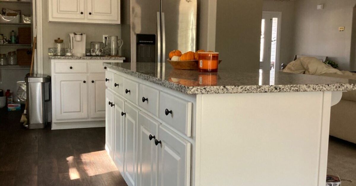
The kitchen has many serious responsibilities. It stores food, hosts redded cheese directly from the bag. With all that important activity, the room deserves more personality than a sea of beige surfaces and stainless-steel appliances.
Adding a pop of color to your kitchen is one of the simplest ways to make the space feel warmer, happier, and more personal. It does not require turning every cabinet electric orange or installing a purple refrigeratoralthough both are technically options. A carefully placed splash of blue, green, yellow, red, or another favorite shade can transform the room without demanding a complete renovation.
The key is choosing where the color should appear, how much of it the room can comfortably handle, and which tones complement the existing cabinets, counters, floors, appliances, and lighting. Whether you own a spacious remodeled kitchen or rent a tiny galley with questionable laminate, there is a colorful solution that can work.
Why a Pop of Color Makes Such a Difference
Kitchens contain many hard, practical surfaces. Cabinets, countertops, appliances, sinks, and floors are usually selected for durability, which can leave the room looking functional but visually flat. Color interrupts that uniformity and gives the eye something interesting to notice.
A colorful feature can also establish a focal point. Instead of every surface competing for attention, one distinctive island, backsplash, pantry door, or lighting fixture becomes the visual star. The remaining finishes can play supporting roles rather than auditioning for the same design reality show.
Color is also an effective way to connect the kitchen with adjoining rooms. In an open floor plan, a blue island might repeat the blue found in living-room artwork. Green stools might echo plants near the dining table. These small connections make separate areas feel intentionally related.
Start With the Color Commitment You Can Handle
Before buying paint or tile, decide how permanent you want the change to be. Colorful kitchens can range from barely-there accents to full-room statements.
Low-Commitment Color
Accessories are ideal for cautious decorators, renters, or anyone whose favorite color changes every six months. Consider colorful cookware, countertop appliances, dish towels, fruit bowls, artwork, rugs, stools, or pendant shades.
These items can be replaced easily, allowing the kitchen to evolve without demolition. A white kitchen with coral stools and matching striped towels can feel completely different from the same space decorated with navy accessories.
Medium-Commitment Color
Painted walls, wallpaper, open-shelf back panels, doors, and freestanding furniture create a noticeable transformation without permanently changing the room’s major structures. Repainting a pantry door is easier than replacing an entire cabinet system when your “mustard yellow era” reaches its natural conclusion.
High-Commitment Color
Cabinetry, permanent backsplashes, flooring, countertops, and large appliances require greater planning. These elements are more expensive and labor-intensive to change, so the selected color should complement both your current taste and the home’s overall architecture.
That does not mean permanent surfaces must be boring. It simply means they should be chosen after viewing real samples in the roomnot after falling in love with a heavily filtered photograph at midnight.
Choose One Main Color Story
A colorful kitchen feels deliberate when its palette has a clear direction. Randomly collecting six unrelated bright shades can make the room resemble a preschool art cabinet. That look may be cheerful, but it is not always calming before the first cup of coffee.
Begin with one main accent color. Then select one or two supporting shades already present in the kitchen’s fixed finishes. Wood tones, countertop veining, metal hardware, flooring, and appliances can all influence the palette.
Blue for a Classic, Flexible Look
Blue works with an impressive range of kitchen styles. Pale powder blue can soften a cottage kitchen, teal can energize a mid-century space, and navy can add depth to a traditional or contemporary design.
Blue cabinetry pairs naturally with white counters, warm wood, brass hardware, stainless steel, and many patterned tiles. In a small kitchen, a lighter blue can introduce personality without making the room feel enclosed. A darker navy is especially effective on lower cabinets or an island where it visually anchors the space.
Green for a Natural, Welcoming Kitchen
Green has become a favorite kitchen color because it bridges the gap between neutral and expressive. Sage, olive, moss, mint, forest green, and emerald each create a different mood while pairing beautifully with wood, stone, cream, black, and metallic finishes.
A soft sage can feel quiet and organic. Olive adds vintage warmth. Deep forest green creates drama and looks especially polished with brass or aged bronze hardware. Homeowners who are nervous about painting every cabinet can use green on a pantry cabinet, island, breakfast nook, or door.
Yellow for Cheerful Energy
Yellow can make a kitchen feel sunny even when the weather is doing its best impression of a wet gray blanket. Butter yellow suits traditional and cottage interiors, while mustard works well with wood, black, cream, and mid-century furnishings.
Bright lemon yellow is most successful in smaller doses, such as stools, lighting, dishware, or the interior of a glass-front cabinet. A little yellow can be delightful. Too much may make breakfast feel like it is taking place inside a highlighter.
Red, Orange, and Terracotta for Warmth
Warm colors bring energy and richness to a cooking space. Brick red, burgundy, rust, burnt orange, and terracotta can complement wood cabinetry, natural stone, creamy walls, and dark metal accents.
These colors are often easier to live with when they are slightly muted rather than extremely bright. A terracotta tile backsplash, oxblood island, or rust-colored range can feel sophisticated, while still giving the kitchen a memorable identity.
Pink and Purple for an Unexpected Twist
Pink and purple are less conventional kitchen choices, which is exactly why they can be so appealing. Dusty rose cabinets can feel warm and vintage rather than sugary. Mauve works nicely with walnut, cream, green, and aged brass. Plum or eggplant can create an elegant focal point in a room with abundant natural light.
For a lighter approach, introduce these shades through artwork, tile details, chair cushions, glassware, or a painted cabinet interior.
Use the Kitchen Island as a Colorful Focal Point
A kitchen island is one of the best places to experiment with color. It is visually separate from perimeter cabinetry, so it can wear a contrasting shade without making the design feel disconnected.
In a white kitchen, a navy, green, burgundy, or charcoal-blue island adds depth. In a wood kitchen, a painted island can break up the amount of brown and create a more layered appearance. A colorful island also emphasizes the room’s gathering area, making it feel more like a piece of furniture than a block of storage.
Repeat the island color once or twice elsewhere. A matching stripe in the rug, a piece of artwork, or a few dishes displayed on open shelving will make the choice feel intentional. Repetition is useful; creating a perfect color-matched army of accessories is not required.
Try Two-Tone Kitchen Cabinets
Two-tone cabinetry adds dimension while allowing bold color to coexist with a lighter neutral. One reliable approach is to use white, cream, or pale gray on upper cabinets and a deeper shade on lower cabinets.
Darker base cabinets visually ground the room and can be more forgiving around busy work zones. Lighter upper cabinets keep the space open and prevent saturated color from dominating eye level.
Other possibilities include painting one wall of cabinets a different color, highlighting a pantry section, or combining painted cabinetry with natural wood. The transition should follow the kitchen’s architecture. Change colors at a corner, cabinet bank, island, or other logical stopping point rather than halfway across an uninterrupted wall.
Make the Backsplash the Star
A backsplash offers color, pattern, texture, and practical wall protection in one hardworking package. In a neutral kitchen, even a relatively small section of colorful tile can make a major visual impact.
Glossy blue or green tile reflects light and can help a compact kitchen feel brighter. Handmade-style tile adds surface variation, preventing a single color from appearing flat. Patterned tile can introduce several related shades that inspire the rest of the room’s palette.
For a cohesive look, choose backsplash tile from the same color family as the cabinetry, but make it slightly lighter or darker. This tonal approach creates depth without excessive contrast. For something bolder, pair complementary colors, such as blue cabinetry with muted orange or salmon tile.
Remember that grout influences the final appearance. Matching grout creates a smoother color field, while contrasting grout emphasizes every tile shape. That difference can determine whether the backsplash feels calm or graphically energetic.
Add Color Through Paint
Paint provides one of the biggest transformations for the lowest material cost. Walls are the most straightforward target, but several unexpected surfaces can also carry color.
Paint a Pantry or Interior Door
A colorful door can act like artwork without occupying counter space. Try teal, mustard, dark green, coral, or red against otherwise neutral walls.
Color the Ceiling
A pale blue, soft peach, or gentle green ceiling adds personality without competing with cabinets and countertops. This technique works especially well when the upper walls and cabinetry remain light.
Paint Inside Open or Glass-Front Cabinets
Coloring the back of a display cabinet creates a contained surprise. It also helps white or clear dishes stand out. Because the area is small, you can use a stronger shade than you might choose for an entire wall.
Prepare Cabinets Properly
Cabinets endure grease, moisture, fingerprints, cleaning, and repeated contact. A successful paint job requires cleaning, degreasing, sanding or deglossing when appropriate, priming, and applying a durable cabinet-compatible finish.
Satin and semi-gloss finishes are commonly favored because they are easier to clean than many flat paints. High-gloss paint can create impressive drama, but it also highlights dents, brush marks, and imperfect preparation. Gloss is honestsometimes brutally so.
Introduce Color With Furniture and Lighting
Counter stools, dining chairs, breakfast benches, and freestanding storage pieces can deliver color without changing permanent kitchen finishes. These elements are especially useful in rentals or recently remodeled kitchens where painting new cabinets would cause family members to stage an intervention.
Lighting is another opportunity. Colorful pendant fixtures bring attention upward and can balance a colorful rug or island below. Enamel shades, painted metal fixtures, colored glass, and fabric-covered cords offer options for nearly every design style.
Always make sure decorative lighting still provides useful illumination. A beautiful pendant that leaves the cutting board in darkness is essentially jewelry with an electrical bill.
Use Rugs, Textiles, and Art for an Easy Refresh
A washable runner can introduce several colors at once while softening a room dominated by hard surfaces. Choose a low-profile design that will not interfere with doors or create a tripping hazard. Patterns are practical because they tend to disguise crumbs until the next cleaning session.
Dish towels, café curtains, seat cushions, and window shades can repeat colors from tile or artwork. Fabric also adds softness, which is valuable in a room filled with stone, metal, glass, and wood.
Artwork makes a kitchen feel like a living space rather than a laboratory for boiling pasta. Frame a colorful print, vintage food advertisement, family recipe, textile, or child’s drawing. Use locations away from direct heat, steam, and splattering oil.
Let Everyday Objects Become Decorations
Useful items can provide color without adding clutter. Display a bright Dutch oven on the range, arrange colorful plates on open shelves, place wooden utensils in a painted crock, or keep citrus fruit in a bold bowl.
Small appliances are another option. A colorful mixer, toaster, kettle, or coffee maker can become a focal point, particularly in a neutral kitchen. Before buying five appliances in matching turquoise, however, consider how many will actually remain on the counter. Color is charming; crowded work surfaces are less charming.
How to Add Color to a Small Kitchen
Small kitchens do not have to be colorless. They simply benefit from thoughtful placement. Light and medium shades can keep the room feeling open, while deeper tones work well below the counter, on a single wall, or within a contained feature.
Reflective tile, glass-front cabinets, pale walls, and adequate lighting help balance saturated accents. A mint backsplash, powder-blue pantry, green lower cabinets, or yellow door can give a compact room identity without visually shrinking it.
Limit the number of major colors and allow some surfaces to remain quiet. When every wall, cabinet, appliance, towel, and spoon demands attention, a small kitchen can feel more crowded than it actually is.
Color Ideas for Renters
Rental restrictions may prevent permanent changes, but they do not require living in a personality-free box. Begin with removable or portable additions.
- Use colorful stools, chairs, rugs, dish towels, and countertop accessories.
- Display vibrant cookware or dishes on open shelving.
- Hang lightweight artwork with removable adhesive products.
- Line cabinet interiors with removable paper.
- Replace cabinet knobs temporarily and store the originals safely.
- Add plants, flowers, fruit, and herbs for natural color.
- Use removable backsplash products only where permitted and appropriate.
Before applying adhesive materials, test a hidden area and review the lease. “But the internet said it was removable” is not always persuasive during a security-deposit discussion.
Test Colors in the Actual Kitchen
Paint colors behave differently depending on natural light, artificial lighting, surrounding finishes, and time of day. A soft green sample may look fresh in morning light and surprisingly gray after sunset. A warm cream can turn yellow beside cool white countertops.
View large samples next to the cabinets, flooring, counters, backsplash, and appliances. Move the samples around the room and observe them in daylight and at night. When choosing tile or countertops, examine physical samples rather than relying only on a screen.
Undertones matter. A blue with green undertones may clash with violet-gray counters. A yellow-based white may look dirty next to a crisp blue-white surface. Identifying these relationships before purchasing materials can prevent expensive disappointment.
Common Color Mistakes to Avoid
Adding Too Many Focal Points
A patterned floor, multicolored backsplash, bright cabinets, dramatic countertop, and vivid wallpaper may each be attractive individually. Together, they can compete. Choose one primary feature and let the remaining elements support it.
Ignoring Existing Fixed Finishes
New paint must work with the countertop, floor, appliances, and wood tones that will remain. Choosing a favorite color in isolation is risky.
Using Delicate Materials in Messy Zones
Kitchen color must survive real life. Select wipeable paint, suitable tile, washable textiles, and finishes that tolerate moisture and frequent cleaning.
Copying a Trend Without Considering the House
A trendy burgundy kitchen may look stunning online, but the color should also fit your home’s architecture, light, and surrounding rooms. Personal style matters more than participating in every design trend simultaneously.
A Simple Formula for a Balanced Color Palette
For homeowners unsure where to begin, use a straightforward three-part palette:
- Foundation color: The dominant neutral or wood tone used on large surfaces.
- Main accent color: The shade used on the island, backsplash, cabinets, walls, or another focal feature.
- Supporting accent: A smaller dose introduced through hardware, textiles, artwork, lighting, or accessories.
For example, combine warm white cabinets, a deep green island, and brass accents. Another option is walnut cabinetry, powder-blue tile, and rust-colored textiles. A third palette might feature cream walls, navy lower cabinets, and natural woven accessories.
This formula is flexible rather than mathematical. Your kitchen will not be inspected by the Color Police. The goal is simply to create enough repetition for the design to feel connected.
Experiences From Living With a Pop of Color in the Kitchen
Color decisions often look easy when presented in polished design photographs. Real kitchens are less cooperative. They contain charging cables, grocery bags, school papers, half-empty cereal boxes, and at least one cabinet nobody wants to organize. The best colorful kitchen ideas are the ones that remain enjoyable after normal life moves back in.
One of the most useful lessons is that a small amount of color can feel much larger than expected. Painting only the kitchen island may seem conservative while you are staring at a tiny sample card. Once that color covers a six-foot structure in the center of the room, however, it becomes a major statement. This is why testing a large sample is worth the extra effort. A shade that appears quiet on a two-inch chip can develop a surprisingly loud personality at full scale.
Another common experience is discovering that the safest color is not always the most satisfying one. Many people begin with three samples: the bold shade they secretly love and two cautious alternatives selected in case courage disappears. The cautious shades often look acceptable. The favorite shade creates an emotional reaction. Kitchens are used every day, so enjoyment deserves a place beside resale considerations and trend forecasts.
That said, colorful features are easiest to live with when they connect to something else. A blue backsplash can initially feel isolated in a warm wood kitchen. Add a blue-striped runner, a ceramic bowl, and a small framed print, and the backsplash suddenly looks intentional. The repetition does not need to be exact. In fact, slightly varied shades usually feel more natural than perfectly matched accessories.
Practicality also becomes clearer with use. A pale rug placed directly in front of the stove may look wonderful for approximately eleven minutes. A washable patterned runner is more forgiving. Matte black cabinets can be dramatic, but they may show fingerprints in a busy household. High-gloss surfaces reflect light beautifully while advertising every preparation flaw. Living with color teaches that the finish matters almost as much as the shade.
Seasonal changes can alter how a color feels. Deep green may appear rich and cozy during winter but heavier during a dark summer thunderstorm. Bright yellow can feel cheerful on gray mornings but more intense in direct afternoon sun. Good lighting helps stabilize the room. Warm under-cabinet lighting, well-positioned pendants, and sufficient general illumination prevent darker colors from becoming gloomy after sunset.
Accessories provide the easiest path for people who enjoy frequent change. A neutral kitchen can move from spring greens to summer blues, autumn rusts, and holiday reds without repainting anything. Changing towels, flowers, dishes, a runner, and one or two countertop objects can shift the room’s mood. The trick is editing. When new accessories arrive, some older ones should leave the stage. Otherwise, “layered color” can quickly become “the cabinet exploded.”
Color also tends to make guests respond to the kitchen differently. A distinctive island or backsplash often becomes a conversation starter. People notice unusual details and remember the space more clearly. More importantly, homeowners frequently report that a personalized kitchen feels less like a showroom and more like their home. Perfectly coordinated neutral rooms can be beautiful, but the unexpected painted door, vintage rug, or row of colorful bowls often supplies the character.
The final lesson is that confidence usually grows after the first successful change. A green pantry door may lead to patterned stools. Those stools may inspire new artwork. Over time, the kitchen develops gradually rather than arriving as a single finished package. That process can produce a room that feels collected, practical, and personalthree qualities that tend to age better than a design copied exactly from a trend report.
Conclusion: Give Your Kitchen a Colorful Personality
A pop of color in your kitchen does not need to be expensive, permanent, or dramatic. One painted island, vibrant backsplash, cheerful door, patterned rug, or colorful pendant can change the atmosphere of the entire room.
Start with a shade you genuinely enjoy, consider the kitchen’s existing finishes, and decide how much commitment feels comfortable. Repeat the color in a few smaller details, test materials under actual lighting, and select finishes capable of handling spills, steam, fingerprints, and enthusiastic cooking.
The most successful colorful kitchen is not necessarily the boldest one. It is the kitchen that feels welcoming, functional, and unmistakably yours. Neutrals can provide the foundation, but color supplies the storyand perhaps distracts visitors from the dishes waiting in the sink.