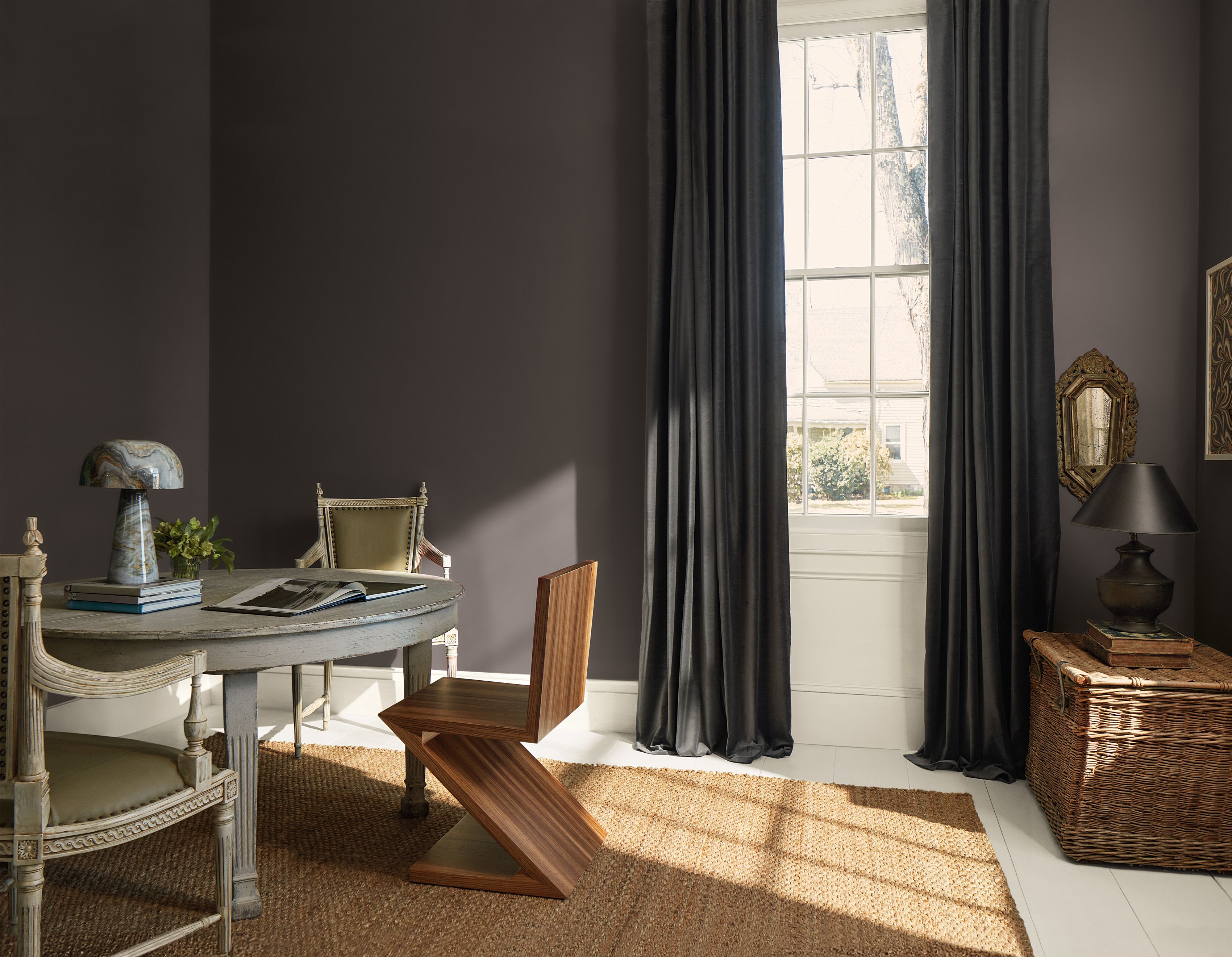
Benjamin Moore’s 2026 Color of the Year is officially here, and no, it did not arrive dressed like a shy little beige trying not to make eye contact. This year’s pick, Silhouette AF-655, is richer, moodier, and much more confident than that. It is a deep espresso-brown with subtle charcoal notes, and it lands right in that sweet spot between dramatic and livable. In other words, it has presence, but it is not here to scream over your sofa.
The announcement matters because Benjamin Moore is not just tossing a random trendy shade into the design ring and hoping everyone starts painting their powder rooms by Friday. The brand’s yearly color selection has become a major signal for where paint trends, interior design trends, and homeowner preferences are headed next. For 2026, that direction is clear: warmer neutrals, tailored spaces, thoughtful layering, and colors that feel like they might still look good five years from now. A shocking concept, apparently.
If 2025 flirted with nuance and soft complexity, 2026 is leaning fully into grounded sophistication. Silhouette feels like the color version of a beautifully cut blazer, a worn-in leather chair, or that one person who somehow looks polished in an oversized cashmere sweater while the rest of us resemble laundry baskets with opinions. It is elegant, it is cozy, and it is exactly the kind of shade that makes a room feel more intentional.
Meet Silhouette AF-655, Benjamin Moore’s 2026 Color of the Year
Silhouette AF-655 is a warm, dark neutral that blends rich espresso with refined charcoal undertones. That combination is what makes it so interesting. It is not flat brown. It is not harsh black. It is not trendy greige with a new publicist. Instead, it has a layered look that shifts depending on the light, the finish, and what you pair it with.
In natural daylight, Silhouette can read as plush and earthy, especially next to oak, linen, warm white trim, and natural stone. In evening light, it becomes deeper and more enveloping, creating the kind of atmosphere people usually try to buy with expensive candles and a playlist called “Soft Jazz For Serious People.” It feels stately without being cold, and dramatic without becoming gloomy.
That balance is a big reason this Benjamin Moore 2026 Color of the Year is already getting attention across the home design world. It works as a statement, but it also behaves like a neutral. That may sound contradictory, but the best paint colors often do both. They attract the eye while still making the room easier to style.
Why Benjamin Moore Chose a Fashion-Inspired Brown for 2026
Fashion and interiors are borrowing from each other again
One of the clearest themes behind Silhouette is the renewed connection between fashion and home design. Benjamin Moore’s color team linked the shade to the return of suiting, classic silhouettes, and pieces that feel tailored rather than disposable. That influence shows up in the color’s structure. Silhouette has softness, but it also has definition. It feels custom, not casual. Refined, not fussy.
This makes sense in a broader cultural moment when people are tired of overly fast trends and algorithm-friendly sameness. Rooms are starting to look more collected, more personal, and more detail-driven. Instead of chasing the newest viral paint color every six minutes, homeowners are looking for shades with longevity. Silhouette fits that shift perfectly.
Brown is replacing black as the softer power neutral
Design publications have been circling the same idea for months: brown is back, and not in a dusty, outdated way. Today’s best brown paint colors feel grounded, luxurious, and surprisingly flexible. Silhouette captures that movement beautifully. It has enough depth to replace black in many rooms, but it feels warmer and more forgiving.
That is important because black can be beautiful, but it can also feel severe when overused. Silhouette brings a similar sense of contrast and drama while softening the edges. It warms up millwork. It flatters brass and bronze. It looks fantastic with cream upholstery. And unlike some cooler dark tones, it does not make a room feel like it is judging your life choices.
What Benjamin Moore’s 2026 Palette Says About Paint Trends
Benjamin Moore did not introduce Silhouette on its own. The brand released it alongside the Color Trends 2026 palette, a curated set of eight shades that reflects the same mood: timeless, detailed, layered, and quietly expressive. The palette splits into what the brand describes as “enchanting pales” and “handsome midtones,” which sounds a little like the cast list for a very expensive period drama, but the concept is useful.
The enchanting pales
- Raindance 1572 – a steely green with gray undertones
- First Crush CSP-310 – a soft blush-toned neutral
- Swiss Coffee OC-45 – a creamy, dependable warm off-white
- Batik AF-610 – a dusty mauve with vintage character
These lighter shades keep the palette from feeling heavy. They introduce air, softness, and a little romance. Swiss Coffee is the stabilizer, First Crush adds warmth, Batik brings a muted artistic quality, and Raindance adds a mineral, slightly moody freshness. Together, they prove that pale colors do not have to feel sugary or washed out to be gentle.
The handsome midtones
- Silhouette AF-655 – the espresso-charcoal star of the show
- Narragansett Green HC-157 – a dramatic blackened teal
- Southwest Pottery 048 – an earthy clay-driven neutral
- Sherwood Tan 1054 – a warm tannish brown
These are the colors that give the palette weight and personality. They are earthy, grown-up, and highly layerable. None of them feel shrill. None of them feel disposable. That alone makes the 2026 palette interesting. It suggests that the next wave of home color is less about novelty and more about nuance.
How to Use Silhouette at Home Without Overdoing It
The easiest way to use Silhouette AF-655 is where architecture already deserves a little spotlight. Think entryways with trim, dining rooms with molding, cozy home offices, powder rooms, or built-ins that need a stronger visual frame. Benjamin Moore has already shown the shade in elegant transitional spaces, and it works especially well when the room has details worth emphasizing.
Best rooms for Silhouette
Entryways: Silhouette makes a first impression in the best way. It feels tailored and welcoming, especially with off-white trim and warm wood floors.
Home offices: In a workspace, it adds focus and polish. It feels smarter than standard gray and more elevated than navy when paired with leather, walnut, or antique brass accents.
Dining rooms: This color shines in rooms meant for evening use. Candlelight, brass fixtures, and textured curtains all look richer against it.
Powder rooms: A small space is a great place to go bold. Silhouette can make a compact room feel jewel-box chic rather than cramped.
Cabinetry and built-ins: If painting an entire room feels like too much commitment, use Silhouette on lower cabinets, bookshelves, or a kitchen island for a darker anchor.
Front doors: While Benjamin Moore highlights many colors for curb appeal, a dark brown-neutral like this can create an understated, upscale entrance when paired with stone, brick, or creamy siding.
Pairing ideas that actually work
Silhouette is easiest to live with when you balance its depth. Try it with Swiss Coffee for high contrast and a clean, classic look. Pair it with First Crush if you want something softer and a little unexpected. Use Narragansett Green for a moodier palette that feels library-worthy in the best possible sense. Add Sherwood Tan if you want tonal warmth and that layered, earthy, quiet-luxury look that designers keep circling back to.
Material matters, too. Silhouette looks especially strong with oak, walnut, unlacquered brass, blackened iron, linen upholstery, boucle, and handmade ceramic pieces. If your room already has cool gray flooring and icy white lighting, though, you may need to warm up the supporting cast. Silhouette is not impossible in a cooler space, but it definitely prefers company with a pulse.
What This Color Means for 2026 Interior Design Trends
Silhouette reflects a few big shifts happening at once. First, there is the move away from icy minimalism and into warmer, more layered interiors. Second, there is growing appreciation for craftsmanship, molding, trim, texture, and rooms that feel composed instead of purely sparse. Third, there is plain old trend fatigue. People want homes that feel personal and finished, not constantly under renovation because a social media reel told them last week’s color is now embarrassing.
That is why Benjamin Moore’s 2026 Color of the Year feels timely. It is trend-aware without being trend-dependent. It nods to fashion, but not in a gimmicky way. It supports contemporary interiors, but it also works in traditional homes, modern farmhouses, classic apartments, and transitional spaces. It is moody, yes, but it is also deeply usable.
Silhouette also suggests that warm neutral paint colors are evolving. The neutral of 2026 is not just pale greige trying to disappear into the drywall. Neutral can now mean depth, brown undertones, softness, and visible character. That is a much more interesting future for paint.
Should You Actually Use Benjamin Moore’s 2026 Color of the Year?
If you love bright, beachy interiors filled with crisp white slipcovers and enough sunlight to power a small village, Silhouette may not be your first choice for every wall. But if you want a home that feels layered, cozy, elegant, and current without being obvious, this shade is worth serious attention.
It is especially smart for anyone who wants a dark paint color but feels nervous about black. It gives you depth without the harshness. It creates mood without flattening the room. And because it works with so many textures, metals, and adjacent neutrals, it is surprisingly flexible for a color that initially looks bold.
The smartest move is still the least glamorous one: sample it first. Dark colors shift dramatically based on natural light, bulb temperature, sheen, and surrounding finishes. Paint a large board. Move it around. Check it in morning light, late afternoon, and at night. Silhouette is a beautiful color, but like a good suit, it really needs the right setting to show off.
Living With Silhouette: The Experience Behind the Trend
There is also something worth saying about the experience of a color like Silhouette, because paint is never just visual. It changes how a room feels when you walk into it. A rich brown with charcoal undertones does not greet you the same way a bright white wall does. White tends to announce itself with clarity and distance. Silhouette feels more like a room leaning in and saying, “Relax, I have this handled.”
In everyday life, that translates into comfort. In the morning, a color like Silhouette can make a home feel settled before the coffee even kicks in. It turns trim sharper, art more intentional, and wood tones warmer. A hallway painted in a deep neutral suddenly feels less like a passageway and more like part of the design story. You notice framed art more. You notice the shape of a sconce more. Even the shadow lines around molding feel richer.
By evening, the experience gets even better. Lamplight and darker paint have a very healthy relationship. Silhouette seems to absorb glare and flatter warm pools of light, which can make a room feel calmer, quieter, and more finished. That is part of why dark browns are so appealing right now. They create atmosphere without trying too hard. They give a room emotional weight. Not drama for drama’s sake, but depth.
Another real-world advantage is how forgiving the color can be when a room contains mixed materials. Many homes are not perfect showroom boxes. They have medium wood floors, inherited furniture, a brass lamp from one decade, a black side table from another, and a rug that refuses to match anything except your mood. Silhouette can act like the diplomat in the middle of that chaos. Because it sits between brown, charcoal, and warm neutral territory, it often helps unrelated pieces feel more cohesive.
There is also a psychological reason people respond to colors like this. Deep brown shades tend to feel grounded and protective. They suggest wood, earth, leather, bark, coffee, cocoa, and other things humans have decided are comforting for excellent reasons. When that brown is refined with charcoal, as Silhouette is, the result feels less rustic and more tailored. It gives you warmth, but with a blazer on.
That experience can be especially powerful in rooms where you want a stronger sense of retreat. A home office can feel more focused. A dining room can feel more intimate. A bedroom can feel more cocooned. Even a tiny powder room can go from forgettable to memorable with the right paint, a mirror with character, and one unapologetically nice light fixture. Silhouette is the kind of color that rewards those details.
And maybe that is the best way to understand why Benjamin Moore’s 2026 Color of the Year is landing so well. It is not just pretty on a paint chip. It supports a way of living that more people seem to want right now: slower, warmer, more intentional, and less obsessed with novelty. Silhouette does not beg for attention. It earns it. That makes it more than a trend forecast. It makes it a genuinely useful design idea.
Conclusion
Benjamin Moore’s 2026 Color of the Year proves that brown is no longer the background player in home design. With Silhouette AF-655, the brand has delivered a shade that feels timeless, sophisticated, and practical enough for real life. It reflects a bigger movement toward warmth, craftsmanship, and colors with staying power. If you have been waiting for a moody neutral that feels elegant instead of severe, this may be your moment. Or, at the very least, your entryway’s moment.