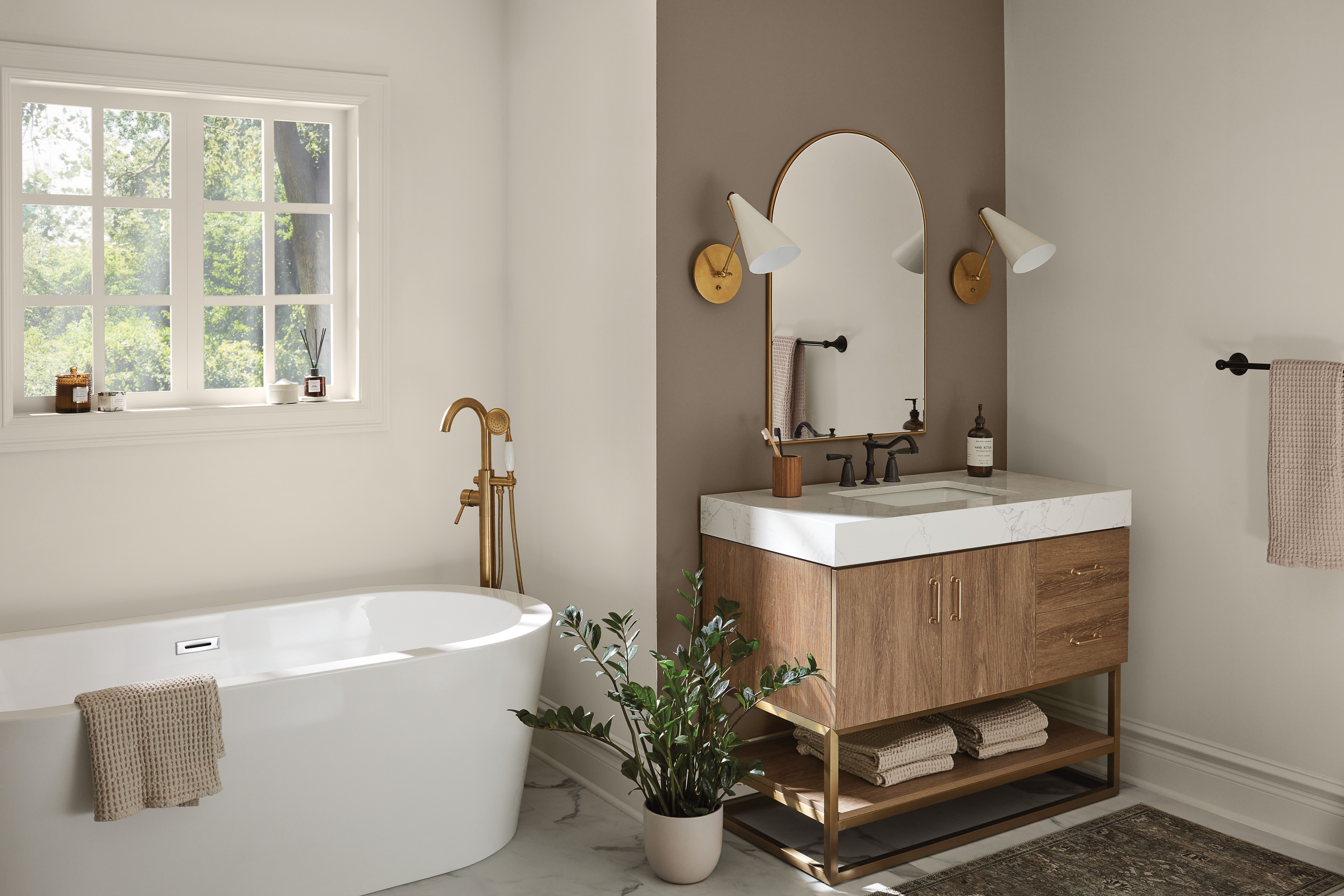
Picking bathroom paint colors sounds easy until you remember bathrooms are basically tiny weather systems:
steamy, splashy, and lit like a reality show reunion (harsh, revealing, and slightly judgmental). The good news?
The right color can make a cramped powder room feel taller, a windowless bath feel brighter, and a plain builder-grade
space feel… suspiciously expensive.
This guide rounds up 31 bathroom paint colors that work across stylescoastal, modern, traditional,
farmhouse, maximalist, and “I just want it to feel clean without looking like a dentist office.” You’ll also get
practical selection tips (undertones! sheen! lighting!) so the color you love on a swatch doesn’t turn into a
surprise-green situation at 7 a.m.
How to Choose a Bathroom Paint Color (Without Regrets)
1) Start with lighting, not vibes
Bathrooms often have cool LED bulbs, tiny windows, or no natural light at all. That means undertones show up fast.
A “soft white” can go yellow, a “greige” can go purple, and a “calm blue” can suddenly look like sports drink.
When possible, test a sample on two walls: one near the light source and one in shadow.
2) Match the fixed stuff (tile, stone, vanity, metal)
In most bathrooms, the tile isn’t leaving anytime soon. Same for countertops and tub surrounds. Let those materials
lead the conversation and let paint play a supporting roleunless you’re intentionally going bold, in which case,
paint gets top billing and tile can sit down and take notes.
3) Pick the right sheen for steam and splashes
Bathrooms need durability. In general, satin or semi-gloss finishes hold up better to moisture and wipe-downs than
flat paint. If you hate shine, choose a modern “washable matte” formulated for high-traffic areasbut confirm it’s
bathroom-friendly, because steam is not a gentle roommate.
4) Use color to “edit” the room
- Small or windowless: lighter, reflective colors can help the space feel more open.
- Large or echo-y: deeper tones can add coziness and dimension.
- Low ceiling: keep the ceiling lighter than the walls or paint everything one color for a wrapped effect.
31 Bathroom Paint Colors for Any Style
Below are 31 tried-and-true picksfrom airy neutrals to moody charcoalsorganized by “mood family” so you can find
the right direction fast. Each includes a quick style cue and pairing ideas.
Airy Whites & Off-Whites (Bright, Clean, Never Boring)
-
Shoji White (Sherwin-Williams):
A warm, modern off-white that feels softnot stark. Great with wood tones, brass, and organic textures for a calm,
elevated look. -
Whipped Cream (Behr):
Cheerful and easygoing, this off-white plays nicely with bold tile and colorful decor. Ideal when you want bright
walls without the “blinding snowfield” effect. -
Writer’s Parchment (Behr):
A buttery, vintage-leaning cream that warms up cool bathrooms. Looks especially good with gold-toned hardware,
warm wood, and soft pink accents. -
White Dove (Benjamin Moore):
A classic, versatile white that layers well with texturethink woven baskets, glass tile, and natural woodso your
bathroom feels styled, not sterile.
Modern Neutrals (Polished, Flexible, “Goes With Everything”)
-
Etched Glass (Behr):
A neutral with a subtle blue lean that reads crisp and modern. Pair with white trim and black hardware for a clean
contrast that still feels soft. -
Kid Gloves (Benjamin Moore):
A warm taupe that instantly makes a bathroom feel more “designed.” It pairs well with light greens, pinks, and
bluesperfect for a calm, layered palette. -
Gray Huskie (Benjamin Moore):
A contemporary ash-gray that works with stone and concrete vibes. Use bright white trim to keep it fresh, and add
darker accents (like a black vanity) for a tailored finish. -
Earl Grey (Sherwin-Williams):
A blue-gray that feels sophisticated without going cold. Great for transitional spacesespecially if your tile is
a mix of warm and cool tones and you need a “peace treaty” color.
Spa Greens (Relaxing, Nature-Inspired, Always a Good Idea)
-
Simply Sage (Behr):
A gentle green-gray that’s easy to live with. It brings in that spa feel without screaming “I’m themed,” and it
pairs beautifully with white and light woods. -
Hollingsworth Green (Benjamin Moore):
Soft and coastal-leaning, this green feels refreshing. Add beige or sandy accents to warm it up, or keep it crisp
with white for a clean retreat vibe. -
Nurture Green (Sherwin-Williams):
A leafy, calming green that works great when you want nature indoors. Pair with sandy neutrals, warm woods, and
bright white fixtures to keep it airy.
Coastal & Water Blues (Fresh, Timeless, Works in Almost Any Style)
-
Aleutian (Sherwin-Williams):
A calming blue that instantly reads “relaxing.” Great as an accent wall in a half-bath or on all walls if you want
a gentle, retreat-like feel. -
Soft Sky (Benjamin Moore):
A familiar sky-and-sea blue that feels universally soothing. Pair with white cabinetry and trim to keep everything
bright and classic. -
Renew Blue (Valspar):
A brighter, more energetic blue that’s excellent for beadboard or an accent wall. It’s playful in coastal spaces,
but also surprisingly sharp in modern bathrooms with simple fixtures. -
Gale Force (Sherwin-Williams):
Navy, bold, and classicthis one looks amazing with white for crisp contrast. Consider it for cabinetry, especially
if you want a “designer” punch without changing tile. -
Blue Gray (Farrow & Ball):
A complex blend of blue, green, and deep tones that shifts with the light. It’s elegant and slightly moodyperfect
for a bathroom that wants depth without going full-dark. -
Sardine (Farrow & Ball):
A silvery blue that adds color quietly. If you want “hint of blue” rather than “nautical costume,” this is a strong
contenderespecially with pale neutral accents.
Romantic Pinks & Purples (Soft, Stylish, Surprisingly Grown-Up)
-
Calluna (Farrow & Ball):
A light lilac that feels tranquil and refinednot sugary. Pair with bright white trim and clean lines for a fresh,
modern twist on a classic romantic color. -
Angelica (Benjamin Moore):
A pale gray with a delicate lavender undertone. Great when you can’t decide between warm and coolthis sits in the
middle and looks gorgeous with creamy whites and tiny hits of green. -
Glamour (HGTV Home by Sherwin-Williams):
A mauve that feels modern and confident. Use it for a statement (even color-drenching) or as an accent with cream
tones to keep it subtle and sophisticated. -
Paris Romance (Benjamin Moore):
A soft, powdery pink that warms low-light bathrooms without overwhelming them. Pair with snowy white and shimmering
silver finishes to keep it airy and polished.
Sunny & Citrusy (Cheerful, Warm, “Morning Person” Energy)
-
Delightful Moon (Valspar):
A sunny yellow that makes a bathroom feel upbeat. Try it on board-and-batten, an accent wall, or a vanity for a
bright pop that still feels inviting. -
Whole Wheat (HGTV Home by Sherwin-Williams):
A warm neutral with a gentle yellow undertonecozy without being loud. Looks great with a white vanity and trim for
a bright, welcoming glow. -
Persimmon (HGTV Home by Sherwin-Williams):
A rich peach that’s fantastic as a vanity color or small accent. Pair it with a complementary light blue for a
playful-but-balanced palette.
Dramatic Darks (Moody, Luxurious, “Yes, It’s a Bathroom”)
-
Evening Dove (Benjamin Moore):
A sophisticated blend of navy, charcoal, and near-black. Use it as an accent wall with off-white balance, or go
bolder and let wood accents warm it up. -
Railings (Farrow & Ball):
A deep black with blue undertones that reads dramatic and modern. Pair with cool gray-whites or natural woods, and
add greenery to keep it feeling alive. -
Onyx (Glidden):
A classic black that works as an accent wall or full-room statement. It’s surprisingly flexiblepair it with almost
any color and let metals (brass, chrome, black) set the tone. -
Cracked Pepper (Behr):
A soft charcoal that feels inviting instead of heavy. White accents pop against it, and it’s a great “first dark
color” if you’re easing into moody bathrooms. -
Wrought Iron (Benjamin Moore):
Warmer than a true black, cooler than a brownthis charcoal sits in a sweet spot. It pairs beautifully with natural
wood and textured accessories for a relaxed, high-end vibe.
Punchy Reds, Oranges & Clay (Bold, Joyful, Surprisingly Chic)
-
Cajun Spice (Glidden):
Vibrant and energizingperfect for an accent wall or statement vanity. Looks great against softer taupe walls when
you want color with a “designer edge.” -
Clay Pot (PPG):
A bright red-orange that’s unapologetically cheerful. Best used on a vanity or focal area, then balanced with teal
or deep blue accents for strong, complementary contrast.
Easy Color Pairings by Style (Quick Inspiration)
Modern / Minimal
Try Etched Glass or Cracked Pepper with white trim and matte black hardware. Add a
simple mirror, clean-lined sconces, and one bold texture (like ribbed glass or fluted wood) so it feels intentional.
Coastal / Airy
Go with Soft Sky, Aleutian, or Renew Blue. Pair with bright white,
sandy neutrals, and warm wood. Add woven baskets and soft linen towels for effortless beachy calm (minus the sand in
places sand should never be).
Traditional / Classic
Choose White Dove, Kid Gloves, or Gale Force. These feel timeless
alongside marble-look tile, polished nickel, and framed mirrors. Keep the palette restrained and let materials do
the heavy lifting.
Bold / Maximalist
Lean into Evening Dove, Railings, Onyx, or Clay Pot.
Add pattern (wallpaper or tile), then repeat one metal finish to keep the chaos looking curatednot accidental.
Experience Notes: What People Learn After Painting a Bathroom (The Fun Part)
Homeowners and designers tend to agree on one thing: bathrooms are where paint tells the truth. Living rooms can
flatter a color. Bedrooms can forgive it. Bathrooms? Bathrooms will expose it under overhead lighting while you’re
half-awake and questioning your life choices. So here are some “experience-based” lessons that come up again and again
after a bathroom paint makeoverso you can skip the stress and go straight to the glow-up.
Undertones are louder in small spaces. A color that looks neutral in a big open room can swing
dramatically in a bathroom because there’s less visual “breathing room.” That’s why soft neutrals like
Kid Gloves, Etched Glass, and Gray Huskie are popular: they give you
personality without turning your walls into a mood ring. If you’re nervous, test a peel-and-stick sample or paint a
poster board and move it aroundnear the vanity lights, by the shower, and in the darkest corner where shadows like
to gather.
Lighting temperature can change everything. Cool bulbs can make whites feel icy and make some blues
look sharper. Warm bulbs can make creams look extra creamy (great if that’s the point, less great if you wanted
“crisp gallery white”). People who swap their bulbs after painting often say it feels like getting an entirely new
color without touching a brush. Translation: if your current lighting is very cool or very warm, factor that in
before committing to delicate shades like White Dove, Whipped Cream, or
Shoji White.
Dark colors aren’t the enemybad contrast is. Many are surprised by how gorgeous moody shades can be
in bathrooms, especially powder rooms. Colors like Railings, Evening Dove, and
Wrought Iron can feel boutique-hotel chic when you balance them with bright trim, a lighter ceiling,
reflective mirrors, and enough lighting. The mistake isn’t going darkit’s going dark and then adding… more dark,
and then wondering why it feels like a stylish cave. If you want drama, pair a dark wall with a lighter vanity top,
crisp towels, and a mirror that bounces light around.
Painting the vanity is the “gateway project.” A full bathroom repaint can feel intimidating, but
many people start with a vanity color instead. That’s where punchy shades like Persimmon,
Gale Force, Cajun Spice, or Clay Pot shine: they create a focal
point and personality without swallowing the whole room. The win? You can keep walls neutral and still get a
high-impact result that looks custom.
Bathrooms demand cleanable paint. After the first few weeks, real life happens: toothpaste splatter,
water drips, handprints, mystery smudges (no one admits it, yet they appear). Most people who choose a flat finish
in a humid bath end up wishing they’d gone with something more durable. A bathroom is a wash zoneso treat paint like
it’s part of the functional design, not just decor.
The “right” color is the one that matches your routine. If your bathroom is your calm-down zone,
spa greens like Nurture Green or Simply Sage earn their fan base. If you need
energy in the morning, sunny tones like Delightful Moon or warm neutrals like Whole Wheat
can feel instantly uplifting. And if you want the room to feel like a styled photo every time you walk in, the classics
(White Dove, Soft Sky, Gale Force) rarely miss.
Final Thoughts
The best bathroom paint colors do two jobs at once: they look great and they solve a problembrightening
a dim room, warming up cold tile, calming a busy space, or giving a small bath a bigger visual footprint. Start with
your lighting and fixed finishes, pick a sheen that can handle steam, and choose a color family that fits how you
want the room to feel. Then paint with confidence… and maybe keep a tiny jar for touch-ups, because bathrooms are
adorable little chaos machines.