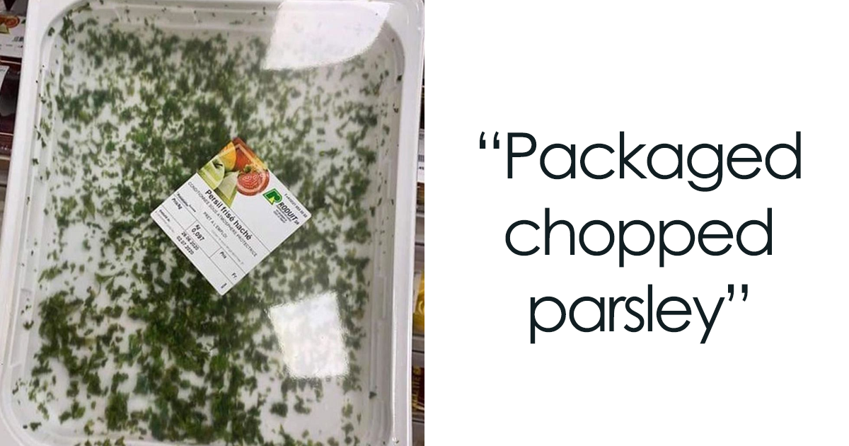
Food packaging has a difficult job. It must protect the p and open without turning lunch into an escape-room challenge. Most packages manage this quietly. Others fail so spectacularly that consumers feel morally obligated to photograph them, review them, and warn the internet.
The funniest food packaging fails usually begin with a tiny design decision: a window placed over the only full cookie, a resealable zipper that never seals again, or a serving suggestion that depicts a banquet while the box contains six lonely crackers. Yet bad packaging is not always harmless comedy. Misleading space, unclear claims, hidden allergens, confusing date codes, and vague disposal instructions can affect value comparisons, food safety, waste, and consumer trust. U.S. regulators require truthful labeling, while consumer and public-health groups continue to push for clearer claims and easier-to-read information.
Why Bad Food Packaging Makes People So Angry
Packaging is a promise made in cardboard, plastic, glass, or foil. The image promises abundance. The label promises clarity. The tear strip promises cooperation. When the actual experience delivers half a bag of air, microscopic instructions, and a lid that fights back, consumers do not merely see a design mistake. They feel tricked.
That reaction is understandable. The Fair Packaging and Labeling Act was created in part to prevent unfair or deceptive packaging and help shoppers compare value. Nutrition claims can also shape a product’s health halo, even when the rest of the package tells a more complicated story. Meanwhile, inconsistent date labels contribute to unnecessary food disposal, and unclear recycling instructions can contaminate recycling streams.
30 Food Packaging Fails That Deserved the Complaints
1. The Cereal Box Full of Confidence
The box looked family-sized. The inner bag looked emotionally unavailable. After opening it, the cereal occupied roughly the bottom third, while the remaining space appeared reserved for hopes, dreams, and premium-priced oxygen.
2. The Cookie Window With Strategic Camera Angles
A clear window displayed several beautiful cookies. Once opened, shoppers discovered that the visible treats sat in carefully positioned grooves while most of the tray was sculpted plastic. Hollywood has used less flattering set design.
3. The “Resealable” Bag That Retired Immediately
The zipper worked exactly once: during the factory demonstration. At home, the tracks refused to align, crumbs entered the mechanism, and the bag became permanently open. A clothespin was promoted to chief freshness officer.
4. The Tear Here Tab That Meant “Find Scissors”
The package printed a cheerful arrow beside a reinforced corner apparently made from bridge cable. Pulling stretched the plastic. Twisting bruised the snack. Eventually, scissors completed the task the tear strip had publicly volunteered to do.
5. The Yogurt Lid With a Splash Zone
Peeling the foil created enough pressure to launch yogurt onto a shirt, countertop, and nearby appliance. Breakfast became an abstract art project, and the package’s only clean surface was the part nobody needed to clean.
6. The Sauce Bottle That Alternated Between Nothing and Everything
A gentle squeeze produced silence. A slightly firmer squeeze produced half the bottle. The nozzle offered no middle setting, transforming a reasonable serving of sauce into a condiment emergency requiring additional food to restore balance.
7. The Frozen Meal With a Fictional Serving Photo
The front showed a deep bowl overflowing with vegetables and glossy sauce. Inside sat a shallow tray containing three peas, two carrot cubes, and noodles arranged with the enthusiasm of employees attending a mandatory meeting.
8. The Snack Pack Designed for Dollhouses
The package looked like a normal lunchbox snack until the scale became clear. The crackers were tiny, the cheese portion was thinner than a business card, and the dessert section held one bite with ambitious branding.
9. The Label Printed in Ant-Sized Font
Ingredients, preparation directions, and allergen information were squeezed into text that required perfect lighting and suspiciously youthful eyesight. Important information should not feel like the final question on an optometrist’s exam. FDA rules require major allergens to be declared clearly on regulated foods. e Nutrition Panel Hidden Under the Fold
The package technically included the facts, but placed them beneath a seam that crumpled every time the bag moved. Reading the sodium content required flattening, rotating, and negotiating with the product like an ancient scroll.
11. The “Natural” Product Wearing a Forest Costume
Leaves, mountains, wooden spoons, and an earth-toned label created an aura of wholesome simplicity. The ingredient list told a longer story. Attractive scenery is not a nutrition credential, no matter how peaceful the illustrated sunrise looks.
12. The Health Claim Doing All the Talking
“Made with whole grains” appeared in enormous letters, while the amount and context lived elsewhere in tiny print. Front-of-package claims can create a health halo, so smart shoppers still check serving size, ingredients, added sugars, and sodium. e Serving Size From an Alternate Universe
A small bag clearly designed for one person quietly claimed to contain multiple servings. The calorie count looked friendly until multiplied by the number of servings anyone with ordinary human snack behavior would actually eat.
14. The Date Code Printed Like a Secret Password
The “best by” date appeared in faint ink on a dark crimp, partly covered by a production code. Consumers should not need a flashlight, a decoder ring, and forensic training to learn when crackers peak.
15. The Date Label That Explained Nothing
Was it a sell-by date, a quality date, or a safety warning? The package offered one mysterious date and no context. Research has repeatedly found widespread consumer confusion about date-label language, contributing to needless food waste. e Box With a Side Door to Nowhere
A perforated opening promised convenient dispensing. Following the dotted line ripped the box diagonally, released several portions at once, and destroyed any chance of closing it. Convenience had entered through the side door and immediately left.
17. The Carton That Dribbled After Every Pour
The spout redirected milk, broth, or juice down the side of the container with remarkable consistency. Each pour required a towel, making the package less of a carton and more of a countertop hydration system.
18. The Plastic Clamshell With No Peaceful Entry
The container protected a few berries as though they were classified documents. Tabs bent, corners cut fingers, and the lid suddenly sprang open, scattering fruit. The berries were safe; everyone else’s dignity was not.
19. The Individually Wrapped Individually Wrapped Snack
A large bag contained smaller bags, each holding a plastic tray, each compartment sealed beneath another film. By the time the snack appeared, the consumer had generated enough packaging to build it a guesthouse.
20. The Tiny Product in the Luxury-Sized Box
A modest chocolate bar rested inside a rigid tray, decorative sleeve, oversized carton, and glossy wrap. The unboxing experience suggested fine jewelry. The product itself suggested Tuesday afternoon at a gas station.
21. The Compostable Claim With Missing Instructions
The package said “compostable” but did not clearly explain whether that meant backyard composting or an industrial facility. Environmental claims need practical context; otherwise, the label becomes a comforting adjective with nowhere useful to go.
22. The Recyclable Package Made of Five Materials
Paper, plastic film, foil, adhesive, and a mystery lining were fused together, yet a recycling symbol appeared confidently on the side. Local programs vary, and clear disposal directions are essential for preventing contamination. e Straw Attached With More Plastic Than the Drink Needed
A tiny beverage arrived with a plastic straw in a plastic sleeve glued to a plastic wrapper around a plastic container. The drink lasted four minutes. Its entourage appeared prepared for a geological era.
24. The Cap That Fell Inside the Food
A loose inner seal, detached ring, or tiny plastic plug dropped directly into the product during opening. Nothing improves appetite like fishing packaging components out of dinner while wondering whether another piece escaped notice.
25. The Instructions Written After the Package Was Designed
Heating directions were squeezed around curves, interrupted by seams, and divided across panels. Step two appeared before step one, while the wattage adjustment hid under a flap. Dinner became a reading-comprehension exercise with steam.
26. The QR Code That Led to the Homepage
The label promised recipes, sourcing details, or disposal instructions. The code opened a generic corporate homepage and left the shopper to search again. Effective QR codes need clear context and a destination that delivers what was promised. e Flavor Color System Nobody Could Decode
Two varieties used nearly identical colors, illustrations, and typography. One was mild; the other could remove wallpaper. A tiny flavor name was the only warning, proving that branding consistency can become dinner roulette.
28. The Package That Looked Like a Different Product
A beverage resembled household cleaner, candy resembled medicine, or a savory pouch looked like baby food. Shelf appeal matters, but basic category recognition matters more. Nobody wants a pantry stocked through accidental identity swaps.
29. The Accessibility-Free Grip
A smooth lid required strong hands, dry fingers, and excellent wrist mobility. Older adults and people with limited dexterity were treated as edge cases. Good packaging should open for real bodies, not only laboratory-perfect hands.
30. The Redesign That “Fixed” What Wasn’t Broken
A familiar package gained a fashionable cap, narrower base, hidden opening direction, and less stable shape. Consumers complained because the redesign added steps without adding value. New is not automatically improved; sometimes it is merely shinier confusion.
What These Packaging Design Mistakes Have in Common
The worst food packaging fails violate one of four basic expectations. First, the package should represent the amount and appearance of the food honestly. Second, essential product labeling should be readable and understandable. Third, the container should open, pour, close, and store as promised. Fourth, disposal claims should match real-world recycling or composting systems.
These expectations are not extravagant. They are the minimum terms of the relationship between a product and the person paying for it. Packaging trade publications have documented complaints about caps that resist opening, zippers that fail, and perforations that refuse to tear. Consumer advocates likewise warn that isolated claims can distract from the complete nutrition picture. e packaging creates another credibility problem. The EPA describes containers and packaging as a major part of the material waste stream, which makes unnecessary layers more than a visual annoyance. A package that uses less material, protects food effectively, and gives accurate disposal guidance can reduce frustration without sacrificing safety.
Real-Life Experiences With Bad Food Packaging
Nearly everyone has a personal packaging villain. Mine is the resealable pouch that opens beautifully but never closes again. The first pull is smooth, almost elegant. Then a few crumbs settle into the zipper, the tracks shift by half a millimeter, and the feature advertised in bold letters becomes decorative trim. From that moment forward, freshness depends on folding the bag three times and balancing another object on top.
Another familiar experience is the suspiciously large box. You pick it up and immediately notice that it weighs less than expected, but the artwork is persuasive. The bowl on the front is overflowing. The product name uses a typeface normally reserved for championship banners. At home, the inner bag ends far below the top. Some empty space may protect food or accommodate machinery, but consumers cannot see those engineering reasons. They only see a package that appeared to promise more.
Then there is the opening battle. A perforated strip tears halfway and changes direction. The plastic film separates from its tab. The foil lid leaves a razor-thin ring around the rim. You try a knife, reconsider because the container is unstable, switch to scissors, and finally transfer the food into another dish because the original package is now structurally compromised. A supposedly convenient product has created extra tools, extra cleanup, and extra language unsuitable for children.
Confusing labels create a quieter kind of frustration. Imagine standing in a grocery aisle comparing two products while someone waits behind you. One package says “natural,” another says “simple,” and both display cheerful farms. The meaningful details are in small print on the back. You rotate each package, compare serving sizes, discover that the portions differ, and realize the prominent claims did not answer the question you actually had. The design succeeded at attracting attention but failed at supporting a decision.
Date codes produce a similar moment at home. A jar has one stamped number on the lid, another near the barcode, and no words indicating what either number means. The food smells normal, but uncertainty wins. The jar goes into the trash, not because it was clearly unsafe, but because the package did not communicate clearly enough to earn trust. That is how a few missing words can turn usable food into waste.
Disposal is often the final chapter of the bad-packaging experience. A pouch says it is recyclable, but it combines film, foil, and a rigid spout. The local recycling guide does not mention it. The brand website offers broad sustainability language but no practical answer. After several minutes of research, the package goes into the trash. The consumer is left feeling guilty for failing a system that never gave usable instructions.
The lesson from these experiences is simple: good food packaging should disappear into the meal. It should protect the product, communicate clearly, open without drama, and leave no mystery about storage or disposal. When packaging becomes the most memorable part of the food, it is usually not because the box delivered a standing ovation.
Conclusion: Packaging Should Help, Not Heckle
Funny packaging mistakes are irresistible because they turn ordinary snacks into tiny acts of betrayal. Yet behind the jokes is a serious design principle: consumers notice when a package wastes their time, hides useful information, exaggerates value, or creates unnecessary trash.
The best food packaging is honest, legible, accessible, efficient, and pleasantly boring to use. It opens when asked. It closes when promised. It shows the product without optical tricks. It explains dates, allergens, serving sizes, and disposal without forcing shoppers to conduct an investigation. Brands that get those basics right rarely go viral for the wrong reasonand that may be the highest compliment packaging can receive.
SEO Information
Note: The 30 examples are composite, illustrative scenarios based on recurring consumer complaints, public labeling guidance, and documented packaging-design failure patterns. They are not allegations about unnamed brands.