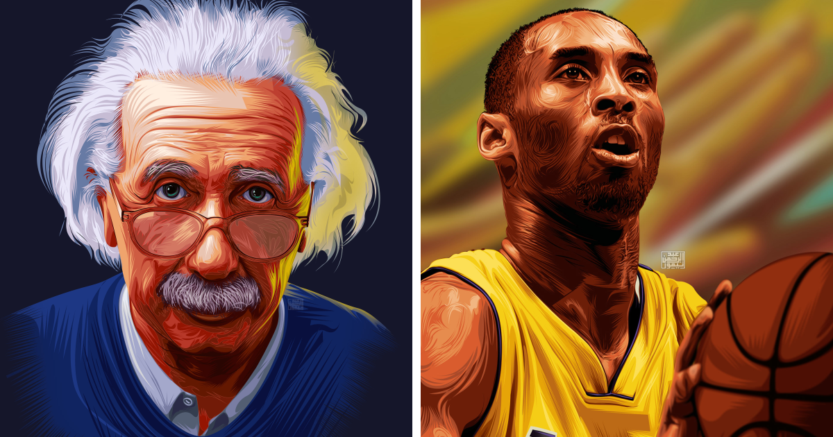
Digital art portraits are where classic portraiture shakes hands with pixels, stylus pressure, glowing screens, and the occasional accidental brushstroke that somehow looks better than the plan. At their best, they are not just polished profile pictures or pretty wall art. They are tiny visual biographies. They capture a face, yes, but also a mood, a memory, a personality, and sometimes the exact expression someone makes when they are trying to look “casual” but absolutely knows they are being drawn.
My digital art portraits begin with the same old question artists have asked for centuries: who is this person, really? The answer is rarely found in perfect symmetry or flawless skin. It is usually hiding in the tilt of a chin, the softness around the eyes, the way hair refuses to obey gravity, or the small details a camera may record but only an artist can interpret. Digital portrait art gives me the freedom to shape those details with color, texture, light, and style while keeping the subject recognizable and emotionally honest.
In a world overflowing with selfies, filters, avatars, and profile icons, a custom digital portrait feels surprisingly personal. It slows the image down. It says, “Look again.” Whether the artwork is realistic, painterly, cartoon-inspired, semi-abstract, or fashion-editorial dramatic, the goal remains the same: to create a portrait that feels alive before it ever gets printed, framed, posted, gifted, or used as a profile picture that quietly says, “Yes, I have excellent taste.”
What Makes Digital Art Portraits Different?
A traditional portrait often carries the physical memory of its materials: oil paint, graphite, watercolor, charcoal, canvas, paper. A digital portrait carries a different kind of memory. It remembers layers, revisions, brush settings, color palettes, reference images, exported files, and the artist’s decisions along the way. The medium is modern, but the artistic challenge is timeless. A portrait still has to communicate presence.
Digital art portraits are not simply photographs with a filter slapped on top like a cheap hat. A strong digital portrait is built. It involves sketching, composition, anatomy, value structure, edge control, color harmony, lighting, expression, and storytelling. The software may offer shortcuts, but it does not replace taste. A brush tool can make a line, but the artist decides whether that line whispers, sings, or trips over its own shoelaces.
The biggest advantage of digital portrait illustration is flexibility. I can test warm lighting, cool shadows, bold backgrounds, muted tones, painterly textures, clean vector-style shapes, or expressive sketch lines without destroying the original work. Layers allow experimentation. Undo buttons encourage courage. Color wheels and eyedroppers help refine the mood. Custom brushes can imitate oil paint, pencil, ink, watercolor, pastel, airbrush, or textures that do not exist in the physical world unless someone has invented “neon velvet thunder dust.”
The Artistic Heart of a Digital Portrait
Every digital portrait starts with observation. The face is important, but the feeling is more important. A technically accurate drawing can still feel empty if it misses the sitter’s personality. That is why I study more than features. I look at posture, expression, clothing, accessories, hairstyle, eye direction, and the emotional temperature of the reference. Is the person confident, dreamy, playful, elegant, mysterious, loud, quiet, rebellious, romantic, or powered entirely by iced coffee?
Portraiture has always been connected to identity. A portrait can reveal how someone sees themselves, how others see them, or how the artist chooses to interpret them. Digital tools make that conversation even more flexible. A person can be placed in a soft pastel background, a dramatic cinematic glow, a futuristic city, a floral dreamscape, or a simple blank space that lets the face do all the talking. Each choice changes the story.
Likeness Is Only the Beginning
Good portrait art needs likeness, but great portrait art needs character. Likeness says, “That looks like her.” Character says, “That feels like her.” The difference is huge. One is a visual match; the other is emotional recognition.
In my digital art portraits, I often exaggerate or soften certain elements to create a stronger impression. A bright smile may receive warmer highlights. Thoughtful eyes may get sharper contrast. A bold personality may call for energetic brushwork and saturated colors. A peaceful subject may look better with gentle edges and quiet tones. The point is not to copy every pore like a facial-recognition robot with art supplies. The point is to make the portrait feel true.
My Digital Portrait Workflow
While every portrait has its own personality, my process usually follows a clear structure. Having a workflow keeps the creative chaos friendly. Without one, digital painting can become a wild jungle of unnamed layers, mysterious brush settings, and files called “final_final_really_final_please_stop.psd.” We have all been there. We do not speak of it.
1. Choosing the Reference and Concept
The reference photo matters. A clear image with good lighting makes the process smoother, but the best reference is not always the most polished one. Sometimes a candid photo has more life than a formal pose. A slightly imperfect smile, windblown hair, or natural expression can make the portrait feel human.
Before sketching, I decide the overall concept. Is this portrait meant to be elegant, modern, soft, bold, romantic, playful, professional, or fantastical? A digital portrait for a personal brand may need clean lighting and confident posture. A pet portrait may need humor and charm. A memorial portrait may need warmth and tenderness. A gift portrait may need visual details that connect to the recipient’s hobbies, favorite colors, or meaningful memories.
2. Sketching the Structure
The sketch is the skeleton of the portrait. I block in the head shape, angle, facial proportions, shoulders, hair mass, and main expression. At this stage, I avoid over-detailing. The goal is to build a strong foundation. If the eyes are slightly misplaced or the head angle is wrong, no amount of fancy rendering will save it. That is like decorating a cake that is sliding off the table.
I usually work loosely at first, using simple lines and shapes. Once the proportions feel right, I refine the features. The eyes, nose, mouth, jawline, and hairline all need careful attention, but I try not to make them stiff. A portrait should breathe. Even clean digital line art needs rhythm.
3. Building Values and Lighting
Value is the pattern of light and dark in an image. It is one of the secret engines of portrait art. Before worrying about exact colors, I focus on the light source. Where is the brightest highlight? Where are the deepest shadows? Does the light come from above, the side, the front, or behind? A strong light plan makes the portrait readable, even when viewed as a small thumbnail.
Digital tools are especially useful here. I can separate shadows, midtones, and highlights on different layers, adjust opacity, and test contrast quickly. Soft light creates intimacy. Hard light creates drama. Rim light adds cinematic flair. A glowing background can make the subject pop, while a darker background can create depth and seriousness.
4. Choosing a Color Palette
Color controls mood. Warm colors can feel friendly, nostalgic, sunny, or romantic. Cool colors can feel calm, futuristic, elegant, or introspective. High saturation creates energy. Muted colors can feel sophisticated and timeless. The right palette turns a portrait from “nice drawing” into “I want this on my wall immediately.”
For skin tones, I avoid using just one flat color. Real skin contains subtle shifts: reds, yellows, browns, blues, violets, greens, and reflected light from the environment. Digital painting makes it easy to sample, adjust, and blend, but the trick is not to over-blend. Too much smoothing can make a face look plastic. A little texture keeps the person alive.
5. Rendering the Face
The rendering stage is where the portrait gains depth. I paint the planes of the face, refine the eyes, shape the nose, build the lips, and define the cheeks, forehead, jaw, and neck. I use soft edges where forms turn gently and sharper edges where contrast or focus is needed. The eyes usually receive the most attention because viewers naturally look there first.
Hair is another major part of the portrait’s personality. Instead of drawing every strand, I paint hair in masses first, then add selected details. This keeps the hairstyle from turning into spaghetti. Highlights, flyaways, curls, waves, and texture are added strategically. The goal is believable movement, not a forensic hair inventory.
6. Adding Texture and Style
Digital portraits can be polished, but they should not always be sterile. Texture adds soul. A pencil grain, painterly brush mark, halftone pattern, canvas effect, paper texture, or loose edge can make the work feel hand-crafted. I like combining clean areas with expressive marks so the portrait feels finished without becoming lifeless.
Style depends on the purpose. A family portrait may call for warmth and softness. A fashion-inspired portrait may need bold contrast and graphic shapes. A fantasy portrait may include glowing effects, dramatic colors, or symbolic objects. A social media avatar may need strong silhouettes and readable features at a small size.
Why People Love Custom Digital Portraits
Custom digital portraits have become popular because they are personal, flexible, and easy to share. A digital file can become a framed print, phone wallpaper, social media avatar, website image, sticker, greeting card, poster, canvas print, or gift. It can be delivered quickly without shipping delays, and it can be adapted into different sizes or formats.
They also feel more meaningful than generic decor. A portrait of a person, couple, family, friend, or pet carries a story. It can celebrate a birthday, anniversary, graduation, wedding, new business, personal milestone, or memory of someone loved. Even a playful cartoon portrait can become deeply sentimental when it reflects the subject’s personality.
Digital Portraits for Personal Branding
A digital portrait can help creators, freelancers, coaches, writers, musicians, podcasters, and small business owners stand out online. A professional headshot is useful, but an illustrated portrait can feel more distinctive. It gives a brand visual personality. It can be polished without feeling corporate, creative without feeling chaotic, and memorable without requiring the subject to pose in front of a brick wall pretending to laugh at an invisible joke.
For personal branding, I usually recommend clean composition, strong facial clarity, and colors that match the person’s website or brand identity. The portrait should work as a profile image, but it should also look good larger on an About page, media kit, or promotional graphic.
Digital Portraits as Gifts
A custom digital portrait makes a memorable gift because it says, “I thought about you specifically.” It is not a random object grabbed from a shelf. It can include favorite outfits, pets, flowers, books, instruments, locations, hobbies, or inside jokes. The best gift portraits balance beauty with recognition. The recipient should see themselves and also feel seen.
Pet portraits deserve a special mention because animals bring excellent drama to art. A cat can look like royalty, a dog can look like a cheerful mayor, and a rabbit can look like it knows secrets from a previous century. Digital tools make it easy to turn pet photos into charming, painterly, funny, or regal portraits.
How I Make Digital Portraits Look Professional
Professional-looking digital portrait art is not about using the most expensive software or downloading 900 brushes. It is about making good visual decisions consistently. The fundamentals matter: drawing, values, edges, color, composition, anatomy, and storytelling. Fancy tools can help, but they cannot rescue weak choices.
Clean Composition
A strong portrait has a clear focal point. Usually, that focal point is the face, especially the eyes. I use contrast, detail, and lighting to guide attention. The background should support the subject, not wrestle them for the spotlight like an overexcited theater kid.
Readable Silhouette
The overall shape of the portrait should be readable. Hair, shoulders, clothing, and accessories help create an interesting silhouette. If the image looks strong even when blurred or reduced to a small size, the composition is usually working.
Controlled Details
Not everything needs equal detail. In fact, too much detail everywhere can make a portrait exhausting. I place the sharpest details near the focal area and let less important parts stay softer. This creates depth and keeps the viewer’s eye moving naturally.
Color Consistency
Color harmony helps the portrait feel intentional. I often limit the palette or repeat key colors in the background, clothing, shadows, and highlights. This creates unity. Even a colorful portrait needs discipline. Otherwise, it can start looking like a paint store exploded politely.
Digital Art Portraits and AI Tools
AI has become part of the modern art conversation, especially in digital spaces. Some artists use AI for brainstorming, mood boards, background concepts, or quick visual exploration. Others avoid it completely. For my digital art portraits, the most important value is human creative direction. The choices that matter mostexpression, emotion, composition, color, style, and final refinementcome from artistic judgment.
When AI-assisted tools are involved in any artwork, transparency matters. Clients and viewers deserve clarity about how a piece was made, especially if it is being sold. Human authorship, originality, and ethical source use are important topics for digital artists. The strongest digital portraits are not impressive because a tool exists. They are impressive because someone used tools thoughtfully to make meaningful visual choices.
Preparing Digital Portraits for Print and Web
A portrait may look beautiful on a tablet screen, but it still needs proper preparation for its final use. A file for Instagram does not need the same resolution as a large wall print. A website portrait should be optimized for fast loading while keeping crisp detail. A print file should be high-resolution, correctly sized, and checked for color shifts.
For web use, I usually prepare versions in common formats such as JPG or PNG, depending on whether transparency is needed. For print, I pay attention to dimensions, resolution, and color appearance. Since screens glow and paper reflects light, printed colors can look different from digital colors. This is why proofing and careful export settings matter.
If a portrait is being sold online, the listing or portfolio description should be clear. Buyers want to know what they receive: file type, size, turnaround time, revision policy, printing rights, and whether the artwork is for personal or commercial use. Good communication prevents confusion and keeps the creative process happy for everyone involved.
How to Display My Digital Art Portraits Online
An online portfolio should make digital portraits easy to enjoy. The images should be high quality, but the page should not load like it is carrying a grand piano uphill. A clean layout, simple navigation, strong thumbnails, and short descriptions can help visitors understand the work quickly.
For each portrait, I like including a short note about the concept, style, or process. This helps viewers connect with the artwork beyond the image. However, the description should not over-explain the piece. Art needs room to breathe. A good caption opens the door; it does not drag the viewer through it by the collar.
Portfolio Tips for Digital Portrait Artists
First, show your strongest work, not every experiment you have ever made since discovering the brush tool. Second, organize portraits by style or category if you offer multiple options. Third, include close-up crops so viewers can appreciate details. Fourth, make your commission process easy to understand. Fifth, use natural, specific language instead of stuffing descriptions with repeated keywords.
Search engines reward helpful, relevant content, but human readers are the real audience. A portfolio page should include phrases people actually search for, such as custom digital portrait, digital portrait illustration, personalized portrait art, pet portrait, family portrait, profile picture illustration, and digital painting commission. These keywords should appear naturally in headings, image alt text, and descriptions.
My Favorite Types of Digital Art Portraits
I enjoy several styles of digital portrait art because each one tells a different kind of story. A realistic digital painting can feel intimate and timeless. A semi-realistic portrait can balance likeness with stylization. A cartoon portrait can bring humor and charm. A painterly portrait can feel emotional and expressive. A minimalist portrait can be elegant and modern. A fantasy-inspired portrait can turn someone into the main character of a novel they have not written yet.
One of my favorite approaches is the modern painterly portrait. It keeps the subject recognizable but allows visible brushwork, rich colors, and expressive lighting. Another favorite is the editorial-style portrait, where the person looks ready for a magazine cover, album release, or very dramatic coffee order. I also enjoy warm family portraits that turn everyday photos into keepsakes with softness and emotional depth.
Common Mistakes in Digital Portrait Art
One common mistake is over-smoothing the skin. Real faces have texture, planes, and subtle color changes. When everything is blended into plastic perfection, the portrait loses life. Another mistake is ignoring values. Even beautiful colors will fall flat if the light and dark structure is weak.
A third mistake is using too many brushes too soon. Brush variety is fun, but it can become distracting. Strong art usually comes from controlled decisions, not from throwing every texture at the canvas and hoping one of them pays rent. A fourth mistake is copying a photo too literally. A digital portrait should interpret, not merely trace the surface of reality.
What My Digital Art Portraits Mean to Me
For me, digital portraits are a conversation between observation and imagination. I am looking at a person, but I am also building an atmosphere around them. I want the final piece to feel familiar and slightly magical, like the subject has stepped into a version of themselves that was always there but needed color, light, and a little artistic confidence to appear.
Each portrait teaches me something. Some teach patience. Some teach restraint. Some teach me that hair has a personal agenda. Some remind me that small details can carry huge emotional weight. A catchlight in the eye, a relaxed shoulder, a favorite necklace, or a certain smile can change the entire artwork.
Personal Experiences Behind My Digital Art Portraits
My experience with digital art portraits has taught me that the most important part of the process often happens before the first polished stroke. It begins with listening. When someone asks for a portrait, they are usually not asking for “a face.” They are asking for a feeling. They may want confidence, memory, beauty, humor, love, or transformation. Understanding that emotional goal changes the entire artwork.
I have learned to ask what the portrait is for. A portrait made for a professional profile needs a different mood from one made as an anniversary gift. A portrait for a musician might need rhythm, contrast, and attitude. A portrait of a child may need softness and wonder. A pet portrait may need the exact sparkle of mischief in the eyes, especially if the pet has a known history of stealing socks, snacks, or emotional control of the household.
One experience that always stays with me is how people react to small personal details. A simple background color might remind someone of their favorite place. A tiny flower in the corner might connect to a wedding bouquet. A certain hoodie, pair of glasses, or hairstyle might make the portrait feel more authentic than perfect lighting ever could. These details are not decorative extras. They are emotional anchors.
Digital painting has also changed the way I handle mistakes. In traditional media, a mistake can feel terrifying. In digital art, mistakes become part of the exploration. I can duplicate a layer, try a dramatic lighting effect, change the background, repaint the expression, or test a completely different color palette. This freedom makes me braver. It also makes the final portrait stronger because I am not trapped by the first idea.
At the same time, digital tools have taught me discipline. Infinite options can become a problem. It is easy to keep adjusting a portrait forever: one more highlight, one more texture, one more tiny correction that only the artist and perhaps a very judgmental eagle would notice. Over time, I have learned that finishing is also an artistic skill. A portrait is done when it communicates clearly, not when every pixel has attended a formal etiquette class.
Another lesson is that style develops through repetition. At first, it is tempting to imitate every artist you admire. That is normal. Study is part of growth. But eventually, your own preferences begin to appear. You notice the colors you return to, the brush marks you enjoy, the kinds of faces you love painting, and the emotional tones that feel most natural. Your style is not something you invent in one dramatic lightning-bolt moment. It is something you recognize after making enough work.
Sharing digital portraits online has taught me the value of presentation. A strong portrait deserves a clean crop, a readable thumbnail, and a description that helps viewers understand what they are seeing. People connect with process too. Showing a sketch, color block-in, or before-and-after detail can make the artwork feel more human. Viewers enjoy seeing how a portrait grows from rough shapes into a finished piece.
Client communication has been another major part of the experience. Clear expectations make the process smoother. I like to explain what reference photos work best, how revisions are handled, what file formats are included, and how long the portrait may take. This protects both the artist and the client. Creativity feels better when everyone knows where the road is, even if the scenery gets wonderfully imaginative.
The most rewarding moments happen when someone sees the finished portrait and recognizes more than the likeness. They recognize the mood, the personality, or the memory. That reaction is why I love digital portrait art. It combines technology with deeply human storytelling. The screen may be digital, but the connection is real.
Conclusion
My digital art portraits are more than illustrated faces. They are personal stories shaped with sketching, color, lighting, texture, and interpretation. Digital tools make the process flexible, but the heart of the portrait remains human. A great portrait does not simply show what someone looks like. It reveals presence, personality, and emotion.
Whether used as a meaningful gift, a personal brand image, a family keepsake, a pet tribute, or a creative profile picture, a custom digital portrait offers something rare in today’s fast-moving visual world: an image made with intention. It slows down the scroll, honors the subject, and turns pixels into personality. And if it also makes someone say, “Wow, that is so me,” then the portrait has done its job beautifully.