AI website builders have become the digital equivalent of a microwave dinner: fast, surprisingly decent, and occasionally suspicious around the edges. Type in your business name, describe your dream site, pick a vibe, and within minutes you have a homepage, copy, images, buttons, contact forms, and enough stock-photo smiles to power a dental brochure.
But speed is not the same as user experience. A website can look polished and still confuse visitors, bury the call to action, load like it is walking through syrup, or use color contrast that makes your “Book Now” button disappear like a magician at tax season. So the real question is not whether AI website builders can create websites quickly. They clearly can. The better question is: Do AI website builders follow UX best practices well enough to launch with confidence?
To answer that, we evaluated popular AI website builder patterns against widely accepted UX principles: clear navigation, responsive design, accessibility, readable content hierarchy, performance, trust signals, search optimization, conversion flow, and human editability. The result? AI website builders are excellent at creating a first draft. They are not yet excellent at knowing whether that first draft is actually the right experience for real users.
What Counts as Good UX in 2026?
Good UX is not just “pretty design.” It is the practical art of helping people do what they came to do without making them mutter dark things at their laptop. A strong website should answer three questions quickly: Where am I? What can I do here? Why should I trust this?
For our test, we used a UX checklist built around proven fundamentals. We looked for simple navigation, scannable page structure, mobile-friendly layouts, accessible color and text choices, fast-loading pages, visible calls to action, form clarity, content usefulness, and whether the design supported the user’s intent instead of merely decorating it.
That matters because AI website builders often optimize for “complete-looking” pages. Humans optimize for behavior. A page can be technically complete while still failing the visitor. If your homepage says “Empowering solutions for tomorrow’s growth” but never explains what you sell, congratulations: you have built a motivational poster with a domain name.
How We Put AI Website Builders To The Test
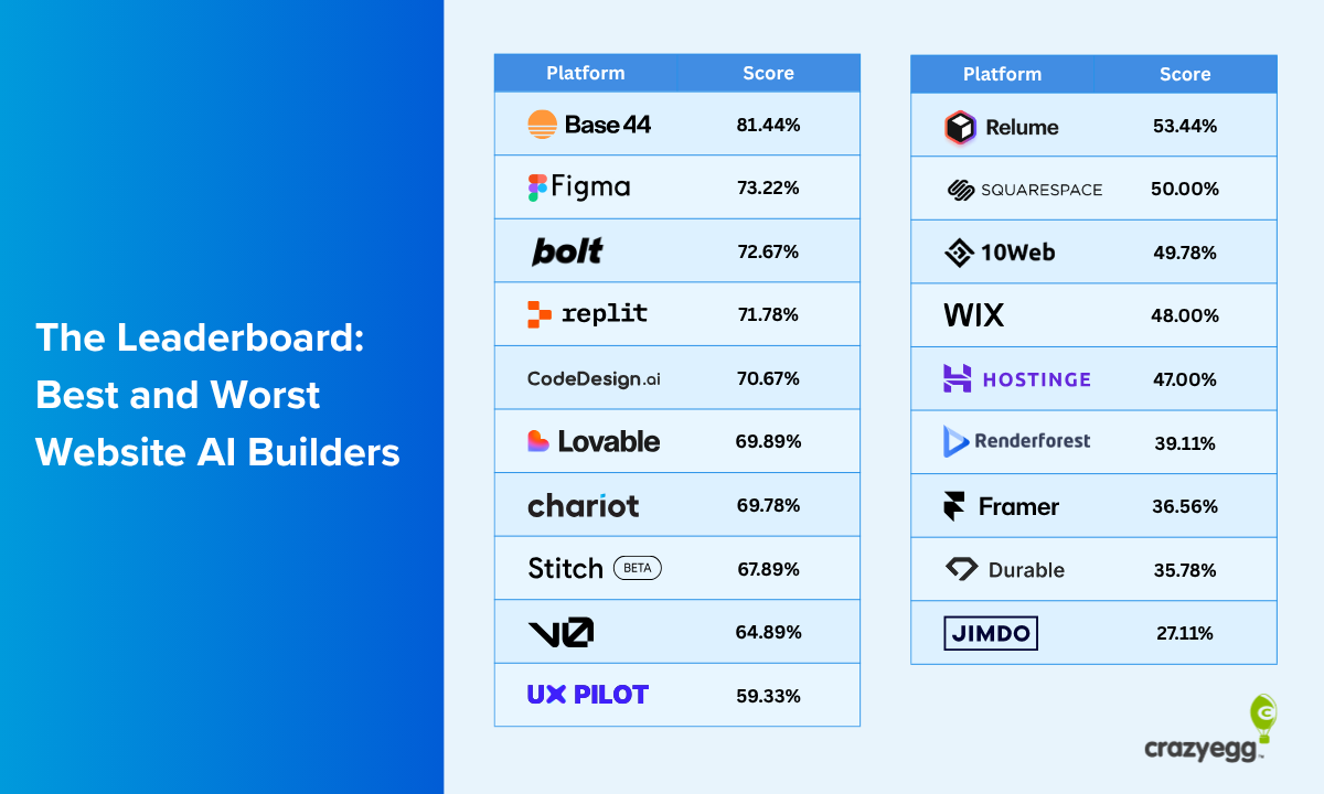
We compared the common output patterns of AI website builders such as Wix AI Website Builder, Squarespace Blueprint AI, GoDaddy Airo, Hostinger AI Website Builder, Webflow AI Site Builder, Framer AI, Durable, 10Web, HubSpot’s AI website generator, and newer AI-assisted WordPress-style builders. We focused on what these tools generally promise: fast setup, no-code editing, starter copy, responsive layouts, SEO settings, image generation or selection, and business-specific page structures.
Instead of judging them by how futuristic their marketing sounds, we judged them like a user would. Could a visitor understand the site in five seconds? Was the primary action obvious? Did the mobile layout make sense? Did the copy sound specific or like a robot wearing a blazer? Were forms easy to complete? Did the design make room for accessibility, performance, and trust?
The Good News: AI Builders Are Surprisingly Strong At The Basics
1. They Usually Create Clean First-Draft Structure
The biggest win is structure. Most AI website builders are good at creating a homepage with familiar sections: hero area, service summary, benefits, testimonials, pricing or packages, contact form, and footer. That is not revolutionary, but it is useful. A small business owner who starts with a blank screen often freezes. AI gives them a working skeleton in minutes.
This is especially helpful for service businesses, portfolios, restaurants, consultants, salons, fitness coaches, photographers, and local contractors. The AI usually understands that a bakery needs menu highlights, location details, ordering options, and photos. A consultant needs credibility, services, testimonials, and a lead form. A portfolio needs project sections and a strong personal introduction.
In UX terms, this means AI builders reduce the “blank canvas problem.” They give users a conventional page flow that visitors already understand. Conventional is not boring when the alternative is chaos wearing a gradient.
2. Responsive Design Is Usually Built In
Modern AI website builders generally produce responsive layouts by default. This is a major advantage over old DIY site-building days, when mobile design sometimes looked like someone folded a desktop website into a suitcase. Today’s AI-generated pages usually stack sections properly, resize images, and keep buttons tappable on phones.
That does not mean mobile UX is always perfect. AI layouts may still create long scrolling pages, oversized hero images, cramped text blocks, or mobile menus with vague labels. But the baseline is much better than it used to be. For many simple websites, AI builders pass the first mobile-responsiveness test: the site does not immediately embarrass itself on a smartphone.
3. Starter SEO Is Better Than Expected
AI website builders are increasingly aware of SEO basics. Many tools generate page titles, meta descriptions, headings, URL slugs, alt text suggestions, and industry-relevant copy. That helps beginners avoid launching a homepage titled “Home” with one paragraph that says, “Welcome to our website.”
However, SEO-friendly does not always mean search-ready. AI may create generic service pages that sound nice but lack real expertise, local detail, product depth, comparison information, or original experience. Search engines and users both reward usefulness. A page about “premium landscaping services” is weaker than a page explaining seasonal lawn care, drainage issues, local soil conditions, project timelines, and before-and-after proof.
Where AI Website Builders Still Miss UX Best Practices
1. The Copy Often Sounds Polished But Empty
This was the most common problem. AI-generated copy is smooth, but it often says very little. Phrases like “tailored solutions,” “seamless experience,” “passionate team,” and “unlock your potential” appear everywhere. They are grammatically fine and emotionally vacant. They are the beige wallpaper of web copy.
Good UX copy is specific. It tells users what they get, what happens next, how much effort is required, and why the business is credible. Bad UX copy floats above reality. For example, an AI builder may write, “We provide innovative wellness solutions for modern lifestyles.” A better version would say, “Book a 45-minute physical therapy session for back, shoulder, or knee pain. Same-week appointments available in Austin.”
The second version wins because it removes uncertainty. Users do not want poetry when they are trying to solve a problem. They want clarity.
2. Navigation Can Be Too Generic
Most AI builders create standard navigation labels: Home, About, Services, Blog, Contact. That is safe, but not always optimal. A restaurant may need “Menu,” “Reservations,” and “Private Events.” A law firm may need “Practice Areas,” “Case Results,” and “Consultation.” An ecommerce brand may need category-first navigation, filters, and product discovery paths.
AI tends to understand page types but struggles with user priority. It may place “About” too prominently while hiding the action users care about most. A visitor looking for pricing, booking, location, shipping, or support should not have to go spelunking through dropdowns.
3. Accessibility Needs Human Review
Many AI website builders now include accessibility-aware features, but accessibility is not something you can sprinkle on at the end like parsley. It must be checked. Color contrast, keyboard navigation, focus states, form labels, heading order, link text, image alt text, motion effects, and error messages all matter.
AI may choose attractive color palettes that are not readable for everyone. It may generate decorative images without useful alt text. It may create heading sequences that look visually correct but make little sense to screen readers. It may add animations that are stylish for some users and distracting for others.
The practical takeaway is simple: AI can help build an accessible foundation, but it should not be treated as an accessibility auditor. Before publishing, run manual checks and automated scans, then test keyboard navigation yourself. If you cannot use the website without a mouse, some of your users cannot either.
4. Performance Can Be Hit Or Miss
AI-generated websites often look polished because they use large images, background videos, animation, embedded widgets, third-party scripts, and fancy visual effects. Unfortunately, the browser still has to load all that glitter. Performance is UX. If a page loads slowly, users leave before they ever admire your tasteful hero image of a laptop next to a fern.
Some builders provide strong hosting, image optimization, and performance settings. Others create pages that need trimming. Common issues include oversized images, too many fonts, unnecessary animations, heavy app integrations, and scripts added “just in case.” A simple local service site does not need to behave like a movie trailer.
5. Forms Often Need Serious Editing
Forms are where good intentions go to trip over a required phone-number field. AI builders usually create contact forms, but they often include too many fields or vague labels. A visitor may be asked for name, email, phone, company, budget, project type, message, preferred contact method, timeline, shoe size, moon sign, and possibly their childhood hopes.
Good form UX asks only for what is needed at that stage. A newsletter signup needs an email address, not a full biography. A consultation form may need a little more context, but it should still feel easy. Labels should be clear, error messages should be helpful, and the submit button should explain the next step, such as “Request a Quote” or “Book a Free Call.”
AI Website Builders vs. Human UX Designers
AI website builders are not replacing UX designers in serious projects. They are replacing the awkward first draft. That is valuable, but it is not the same job.
A human UX designer asks questions AI often skips: Who are the users? What are they afraid of? What information do they need before they convert? What objections stop them? What does the analytics data show? Where do visitors abandon the process? What accessibility needs are being ignored? What language do real customers use?
AI can generate a layout. A UX designer can explain whether that layout matches user behavior. AI can write button text. A UX writer can test whether that button reduces hesitation. AI can create three homepage versions. A strategist can decide which one supports the business model.
The smartest workflow is not AI versus humans. It is AI for speed, humans for judgment.
Which Types Of Websites Benefit Most From AI Builders?
Great Fit: Simple Business And Portfolio Sites
AI website builders are very useful for simple sites that need to launch quickly: personal portfolios, local service pages, coaching websites, event pages, landing pages, restaurants, salons, freelancers, and early-stage business ideas. These sites usually need clear information, a few strong calls to action, contact options, and basic SEO. AI can get them 70% of the way there quickly.
Possible Fit: Ecommerce And Lead Generation
AI can help ecommerce sites with product descriptions, category pages, homepage sections, and promotional landing pages. But ecommerce UX is more complex. Product filters, search, checkout flow, shipping clarity, return policies, product comparison, trust badges, and mobile checkout all need careful attention. AI can create a store; it cannot automatically guarantee a smooth buying journey.
Risky Fit: Complex Products And Regulated Industries
Healthcare, finance, legal services, SaaS platforms, education, government, and enterprise websites need deeper review. These sites often involve compliance, accessibility obligations, trust concerns, technical documentation, account flows, data privacy, and high-stakes decisions. AI can support content drafting and layout exploration, but publishing without expert review is risky.
Our UX Scorecard: How AI Builders Performed
Visual polish: Strong. Most AI builders can create modern-looking pages quickly, especially for simple industries.
Information architecture: Mixed. Basic page structures are good, but navigation often needs customization based on actual user intent.
Mobile responsiveness: Generally strong. Most tools produce responsive layouts, though long pages and oversized sections remain common.
Accessibility: Improving but not automatic. Built-in tools help, but manual review is essential.
SEO foundation: Good for basics. Titles, descriptions, headings, and starter copy are useful, but content depth usually needs human improvement.
Conversion UX: Mixed. AI understands calls to action, but not always persuasion, trust, objections, or the right sequence of information.
Performance: Depends on the builder and edits. Image-heavy designs and extra scripts can slow pages down.
Brand differentiation: Weak to moderate. AI layouts can look clean but familiar. Strong branding still requires human taste, original visuals, and sharper messaging.
How To Make An AI-Built Website Follow UX Best Practices
Start With A Better Prompt
Do not prompt the AI like this: “Make me a website for my business.” That is how you get a digital smoothie made of buzzwords. Instead, include your audience, location, services, differentiators, tone, pages needed, primary call to action, and examples of what users care about.
Try: “Create a mobile-friendly website for a family-owned plumbing company in Phoenix that offers emergency repairs, water heater installation, and drain cleaning. The main goal is phone calls. Emphasize same-day service, licensed technicians, upfront pricing, reviews, and service-area pages.”
Edit The Hero Section First
The hero section should explain what you do, who it is for, and what users should do next. Replace vague headlines with specific value. “Reliable Home Cleaning in Denver, Bookable Online in 60 Seconds” beats “Transforming Spaces With Care.” The first one sells. The second one sounds like a candle label.
Check Every Page On Mobile
Mobile is not optional. Open every page on a phone. Check the menu, buttons, forms, image cropping, spacing, and text size. Make sure the most important action is easy to reach. If your thumb has to train for a marathon to find the contact button, fix it.
Run Accessibility And Performance Checks
Use accessibility scans, contrast checkers, keyboard testing, and performance tools before publishing. Compress images, remove unnecessary sections, avoid excessive animation, and use readable font sizes. The goal is not to impress another designer. The goal is to help real people use the site.
Replace Generic AI Copy With Real Proof
Add testimonials, case studies, credentials, photos of real work, pricing guidance, process explanations, FAQs, guarantees, and specific service details. AI copy often creates the shape of trust. Real proof fills it in.
Final Verdict: Do AI Website Builders Follow UX Best Practices?
Yes, partially. AI website builders follow many surface-level UX best practices: responsive layouts, recognizable page structures, clear section patterns, starter SEO, and easy editing. They are excellent for getting from zero to something. That is a huge advantage for small businesses, creators, and teams that need momentum.
But AI website builders do not fully understand your users. They do not know your customer objections, your analytics, your sales process, your brand nuance, or your accessibility responsibilities. They can generate a professional-looking website, but professional-looking is not the same as user-tested, conversion-ready, inclusive, and strategically sound.
The best approach is to treat AI like a junior designer with superhuman speed and questionable taste in generic adjectives. Let it create the draft. Then let human judgment do the serious UX work.
Experience Notes: What It Feels Like To Build With AI Website Builders
The first experience most people have with an AI website builder is delight. You type a few sentences, answer some questions, and suddenly there is a website. It has a logo area, navigation, a hero image, service cards, buttons, a contact form, and copy that sounds confident enough to run for city council. Compared with starting from scratch, it feels magical.
Then the second feeling arrives: editing. This is where the romance becomes a relationship. You notice the headline is almost right, but not quite. The services are close, but one is missing. The AI chose a photo of smiling people in a conference room, even though your business repairs garage doors. The call-to-action button says “Learn More,” when what you really need is “Call Now.” Nothing is disastrous, but everything needs a little human steering.
The best experience comes when the builder gives you control without making you feel like you accidentally opened an aircraft dashboard. Wix and Squarespace-style builders are comfortable for beginners because they guide choices. Webflow and Framer-style tools can feel more powerful but also more demanding, especially if you care about layout precision. Business-focused tools like GoDaddy Airo, Durable, Hostinger, and HubSpot are appealing because they connect the website to practical needs: domains, marketing, CRM, analytics, and lead capture.
The biggest practical lesson is that AI builders reward users who know what they want. If you have a clear audience, clear services, real photos, strong proof, and a defined call to action, the AI becomes very useful. If you only have a vague idea, it will happily produce a vague website. It is obedient, not psychic.
Another lesson is that AI-generated websites often look better than they read. The layout may feel modern, but the words need sharpening. Replacing generic claims with concrete details instantly improves UX. “We help businesses grow” is weak. “We build Shopify stores for food brands that need subscriptions, wholesale pricing, and faster checkout” is much stronger. Specificity is the cheapest UX upgrade on the internet.
Finally, publishing should not be the finish line. It should be the first checkpoint. After launch, watch how people behave. Are they clicking the main button? Are they abandoning the form? Are mobile visitors bouncing? Are users searching for pricing, location, or FAQs? AI can help build the first version, but real users tell you what the next version should become.
So yes, AI website builders can create impressive websites quickly. But the best results happen when you treat the AI output as clay, not marble. Shape it, test it, simplify it, and make it unmistakably useful. That is where good UX begins.
Conclusion
AI website builders are no longer toys. They are practical tools that can produce usable, attractive, mobile-friendly websites faster than most people can find their old hosting password. But they are not magic UX machines. They need human review for accessibility, performance, copy clarity, navigation, conversion flow, and brand trust.
For small businesses and creators, AI builders are a smart starting point. For complex, high-stakes, or revenue-critical websites, they should be part of the workflow, not the whole workflow. The winning formula is simple: let AI move fast, then let UX best practices make it work.