The kitchen is where coffee happens, dinner happens, and, if we are being honest, at least one life decision gets made while staring into the refrigerator. So when a kitchen starts to feel dated, it is not just a style problem. It changes the whole mood of the room. And according to designers, the fastest way a kitchen ages is not always the layout. More often, it is the finish choices: the cabinet sheen, the countertop pattern, the backsplash color, the hardware tone, and the overall mix of materials.
That is why this topic matters so much. A kitchen can have a perfectly functional floor plan and still feel trapped in 2004 because the finishes are doing all the wrong kind of talking. The good news is that “dated” does not always mean “terrible.” Many older finishes were popular for good reasons. They felt rich, polished, trendy, or easy to maintain at the time. But design priorities have shifted. Today, designers consistently favor kitchens that feel warmer, calmer, more layered, and less obviously tied to one short-lived trend cycle.
So which kitchen finishes are making designers wince a little? Below is a deep dive into the looks that often age a kitchen fast, why they now read as tired, and what feels fresher without turning your remodel into a social media costume party.
Why Finishes Date a Kitchen Faster Than Almost Anything Else
Cabinetry, countertops, backsplash tile, and hardware cover a huge amount of visual real estate. In plain English, they are the first things your eyeballs notice before your brain even has time to say, “Nice island.” When those elements lean too hard into one era, the whole room can feel stuck there.
Designers today are not rejecting personality. Far from it. What they keep pushing back against is a one-note look. Kitchens with warmth, texture, and a sense of restraint tend to age better because they do not scream one specific year. The goal is not a kitchen with zero character. It is a kitchen whose character survives trends.
1. Speckled Brown Granite That Dominates the Room
For years, dark brown and black speckled granite was the king of “upgraded” kitchens. If it came with a matching 4-inch backsplash strip, even better. Or worse, depending on your point of view.
Designers now tend to see this finish as one of the biggest instant date stamps in a kitchen. The issue is not granite itself. Natural stone can still look beautiful. The problem is the heavily speckled brown family of granite that was everywhere in the late 1990s and early 2000s. It often reads visually busy, heavy, and a little gloomy, especially when paired with dark cabinets and bronze hardware.
Busy stone also fights for attention. Instead of letting cabinetry, lighting, or architecture breathe, the countertop becomes a giant field of visual static. It can make even a decent-size kitchen feel smaller and more cluttered.
What designers prefer instead
More current kitchens lean toward surfaces with either gentler movement or a more natural, grounded texture. Think quartzite, honed stone, quieter quartz patterns, or even butcher block in the right setting. The modern vibe is less “look at all this pattern” and more “this material has depth without yelling at me.”
2. High-Gloss Cherry and Red-Toned Wood Cabinets
There was a time when cherry cabinets looked luxurious, polished, and expensive. And in the right historic or traditional home, they still can. But in many everyday kitchens, especially ones with a glossy finish, red-toned cherry now feels like a throwback to an era of ornate trim, decorative corbels, and Tuscan-style everything.
Designers have been especially vocal about red and honey-toned woods that visually overpower the room. These finishes can throw a warm orange-red cast over everything around them, making the kitchen feel darker, heavier, and less flexible. Pair them with a dark stone countertop and suddenly the room starts feeling like it wants to sell you olive oil from a themed gift shop.
The same goes for high-gloss cherry finishes. The shinier and redder the cabinetry gets, the more it reads like a trend rather than a timeless material choice.
What designers prefer instead
Natural-looking wood finishes are still very much in the conversation, but the newer favorites are lighter, softer, and more organic. White oak, walnut, rift-cut oak, and medium woods with muted undertones feel calmer and more current. Satin and matte finishes also help wood look richer and less theatrical.
3. Honey Oak That Feels Builder-Grade, Not Beautiful
Honey oak is probably the most misunderstood finish in kitchen history. On one hand, wood is back. On the other hand, not every wood tone gets to return wearing a tiny crown and a “timeless icon” sash.
Designers often say honey oak cabinetry dates a kitchen when the finish leans strongly yellow or orange and the door profile looks overly basic or overly busy. It tends to remind people of spec homes, dated suburban remodels, or kitchens that have not been touched since flip phones ruled the earth.
That does not mean every oak kitchen is doomed. The problem is usually the combination of the stain color, the sheen, and the cabinet style. Yellow-heavy oak with raised-panel doors can look stuck in the past. More natural oak with a soft finish can look warm and intentional.
What designers prefer instead
If you like wood, keep the grain but tone down the yellow. Neutralized oak, mushroom-toned stains, and matte sealers can make wood cabinetry feel sophisticated again. In some kitchens, even a simple hardware update and a less harsh wall color can dramatically improve older oak cabinets.
4. Faux-Distressed, Glazed, or “Antique” Cabinet Finishes
Artificially aged cabinetry had a serious run. Distressed paint, decorative glazing, rubbed edges, crackle finishes, and faux antique treatments were all meant to give kitchens a collected, old-world charm. The result often looked less “European heirloom” and more “brand-new cabinet trying very hard to cosplay as grandma’s armoire.”
Designers now regularly call this finish family outdated because it feels overly styled and a little forced. In many kitchens, distressed cabinets can make the space seem visually messy before a single dish has even hit the sink. The same goes for dramatic glazes that settle into grooves and emphasize decorative trim in a way that feels heavy.
Today’s kitchens tend to look better when the finish speaks plainly. Clean paint, visible natural wood grain, and subtle texture feel more honest. The room still has personality, but it does not look like it came with a fake backstory.
What designers prefer instead
Sleek painted cabinetry in satin or matte, slab or simple shaker doors, and finishes that age naturally rather than artificially. A cabinet can still feel storied and warm without looking intentionally roughed up.
5. Cool Gray Everything
If the 2010s had a mascot, it might have been a gray kitchen with gray floors, gray backsplash tile, gray cabinets, and a gray personality crisis. Gray is not inherently bad. But designers keep pointing out that kitchens drenched in cool gray now feel flat, sterile, and overly safe.
The issue is monotony. A gray-on-gray-on-gray palette can drain the room of warmth and make everyday materials feel lifeless. Many gray kitchens were also designed with mismatched undertones, which is how you end up with blue-gray cabinets fighting green-gray tile while everyone involved pretends things are going well.
Another problem is that all-gray kitchens often read like flips rather than homes. They feel designed for resale photos instead of actual living.
What designers prefer instead
Warmer neutrals are leading the pack now: cream, taupe, mushroom, putty, greige with warmth, muted olive, soft blue-green, and natural wood tones. The mood is calmer, softer, and less chilly. In short, the kitchen finally stopped acting like an airport lounge.
6. Stark White Finishes with No Warmth or Contrast
This one needs nuance. White kitchens are not automatically dated. In fact, a well-executed white kitchen can still be classic. What designers are increasingly moving away from is the sterile, all-white kitchen with no tonal variation, no texture, and no hint that a human with feelings lives there.
When cabinets, backsplash, walls, counters, and even decorative accents all live in the same bright-white universe, the space can feel clinical. It may photograph beautifully at first glance, but in real life it can come across as cold, unforgiving, and a little too eager to show every crumb.
This is especially true when white finishes are paired with shiny surfaces and harsh lighting. Instead of “timeless,” the kitchen can start reading as “builder basic wearing expensive shoes.”
What designers prefer instead
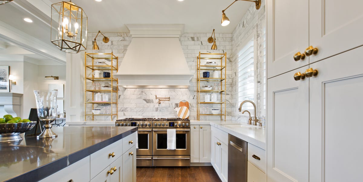
Designers still like light kitchens, but with warmth. Creamy whites, off-whites, handmade tile, warm metals, wood accents, and tactile materials help a pale kitchen feel layered rather than lifeless. White can absolutely stay; it just needs friends.
7. Busy Mosaic Backsplashes and Border Tile Details
Remember when the kitchen backsplash was expected to do absolutely the most? Tiny glass mosaics, mixed stone strips, decorative inserts, metallic pieces, and little border accents all had their moment. That moment has now packed its bags.
Designers increasingly view overly busy backsplash finishes as one of the fastest ways to age a kitchen. Small-scale mosaics can feel fussy. Border details often interrupt the wall visually rather than enhancing it. And highly reflective glass mosaics can push the kitchen into a style zone that feels very specific to the early 2000s and 2010s.
The problem is not detail itself. It is detail without calm. If the countertop has movement, the floor has pattern, the hardware has personality, and the backsplash is also doing gymnastics, the room loses balance.
What designers prefer instead
More current kitchens often use full-height slab backsplashes, larger-format tile, zellige, natural stone, or simple ceramic with a handmade look. Texture is welcome. Chaos is not.
8. Matte Black and Painted Metal Hardware That Feels Too Trend-Stamped
Matte black hardware had a meteoric rise because it offered contrast and looked modern. The problem, according to many designers, is that it became the default choice in too many kitchens, especially when combined with white shaker cabinets and other trend-heavy details. At that point, it stopped feeling sharp and started feeling predictable.
Some designers are also critical of painted metal finishes in general when they look flat or cheap. In kitchens, hardware gets touched constantly, so finishes that feel authentic and age gracefully usually win in the long term.
That does not mean black hardware is banned forever. It just means it can look dated faster when it is used as a shortcut to “modern,” rather than as part of a larger, well-considered material palette.
What designers prefer instead
Polished nickel, satin nickel, unlacquered brass, aged brass, and other living finishes are getting more love because they feel classic and develop character over time. They also tend to play well with both painted cabinetry and natural wood.
9. Tuscan-Inspired Finishes That Feel Too Themed
There is a difference between warmth and full theatrical production. Designers continue to move away from kitchens that lean too hard into Tuscan-inspired finishes: dark glazed cabinets, ornate bronze hardware, tumbled stone backsplashes, golden-beige walls, heavy corbels, and reddish-brown tile all stacked together in one room.
Individually, some of these elements can still work. Together, they often make a kitchen feel like it has not updated its playlist since 2006. The biggest issue is that the look can become costume-like. Instead of feeling naturally warm, it feels heavily themed.
What designers prefer instead
Earthy kitchens still matter, but they are now edited more carefully. Designers favor warmth through natural wood, soft stone, creamy plaster-like colors, quieter tile, and restrained metal finishes. The new version of warmth is more relaxed and less busy.
What Actually Looks More Timeless Right Now
If there is one clear direction emerging from designer advice, it is this: timeless kitchens feel grounded, not gimmicky. They rely on authentic materials, warmer undertones, subtle variation, and a finish palette that does not look copied from one trendy social post.
That can mean flat-panel or simple shaker cabinets, natural or lightly stained wood, creamy painted finishes, polished nickel or unlacquered brass hardware, quieter stone, slab backsplashes, and surfaces with texture but not visual overload. The point is not to make the kitchen boring. The point is to make it livable, layered, and less likely to embarrass you in six years.
Designer-Led Experiences Homeowners Keep Having With Dated Kitchen Finishes
One of the most interesting things about kitchen design is that homeowners usually do not notice a finish feels dated all at once. It sneaks up on them. A person can live happily with glossy cherry cabinets for years, then suddenly one day replace a light fixture, paint the walls, or swap out a bar stool and realize the cabinets are now loudly narrating the wrong decade. Designers talk about this kind of moment all the time. The kitchen was functional the whole time, but visually it stopped making sense with how people want their homes to feel now.
Another common experience happens during resale prep. A homeowner thinks the kitchen is the strongest room in the house because it once cost a lot of money to remodel. Then a stager walks in, pauses politely, and starts suggesting ways to tone down the granite, update the hardware, and distract from the backsplash. That can be a humbling experience, but it also reveals something important: expensive does not always equal enduring. A pricey finish can still date a room if it was highly trend-driven to begin with.
There is also the maintenance reality. Many finishes that once looked glamorous have aged poorly in everyday life. High-gloss cabinets show fingerprints. Black glass tile shows water spots. Stark white surfaces highlight every splash of pasta sauce like it is auditioning for a crime show. Open shelving looked airy in magazine spreads but often left homeowners dusting mugs they never even liked that much. Designers increasingly listen to these lived experiences, which is one reason current kitchens are becoming warmer, more practical, and less performative.
Homeowners also frequently discover that the easiest updates bring the biggest emotional relief. They do not always need a full renovation. Replacing matte black pulls with polished nickel, changing a backsplash, repainting overly gray cabinets, or adjusting lighting temperature around red-toned wood can shift a kitchen dramatically. Many people are surprised by how much lighter and more current the room feels once the finish palette becomes less harsh and more cohesive.
And then there is the most relatable experience of all: regret by inspiration overload. Someone sees a trendy kitchen online, copies every finish exactly, and ends up with a room that looks current for about eleven minutes. Designers repeatedly warn against this because the most satisfying kitchens are usually not trend collages. They are edited spaces built around how the room is used, how the light behaves, and how materials interact day after day. That is why so many professionals now push homeowners toward natural wood, softer colors, and finishes with authenticity. Those choices tend to wear in, not wear out.
In the end, the kitchens people love longest usually are not the ones chasing novelty the hardest. They are the ones that feel balanced, useful, and warm enough to survive breakfast, holidays, homework, and the occasional late-night refrigerator stare-down. Designers are not saying you need a soulless “safe” kitchen. They are saying your finishes should support the room instead of stealing the spotlight for reasons that age badly. That is a pretty good design rule, and honestly, not a terrible life rule either.
Conclusion
Kitchen finishes that look dated usually have one thing in common: they were too attached to a specific trend moment. Speckled brown granite, glossy cherry cabinets, faux-aged paint treatments, cold gray palettes, busy mosaic backsplashes, and overly stark white or black finish schemes all tend to age a kitchen faster because they feel one-dimensional. Designers are now leaning toward softer, more natural, and more tactile choices that still look stylish without trying so hard.
If you are updating your kitchen, the smartest move is not chasing whatever is hottest this second. It is choosing finishes that feel warm, balanced, and believable in your home. In other words, let your kitchen be memorable for the meals and conversations, not because the backsplash is still emotionally attached to 2011.