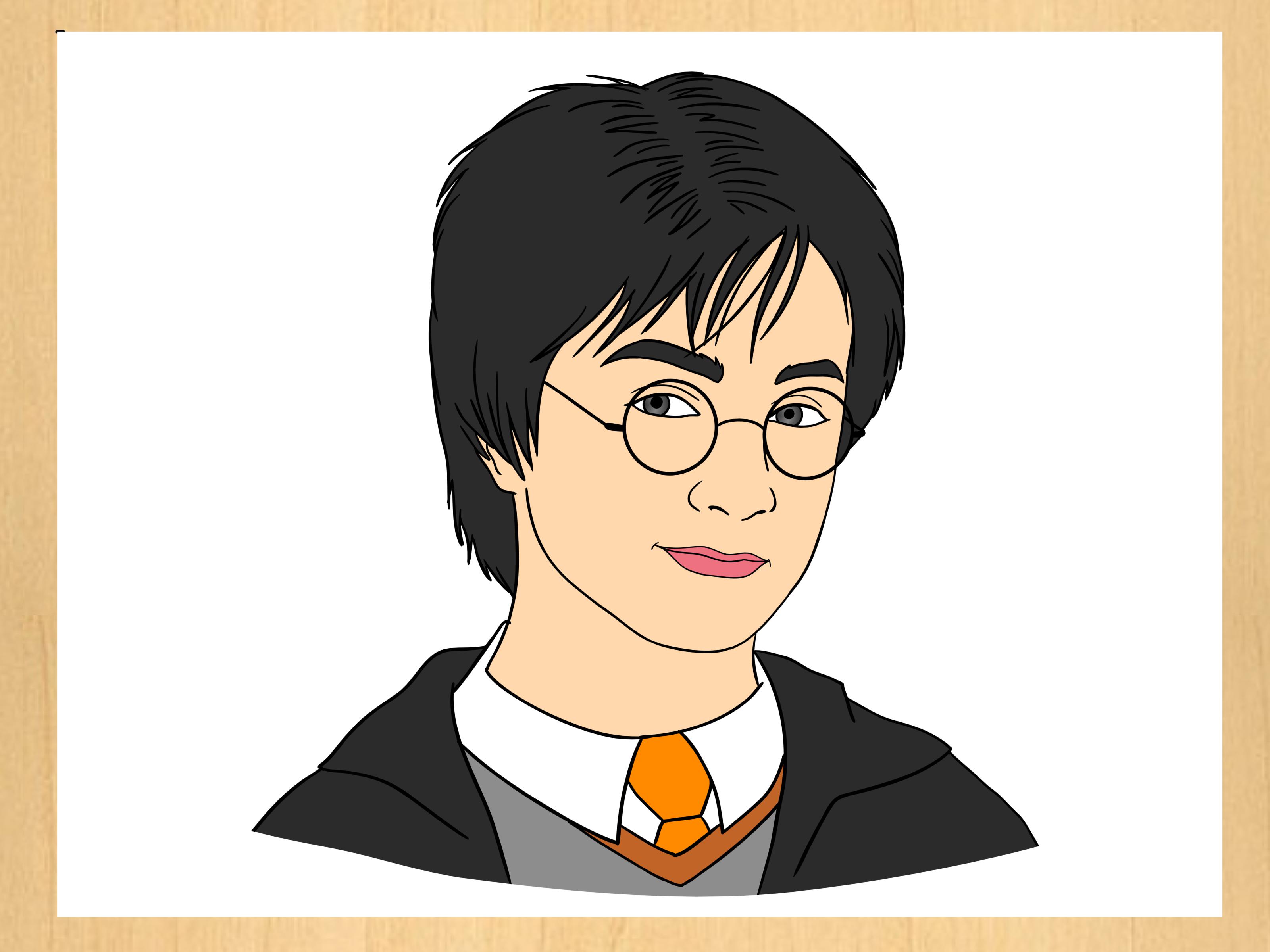
Learning how to draw Harry Potter is a little like attending your first class at Hogwarts: the supplies seem mysterious, the instructions require concentration, and something may look mildly cursed before it looks magical. Fortunately, drawing is much safer than experimenting with unidentified potions.
This step-by-step Harry Potter drawing tutorial will help you create an recognizable portrait using simple shapes, facial guidelines, controlled shading, and iconic details. You can follow it with ordinary pencils or adapt the process for colored pencils, markers, or digital drawing software.
The goal is not to copy every wrinkle from a movie still. It is to understand the character’s visual identity and build your own polished fan-art interpretation. Once the round glasses, unruly hair, lightning-shaped scar, and Hogwarts clothing appear, even a relatively simple sketch begins to say, “Yes, I probably left my broom somewhere inconvenient.”
Choose the Harry Potter Version You Want to Draw
Before touching the paper, decide which interpretation you want to create. Harry changes considerably throughout the story, so a first-year student and an older, battle-ready wizard require different proportions and expressions.
A simple cartoon version
A cartoon Harry Potter drawing is ideal for beginners. Use a larger head, simplified facial features, oversized glasses, and clean outlines. The proportions do not have to be realistic, which gives you more freedom to exaggerate recognizable details.
A realistic portrait
A realistic approach depends more heavily on accurate facial proportions, subtle values, and careful observation. If you use a reference image, study the large shapes first. Do not begin by counting individual hairs or shading the pupils into tiny black holes. Structure comes before decoration.
A book-inspired interpretation
You can also design Harry from the literary description rather than following a particular actor. Emphasize messy black hair, round glasses, a slim build, a lightning-bolt scar, and green eyes. This approach lets you create an original version while preserving the character’s best-known traits.
Materials for a Harry Potter Pencil Drawing
You do not need a trunk full of enchanted equipment. A modest collection of ordinary art supplies is enough:
- Sketch or drawing paper
- An H or 2H pencil for light construction lines
- An HB pencil for general outlines
- A 2B or 4B pencil for dark hair, shadows, and clothing
- A kneaded or precision eraser
- A pencil sharpener
- A blending stump or clean tissue, if desired
- Colored pencils or markers for a color version
- A ruler for checking alignments
Sketch paper works well for practice, while heavier drawing paper is better for a finished portrait because it can accept more graphite and repeated erasing. Keep your early lines faint. Pressing hard during the construction stage can leave grooves that survive every erasing spell known to Mugglekind.
How to Draw Harry Potter Step by Step
Step 1: Establish the head shape
Begin with a light circle representing the upper part of the skull. Add two gently angled lines descending from the sides, then connect them with a rounded chin. For a young Harry, keep the jaw narrow and soft. An older version can have a slightly longer face and more defined jawline.
Draw a vertical guideline through the center of the head. Add a horizontal eye line roughly halfway between the top of the skull and the chin. These guides help keep the features aligned, especially when the head is tilted.
If Harry is looking to one side, curve the centerline around the form of the face. Thinking of the head as a three-dimensional object prevents the features from looking pasted onto a flat oval.
Step 2: Mark the facial proportions
Divide the lower half of the face into manageable sections. Place the bottom of the nose approximately halfway between the eye line and chin. Position the mouth between the nose and chin, usually a little closer to the nose.
These measurements are starting points rather than magical laws. Compare each feature with your chosen reference. Ask practical questions: Is the nose wider than the space between the eyes? Where do the mouth corners align? How much forehead remains below the hairline?
Check the drawing from a distance before adding details. Correcting a misplaced eye now takes seconds. Correcting it after drawing eyelashes, reflections, and seventeen strands of hair is how villains are created.
Step 3: Draw the eyes and eyebrows
Sketch the eyes as soft almond shapes. Leave approximately one eye-width of space between them, adjusting that distance to match your design. Add circular irises partially covered by the upper eyelids. A small untouched highlight in each pupil can make the expression feel more alive.
Harry often appears alert, curious, worried, or determined. You can change his expression through the angle of the eyebrows and upper eyelids. Raised inner eyebrows create concern, while lower, more sharply angled brows suggest concentration or defiance.
Do not outline every edge with equal darkness. The upper eyelids are commonly darker because of the lashes and the shadow cast over the eyes. Softer lower lids usually look more natural.
Step 4: Add the round glasses
The glasses are among the most important elements in any easy Harry Potter drawing. Lightly create two round or slightly oval frames centered over the eyes. Join them with a small curved bridge across the nose, then extend the arms toward the sides of the head.
Do not make the frames mechanically perfect unless you want a highly graphic style. Slight variations can make a hand-drawn portrait feel more natural. However, the two lenses should remain similar in size and sit on the same perspective line.
Draw the facial features before darkening the glasses. Parts of the eyebrows and eyelids should remain visible behind the frames. You can add a small highlight along one edge of each lens, but avoid filling the entire lens with white glare unless Harry has wandered beneath the world’s most aggressive studio lamp.
Step 5: Construct the nose and mouth
Use light marks to indicate the bridge, nostrils, and shadow beneath the nose. A realistic nose rarely needs a complete outline. It is usually described more convincingly by changes in value along its sides and underneath its tip.
For the mouth, begin with the line where the lips meet. Add the upper and lower lip shapes without creating a heavy border around both. Harry can wear a subtle half-smile for a friendly portrait or a straight, tense mouth for a more dramatic scene.
Step 6: Place the lightning-bolt scar
Position the lightning-shaped scar on the forehead, typically above one eye and partly surrounded by hair. Keep it relatively small. The scar is iconic, but enlarging it until it occupies half the forehead can make it resemble an unfortunate encounter with a permanent marker.
Use angular strokes rather than one thick zigzag. For a realistic interpretation, soften the edges and vary the value. For a cartoon drawing, a clear, simple symbol works perfectly well.
Step 7: Draw Harry’s messy hair
First sketch the overall silhouette of the hair as one large shape. It should sit above the skull rather than following the circle too closely. Divide that mass into uneven locks that overlap the forehead, ears, and one another.
Avoid drawing every strand separately. Group the hair into larger dark and light sections, then add selected strands along the edges and around the scar. Vary their length and direction. Repeating identical spikes around the entire head can make Harry look less like a wizard and more like a startled hedgehog.
With graphite, use a softer pencil to deepen the shadow beneath overlapping locks. Preserve a few lighter areas where the hair catches the light. Even very dark hair needs value variation to show volume.
Step 8: Add the neck and Hogwarts clothing
Draw two lines descending from below the ears to form the neck. Add a shirt collar, tie, sweater, robe, or scarf depending on the version you prefer. Keep the shoulders broad enough to support the head but appropriate for Harry’s age and slim frame.
For a classic school appearance, sketch a V-shaped sweater opening beneath the collar and a robe falling from the shoulders. A Gryffindor scarf can be created with alternating deep red and warm gold bands. Allow the fabric to curve around the neck rather than drawing its stripes as flat horizontal bars.
Use folds to explain how the clothing hangs. Most folds begin near tension points such as the shoulders, collar, elbows, and scarf knot. A few purposeful folds look more convincing than dozens of random wrinkles.
Step 9: Include a wand or magical pose
If you want more than a head-and-shoulders portrait, lightly sketch an action line through the body before constructing the torso and arms. A diagonal pose generally feels more energetic than a perfectly upright stance.
Build the wand hand from simple forms: a block for the palm, tapered cylinders for the fingers, and a longer narrow cylinder for the wand. Hands are complicated, so use a reference showing a similar grip. Check that the wrist connects naturally to the forearm and that the fingers wrap around the wand rather than floating beside it.
You can suggest magic with curved motion lines, sparks, mist, or a concentrated glow near the wand tip. Keep these effects subordinate to the character unless the spell itself is the focus of the composition.
Step 10: Clean up the final line art
Once the proportions feel right, darken the important contours with an HB or 2B pencil. Use stronger lines beneath the hair, chin, glasses, and clothing overlaps. Keep lines thinner where light strikes the form.
Erase the construction guides carefully. A kneaded eraser is helpful because it can lift graphite gradually without creating harsh white patches. Turn the paper upside down or view it in a mirror before committing to the final outline. This changes your visual perspective and makes proportion problems easier to notice.
How to Shade the Harry Potter Drawing
Choose one clear light direction before shading. If the light comes from the upper left, shadows will generally appear beneath the hair, glasses, nose, chin, and right side of the face.
Start with the broad shadow families instead of isolated dark spots. Use the side of the pencil and light pressure to build smooth layers. Gradually strengthen the darkest values in the pupils, hair, robe openings, and cast shadows. Preserve the paper for the brightest highlights.
Hatching and cross-hatching can give the portrait a storybook or illustrated-novel quality. Smooth blending creates a softer, cinematic result. Either method works, but applying both randomly may make the face look as though it cannot decide which art class it attended.
Remember that shading should describe form. The cheek turns away from the light gradually, while the shadow cast by the glasses may have a sharper edge. Combining soft form shadows with selective hard edges creates depth.
How to Color Harry Potter
Apply colored pencil in light layers rather than pressing hard immediately. Build skin tones with peach, light brown, muted pink, and touches of cooler violet or blue in shadowed areas. Choose tones that suit your interpretation and reference.
For black hair, combine dark brown, indigo, gray, and black. This produces richer shadows than using black alone. Add warm red and gold to Gryffindor clothing, but vary the brightness as the fabric moves into light and shadow.
When creating a book-inspired Harry, green eyes provide a distinctive accent. Keep the color controlled so the eyes belong to the face rather than glowing like two tiny traffic signals.
With markers, test every color on scrap paper first and work from light to dark. With digital art, place the sketch, line art, base colors, shadows, highlights, and effects on separate layers. Locking transparent pixels or using clipping masks makes it easier to shade without coloring outside the selected area.
Background Ideas for Harry Potter Fan Art
A background can turn a character study into a complete illustration. Consider adding one of these settings or motifs:
- A softly lit Hogwarts corridor
- Floating candles and distant stone arches
- A snowy castle silhouette
- An owl perched near Harry’s shoulder
- A stack of spell books and parchment
- A circular magical glow behind the figure
- House-color banners or a patterned scarf
Keep the background less detailed and lower in contrast than the face. Atmospheric perspective, softer edges, and lighter values help Harry remain the focal point. A few carefully chosen symbols usually create more impact than squeezing the entire Wizarding World onto one sheet of letter paper.
Common Harry Potter Drawing Mistakes
Drawing details before checking proportions
Round glasses and a lightning scar cannot rescue a face whose features are drifting in different directions. Block in the skull, jaw, centerline, and feature placement first.
Making the glasses uneven
Compare the height and width of both lenses. Draw a horizontal guide through their centers and remember that a turned head changes their apparent shapes.
Attaching the hair directly to the skull
Hair has thickness. Leave space above the cranium and build the hairstyle as overlapping masses before adding individual locks.
Using only one dark value
If the pupils, hair, glasses, robe, and every shadow are equally black, the drawing loses depth. Reserve the darkest darks for a few focal areas and create several middle values.
Over-blending the face
Blending can smooth graphite, but too much produces a cloudy surface and erases useful structure. Build values with the pencil first, then blend selectively with a clean tool.
A Practice Journal: Experiences Beginners Commonly Have
The first attempt at drawing Harry Potter often teaches an amusing lesson: recognition depends more on relationships than on decorative details. A beginner may lovingly draw the scar, glasses, tie, and wand, only to discover that the eyes sit too high and the chin has wandered toward another postal code. The drawing contains every correct object, yet the portrait still feels wrong.
The most useful response is not to erase everything in frustration. Compare the width of the head with its height, examine the distance between the eyes, and check where the nose sits relative to the glasses. Correcting two or three large relationships usually improves the likeness more than polishing twenty small details.
Another common experience involves the glasses. Beginners tend to darken them early because the frames are fun and instantly recognizable. Later, they realize one lens is larger or sits higher than the other. A better routine is to draw both lenses lightly, compare them as a pair, and darken them only after the eyes and nose are stable. The frames then feel connected to the head rather than pasted onto it.
Hair creates a different challenge. The temptation is to represent “messy” by launching sharp lines in every direction. During practice, artists usually discover that believable disorder still needs structure. When the hairstyle is divided into a few major clumps, with selected flyaway strands added afterward, it becomes lively without turning into visual static.
Shading brings its own small drama. The early portrait may look clean in outline but suddenly muddy after aggressive blending. This happens when graphite is moved around before the light and shadow pattern has been planned. On the next attempt, mapping the main shadow shapes first produces a clearer face. Blending becomes a finishing tool instead of an emergency fog machine.
Using a reference also becomes easier with experience. Beginners often stare at the reference, draw from memory for several minutes, and then wonder why the result has changed. More effective practice involves frequent comparison. Look at one relationship, place it on the page, and check it immediately. Where does the scar align with the lens? How far does the hair extend beyond the temple? Where does the scarf overlap the robe?
Many artists notice significant improvement when they repeat the same subject in smaller studies. One page might contain four quick Harry Potter sketches: a front-facing head, a three-quarter view, a smiling expression, and a wand-casting pose. None needs to be finished. These studies develop proportion, gesture, and character recognition faster than spending hours trying to make one drawing flawless.
The most encouraging experience is seeing the character emerge gradually. At first, the page holds only a circle and a few guidelines. Then the glasses appear, the scar settles beneath the hair, and the expression begins to carry personality. That transformation is why drawing familiar characters is such satisfying practice. You are not merely copying symbols; you are learning how shape, value, line, and expression work together.
Keep the unsuccessful versions instead of throwing them away. Date each sketch and compare it with later work. Improvement can be difficult to feel from one day to the next, but a month of drawings provides honest evidence. Even Hogwarts students needed years of practice, and they had moving textbooks.
Conclusion
To learn how to draw Harry Potter successfully, begin with simple construction, verify the facial proportions, and add the iconic features only after the head feels solid. Round glasses, untidy hair, a subtle lightning-bolt scar, expressive eyes, and Hogwarts clothing will establish the character, while thoughtful shading and color will give him depth.
Do not expect the first sketch to arrive fully formed like a letter delivered by owl. Make small studies, use references carefully, correct large shapes before refining details, and allow your interpretation to develop. With consistent practice, you can progress from a simple Harry Potter cartoon to a detailed wizard portrait or a complete magical scene.