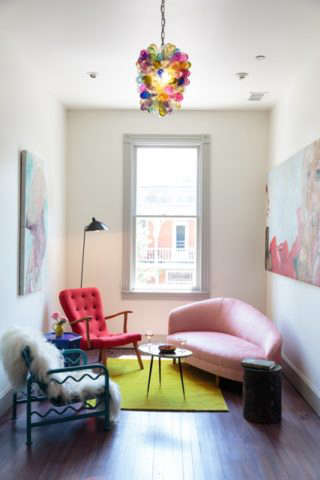
Some design studios create attractive rooms. Reunion Goods &amesrooms that appear to have hobbies, opinions, old friends, and at least one mildly embarrassing story from college.
The New York-based multidisciplinary studio is known for combining interior architecture, graphic identity, art direction, furniture, objects, and branding into one coordinated experience. Its portfolio moves comfortably among boutique hotels, restaurants, private residences, social clubs, and temporary installations. Rather than applying a recognizable “house style” everywhere, Reunion builds each project around a specific story, then carries that story through everything from floor plans and upholstery to menus, signs, artwork, and tiny details guests may not notice until their second cocktail.
That integrated approach has helped Reunion Goods & Services stand out in American hospitality design. Its work feels polished but rarely precious, nostalgic without becoming a museum, and playful without resembling a theme park designed by an overexcited committee.
What Is Reunion Goods & Services?
Reunion Goods & Services is a multidisciplinary design studio whose work brings together architecture, interior design, branding, graphic design, art curation, furniture sourcing, and product development. The studio describes its mission in terms of creating storied spaces, artful details, memorable brands, and goods that bring those stories to life.
This broad scope matters because commercial spaces are rarely experienced as isolated design disciplines. A hotel guest does not mentally separate the lobby architecture from the logo on the room key, the artwork in the hallway, or the typeface on the breakfast menu. All those elements merge into one impression. Reunion designs that impression as a complete system rather than a stack of unrelated assignments. >
A Studio Born in Transit
The firm’s origin story is suitably cinematic. In late 2011, Laura Flam, Eric Adolfsen, and Carlton DeWoody were flying over the Midwest on their way to work on Wildwood, a reclaimed 1960s ski lodge in Snowmass, Colorado. During the trip, they decided to formalize their collaboration.
The name “Reunion” reflected existing relationships among the founders. Adolfsen had known Flam since elementary school and had previously collaborated with DeWoody. The team later expanded its architectural and interior-design capabilities by joining forces with Carrie Dessertine and Dana Jaasund, who had created the studio Own Entity after working at Roman and Williams. The resulting practice combined a surprisingly wide range of skills without sanding away the personality of its individual members. >
The Reunion Goods & Services Design Philosophy
Spaces Should Tell Stories, Not Merely Follow Trends
Reunion’s projects often begin with narrative rather than decoration. The designers examine the building, neighborhood, client, audience, and cultural history before determining what the space should look like. That research may lead to preserved architectural details, locally commissioned art, a fictional character, a revived visual motif, or an unexpected color palette.
This process produces interiors that feel accumulated rather than installed. New furniture may sit beside vintage pieces. Refined marble may share a room with humorous illustrations. A traditional lounge chair may appear beneath a graphic light fixture that seems to have arrived from a much livelier decade.
The goal is not visual chaos. It is controlled layering. Each element contributes to the atmosphere, yet the room still feels usable and comfortable. That balance is difficult. Anyone can buy six eccentric lamps; convincing them to cooperate is another matter.
Branding Is Part of the Physical Environment
For Reunion, branding is not a logo applied after the interior is complete. It can influence signage, uniforms, menus, printed materials, packaging, custom tableware, artwork, wallpaper, and the tone of written language throughout a property.
This is especially valuable in hospitality design. A restaurant may have excellent food and beautiful furniture, but its identity becomes more memorable when every customer touchpoint appears to belong to the same world. When the menu graphics, exterior illustrations, plates, lighting, and interior architecture support one idea, guests understand the concept without needing a three-paragraph mission statement near the hostess stand.
Humor Works Best When It Is Embedded
Humor regularly appears in Reunion Goods & Services projects, but it is usually woven into the design rather than delivered as a loud punchline. A strange portrait, cheeky neon sign, unconventional pattern, or unexpected inscription may reward attentive visitors.
This subtlety keeps playful interiors from becoming exhausting. Guests can enjoy a room at first glance, then discover its jokes and references gradually. The humor adds humanity while allowing serious materials, historic architecture, and sophisticated craftsmanship to remain visible.
Notable Reunion Goods & Services Projects
Wildwood Snowmass: The Beginning of the Reunion Story
Wildwood Snowmass was the project that helped bring the original collaborators together. The assignment involved transforming a tired ski lodge through a spirited interpretation of 1960s mountain culture.
Rather than approaching the property as a generic luxury resort, the team leaned into bold geometry, lively graphics, vintage references, and a social atmosphere suited to après-ski gatherings. The project established several ideas that would reappear throughout Reunion’s later work: respect for an existing building, willingness to use humor, and an ability to convert nostalgia into something energetic rather than dusty.
Pinewood Social: Designing a Place for an Entire Day
Pinewood Social in Nashville combines dining, coffee, cocktails, bowling, and social gathering within a former trolley-barn environment. Reunion helped shape the creative direction and visual vocabulary, drawing on the character of historic athletic and social clubs.
The challenge was not simply filling a large space with attractive furniture. Pinewood needed to accommodate different activities and moods without feeling like several businesses trapped beneath one roof. Its lounges, tables, bowling lanes, coffee areas, and recreational features had to feel related while retaining distinct functions.
The finished environment demonstrates how hospitality design can encourage longer visits. Someone may arrive for coffee, stay for lunch, open a laptop, meet friends, and eventually find themselves wearing rented bowling shoes. That is an impressive journey for a person who originally planned to answer two emails. >
Hotel Tivoli: Art, Color, and Hudson Valley Character
At Hotel Tivoli in New York’s Hudson Valley, artists Brice and Helen Marden collaborated with Reunion on the transformation of a century-old local hotel. The 10-room property and its restaurant were filled with artwork, vintage furniture, rich color, and expressive stone surfaces.
Instead of erasing the property’s past, the renovation strengthened its role as a community gathering place. The combination of fine art, locally sourced vintage pieces, and relaxed hospitality created a setting that felt culturally significant without becoming intimidating. Guests could appreciate the work of celebrated artists while still feeling comfortable ordering dinner rather than whispering as though a museum guard might appear. >
Hotel Clermont: Preserving Atlanta’s Complicated Personality
Hotel Clermont is one of Reunion Goods & Services’ most recognizable projects. Located in Atlanta’s Poncey-Highland neighborhood, the historic building reopened as a 94-room boutique hotel after an extensive rehabilitation.
Reunion designed the hotel interiors, including the lobby bar, rooftop spaces, and Tiny Lou’s, a brasserie inspired by European dining rooms but grounded in Atlanta history. Architecture firm Gamble + Gamble handled the building’s restoration, while the famous Clermont Lounge in the basement remained in place.
The interiors combine floral patterns, vintage-inspired furniture, saturated colors, marble, velvet, portraits, and local references. The concept has been described as a collision between rock-and-roll energy and a grandmother’s living room. It sounds dangerous on paper, particularly for the lamps, but the contrast gives the hotel its charm.
Most importantly, the design does not sanitize the property into a generic boutique hotel. It acknowledges the building’s long, eccentric history and allows glamour, grit, femininity, nightlife, and neighborhood memory to coexist. >
Quality Eats: A Steakhouse That Refuses to Act Stuffy
For the Upper East Side location of Quality Eats, Reunion developed an environment that was simultaneously old-school and contemporary. The compact restaurant paired original brick with vintage pendant lights, schoolhouse chairs, custom tables, commissioned illustrations, menu graphics, and playful exterior artwork.
The design supported the restaurant’s positioning as a neighborhood steakhouse for a younger generation. Traditional steakhouse cues were present, but they were loosened with humor, approachable materials, casual graphics, and artistic details. Even the branding participated in the joke rather than standing politely in a corner.
This project shows why multidisciplinary design can be commercially effective. Customers encounter one consistent personality on the facade, menu, furniture, illustrations, signage, and table. The restaurant therefore becomes easier to recognize, describe, photograph, and remember. >
The Wayfinder Hotel: Coastal Design Without the Expected Anchors
The Wayfinder Hotel in Newport, Rhode Island, offered Reunion an opportunity to reinterpret New England coastal style. Instead of relying on predictable nautical stripes, decorative ropes, and enough miniature anchors to alarm the Coast Guard, the design team studied the colors and atmosphere of Newport’s rocky shoreline.
The hotel’s public spaces use saturated teal, burnt orange, mustard yellow, dark blue, terrazzo, textured walls, modern artwork, and playful upholstery. Guest rooms are calmer, with sage green, muted teal, and warm whites creating a residential feeling.
The brighter restaurant palette reflects the meeting of ocean and sunset, while subdued guest-room colors provide a quieter retreat. This variation demonstrates thoughtful hospitality planning: public areas can be sociable and energetic, but bedrooms should not behave as though they are still at the bar.
Local collaboration also shaped the property’s identity, including a substantial collection of work by Rhode Island artists. The result feels connected to Newport without reproducing a postcard version of it. >
Fairlane Hotel: Making a Former Bank Feel Sociable
The Fairlane Hotel occupies a former financial building in downtown Nashville. Reunion collaborated on interiors that preserved and enhanced the structure’s midcentury characteristics, including terrazzo flooring, brass details, wood paneling, and clean modern lines.
Turning an office or bank building into a hotel requires more than inserting beds where desks once stood. The original architecture must be interpreted in a way that feels intentional, comfortable, and relevant to contemporary travelers. At the Fairlane, the building’s corporate past became an asset, supporting a retro-modern identity rather than a design obstacle.
The result illustrates Reunion’s preference for working with existing character. The building does not pretend it was born yesterday, which is fortunate because very few 1970s bank towers can convincingly pull off that story. >
Osborne Building Residence: Serious Architecture, Playful Details
Reunion’s work is not limited to hospitality. In a residence inside New York’s historic Osborne building, the studio combined the sophistication of a Gilded Age setting with lively contemporary color and distinctive bathroom fixtures.
The project demonstrates that respecting historic architecture does not require decorating entirely in beige and speaking in a low voice. Bold modern elements can coexist with ornate details when their scale, color, and craftsmanship are carefully considered. The residence received recognition in the Fantini Design Awards for this balance of sophistication and playfulness. >
Why Reunion’s Multidisciplinary Model Matters
Reunion Goods & Services reflects a broader change in hospitality and commercial design. Customers no longer experience a restaurant, hotel, or social venue only as a physical interior. They encounter it through booking platforms, photographs, social media, menus, packaging, signs, staff interactions, and branded objects before, during, and after a visit.
A multidisciplinary studio can coordinate these touchpoints from the beginning. That coordination offers several practical advantages:
- A stronger identity: Architecture, interiors, graphics, and objects communicate one recognizable idea.
- More memorable guest experiences: Layered details give visitors reasons to look around, take photographs, and talk about the space.
- Better use of local history: Research can transform existing stories into meaningful design elements rather than superficial decoration.
- Greater flexibility: Vintage items, custom furniture, contemporary art, and preserved architecture can be combined instead of forcing every project into one formula.
- Commercial distinction: A complete experience is harder for competitors to imitate than a fashionable paint color or chair.
The best Reunion projects show that design can be strategic without feeling calculated. They support business objectives while preserving surprise, warmth, and personality.
What Designers and Hospitality Brands Can Learn From Reunion
Begin With Context
The history of a building, street, neighborhood, and business can supply more original material than a folder of current design trends. Context helps a project belong somewhere.
Design the Smallest Touchpoints
Guests may forget the specification of a stone floor, but they often remember an amusing menu, unusual room key, strange painting, beautiful plate, or sentence hidden on a wall. Small details make large concepts believable.
Mix Eras Instead of Copying One
Successful nostalgia does not require recreating a historical room exactly. Reunion often combines references from multiple periods with contemporary art and custom graphics. This prevents the space from feeling like a stage set.
Let Comfort Share the Spotlight
Visual impact attracts attention, but comfort determines whether people stay. Seating, lighting, circulation, acoustics, and scale remain essential, regardless of how photogenic the wallpaper may be.
Use Humor With Confidence and Restraint
A humorous detail becomes more effective when surrounded by thoughtful design. When every object is shouting a joke, the room begins to resemble an office party that should have ended an hour ago.
Experiencing a Reunion Goods & Services Space
The following is a composite experiential interpretation based on documented Reunion projects, not a claim of one specific firsthand visit.
Entering a Reunion-designed property often begins with a moment of recognition followed by a small surprise. The lobby may initially feel familiar: comfortable sofas, warm lighting, patterned rugs, a reception desk, perhaps a fireplace. Then the details begin misbehaving in the best possible way. The ceiling is unexpectedly dark. A mustard-colored architectural feature anchors the room. A portrait looks dignified until closer inspection reveals something slightly peculiar about it.
The first impression is usually not, “Someone bought everything from the same showroom.” Instead, the space feels as though it developed over time. A vintage chair seems to have known the building before the renovation. A custom table gives the room a contemporary rhythm. Modern art interrupts the nostalgia before it becomes sentimental. Nothing matches perfectly, yet the relationships among color, shape, and material keep the composition coherent.
Walking farther into the property, the story becomes easier to read. In a coastal hotel, blue may not merely mean “ocean.” It can shift from a saturated restaurant surface to a smoky bedroom wall, reflecting how the shoreline changes from bright afternoon to misty morning. Orange leather suggests sunset without requiring a giant painting of one. Natural materials and woven textiles soften the stronger colors, preventing the interior from becoming a paint-sample wrestling match.
In a historic city hotel, the experience may be more theatrical. Velvet, floral wallpaper, marble, aged portraits, vintage-inspired lighting, and references to local nightlife create the sense that the building has accumulated glamorous and questionable memories in equal measure. The design allows guests to imagine what may have happened there without presenting history as a tidy timeline.
Food and beverage spaces often deliver the most visible humor. A menu graphic may gently mock restaurant formality. Illustrations might transform familiar neighborhood imagery into something stranger. Tableware can become part of the brand voice. The jokes are not separate decorations; they make the meal feel specific to the place.
The experience also changes with time. In daylight, texture, color, and artwork dominate. In the evening, lower lighting brings out polished brass, reflective stone, and darker paint. A room that felt casual at breakfast can become seductive after dinner without requiring a complete costume change.
Another notable quality is social permission. Reunion’s interiors often suggest that visitors are allowed to settle in. Lounge seating is arranged for conversation rather than inspection. Coffee, dining, work, and recreation can overlap. At Pinewood Social, this idea becomes literal as guests move among meals, meetings, drinks, and bowling. In a boutique hotel lobby, the same philosophy appears more subtly: the room feels like somewhere to spend time, not merely a decorative corridor between the entrance and elevator.
The most successful moments arrive gradually. Guests may first notice the bold fireplace, then the artwork, then a peculiar object on a shelf. Later, they recognize that the menu typography echoes the signage or that a color introduced in the lobby reappears in the restaurant. This delayed discovery encourages people to look twice.
That may be the defining Reunion Goods & Services experience. The rooms do not reveal everything immediately. They are layered, approachable, and visually articulate, but they leave enough unresolved detail to reward curiosity. You enter a designed environment and leave with the feeling that you met a character.
Conclusion
Reunion Goods & Services has built a distinctive body of work by treating design as a connected experience rather than a collection of separate services. Architecture, interiors, branding, art, furniture, graphics, and storytelling are developed together, allowing each project to express a personality rooted in its location and history.
From the playful coastal palette of the Wayfinder Hotel to the layered Atlanta mythology of Hotel Clermont, the studio repeatedly demonstrates that memorable spaces need more than expensive materials. They need context, wit, comfort, and details that feel worth discovering.
Reunion’s work is sophisticated without becoming stiff and nostalgic without becoming trapped in the past. Most importantly, it understands that people do not visit hospitality spaces merely to admire them. They visit to eat, rest, meet, celebrate, talk, work, laugh, and occasionally bowl after answering those two emails.