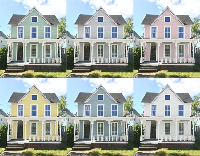
Picking a pink house color sounds simple until you are standing in the driveway holding twelve paint chips, three coffee cups, and a rapidly fading belief in your own taste. We started with one innocent idea: “Let’s do pink.” What followed was a crash course in undertones, sunlight, curb appeal, neighboring materials, and the uncomfortable truth that some pinks look elegant while others look like a dessert box escaped onto your siding. Design pros consistently recommend testing exterior colors in real light, watching how the shade changes by time of day, and thinking about how the color plays with the roof, trim, stone, landscaping, and the overall architecture of the house.
The idea began with curb appeal, not just color
We did not choose pink because it was trendy in a shallow way. We chose it because exterior color is one of the fastest ways to change the emotional temperature of a house. The best exterior palettes do more than look pretty from the street; they create a feeling. Architectural Digest, HGTV, Bob Vila, and Martha Stewart all point to the same big idea: exterior color should fit the home’s style, the setting, and the mood you want visitors to feel before they even reach the front door. That was our starting point. We wanted warm, inviting, and a little memorable without looking like a joke that would age badly.
Pink worked because it can be soft and sophisticated when the undertone is right. It can also feel coastal, vintage, modern, or cottage-like depending on how it is paired. Benjamin Moore notes that pink plays beautifully with cool grays, warm taupes, white, off-white, and even green for a balanced look. That gave us a useful clue: the house would not be “pink” in isolation. It would be pink plus all the other things around it.
Our first rule: never trust a paint chip alone
Paint chips are tiny, and tiny paint chips are liars. They flatten out undertones and make every color seem safer than it really is. Sherwin-Williams recommends looking at paint in real conditions and using large samples on the actual surface because lighting can dramatically change how a color reads. The Spruce says the only reliable way to understand undertones is to sample them in all kinds of light. Benjamin Moore makes a similar point when it explains that undertones are what make two colors that look similar on paper behave very differently in a room or on a facade. That advice saved us from choosing a pink that would have gone chalky and cold at noon and weirdly neon at sunset.
What we tested first
We painted sample boards, not just wall patches. Then we moved them around the house, leaned them against the siding, and looked at them in morning shade, midday sun, and late afternoon warmth. We also checked them beside the roof color, the front steps, the trim, and the landscape. That is exactly the sort of real-world test design sources recommend, because exterior colors do not live alone. They share a stage with other materials, and the supporting cast matters.
Why undertone mattered more than the word “pink”
We learned that “pink” is not one color. It is a family reunion. Some pinks lean peach, some lean beige, some lean lavender, some lean gray, and some lean straight into bubblegum territory like they are auditioning for a children’s party. Sherwin-Williams explains undertones as the subtle color cues that show up when a paint is compared with something else. Benjamin Moore’s pink palette and its color guidance both reinforce the same lesson: pink can be romantic, modern, grounded, or bright depending on what is underneath it. For an exterior, we wanted a pink with enough depth to feel grown-up and enough softness to avoid looking sugary.
We also paid attention to how the pink behaved next to neutral materials. Benjamin Moore’s exterior guidance shows that curated palettes are meant to create depth and beauty, not just add color for its own sake. The Spruce’s recent exterior coverage also leans toward warm, muted, or balanced tones rather than harsh whites and cold grays. That matched our instincts: the pink needed to feel lived-in, not loud.
Sunlight changed everything
Exterior paint is a moving target because the sun keeps changing its mind. A shade that feels perfect in the morning may look almost beige at noon and then suddenly glow at sunset. Sherwin-Williams specifically advises testing large samples because lighting can dramatically alter how a color appears, and it also notes that light direction affects how color behaves. That is not a small detail; it is the difference between “charming blush cottage” and “why does the house look different every hour?”
Our house gets strong direct light on one side, soft reflected light on another, and a little drama from trees that throw shadows across the facade. So we chose a pink that could hold its own in all three conditions. In direct sun it still needed to read as pink, not white. In shade it needed enough warmth to avoid looking dusty. In evening light it needed to stay calm rather than turning candy-bright. That balancing act is exactly why pros keep telling homeowners to judge exterior color where it will actually live.
The neighborhood check: friendly, not shouty
Another lesson came from looking beyond our own lot line. Architectural Digest and HGTV both stress that exterior color should fit the architectural style and surrounding context. We did not want the house to vanish into the street, but we also did not want it to scream over the fence. So we looked at nearby homes, the color of the pavement, mature trees, and the general tone of the block. The best exterior colors are noticeable because they belong, not because they are trying to win a costume contest.
That is one reason pink became more appealing than a plain gray or white. A thoughtful blush can feel classic, especially when paired with crisp trim or a grounded neutral. Martha Stewart’s 2026 exterior color coverage highlights softer, moodier, and warmer tones, including blush-adjacent shades and warm off-whites, which tells us the industry has definitely moved toward more personality without losing polish.
How we narrowed the final shade
We made a shortlist of pinks that all behaved differently. One was too peachy. One looked too dusty in the shade. One became suspiciously cheerful in the sun. One was beautiful on paper and a little too sweet on the house. We kept coming back to the same question: does this color make the house feel intentional? That question guided the final decision more than any trend forecast. Designer recommendations from magazines and paint brands kept circling back to the same thing: the right exterior color is the one that supports the architecture and the life around it.
We also looked at trim colors carefully. Benjamin Moore’s pink color guidance suggests pairing pink with white, off-white, gray, taupe, or green depending on the effect you want. That helped us understand the trim was not just a border; it was part of the whole personality. Crisp trim made the pink feel cleaner. Warmer trim made it feel softer. Green landscaping made the whole thing feel more natural and less confectionary.
Why we did not go too bright
Bright pink can be fun, but it is a commitment that can overwhelm a facade fast. Bob Vila’s guidance on dingy or awkward exterior colors includes a useful note for people who love pink: choose a pink with light undertones rather than something overly intense. That was our rule of thumb. We wanted charm, not whiplash. A softer pink also had a better chance of aging well as the house weathered, the landscaping matured, and our taste hopefully stayed intact.
The more we looked, the more we noticed that the best pink exteriors were rarely pure bubblegum. They were usually softened with beige, gray, peach, or earth tones. That aligns with broader exterior trends from The Spruce and Martha Stewart, which point toward warm neutrals, blush-tinged shades, and earthier palettes over icy or overly loud colors. In other words, the winning pink is usually a grown-up in a pink sweater, not a cartoon flamingo.
The final pick
We finally chose a blush pink with a warm undertone and enough softness to sit comfortably beside our trim and roof. It felt calm in the morning, flattering in the afternoon, and quietly romantic at night. Most importantly, it made the house look like it had a point of view. That is the best outcome in any color decision: not just pretty, but believable. The house did not look painted for attention. It looked finished.
Once the first full coat went on, we understood why pink exteriors keep showing up in design inspiration and editor-curated galleries. They can feel nostalgic without being dated, and cheerful without being childish. They also bring a softness that works surprisingly well with wood, stone, brick, greenery, and classic architectural lines. That balance is what made us stick with it.
What we learned the hard way
This was the part of the project nobody sees on the finished house: the pacing, the second-guessing, the endless comparisons, and the mild domestic diplomacy required to keep everyone from declaring a favorite too early. We learned that choosing a pink house color is less about “What is the prettiest pink?” and more about “What pink can survive real life?” That means sun, rain, dust, the roof color, the front path, the driveway, the shape of the windows, the age of the house, and the plantings that frame it. The color that wins is usually the one that behaves best in all those conditions, not the one that looks best in the paint store under flattering lights.
We also learned that pink has a reputation problem it does not deserve. People hear “pink house” and immediately imagine something loud, playful, or overly whimsical. But the right pink exterior can feel as timeless as ivory or gray if the tone is restrained and the supporting details are thoughtful. That was the revelation for us. The color itself was only half the story. The trim, the door hardware, the landscaping, the roof, the porch furniture, and the surrounding neighborhood all helped define the final effect. In that sense, the house did not become pink; it became composed.
Another lesson was patience. We almost rushed because the first sample looked lovely on a cloudy day. But when we gave ourselves time, we saw how the color changed with weather, season, and even the greenery outside. That kind of waiting is boring, but it is where good decisions happen. It is also the difference between a house you admire for a month and a house you love for years. The best exterior palettes are usually chosen slowly, with a little humility and a lot of observation.
We learned to trust balance over drama. A pink house can absolutely be bold, but bold does not have to mean brash. Our favorite version had warmth without sweetness, personality without noise, and a softness that made the whole place feel more welcoming. That was the real goal: a home that made people slow down on the sidewalk and smile, not because it was shocking, but because it felt right.
And finally, we learned that the “perfect” color is often the one that makes every other part of the house look better. When the pink was right, the trim looked cleaner, the windows looked sharper, the plants looked greener, and the whole facade suddenly had a little rhythm. That is the magic of a well-chosen exterior color: it does not just paint the house. It edits it. It gives the architecture a voice. It makes the front of the home feel finished, friendly, and unmistakably ours.
Conclusion
We picked our pink house color the same way people should pick any exterior color: by respecting light, undertone, architecture, context, and the way a color feels after the novelty wears off. The final shade worked because it was not just pink. It was a warm, balanced, lived-in blush that fit the house, the street, and the mood we wanted to create. That is the real secret. A good house color is not the loudest one in the room. It is the one that makes the whole home make sense.
Note: This article is formatted as body-only HTML for easy publishing.