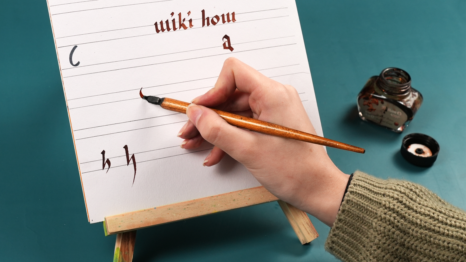
Learning how to write with a calligraphy pen can feel a little like adopting a tiny metal dragon: beautiful, dramatic, and very capable of spitting ink when offended. The good news? Calligraphy is not magic, and it is not reserved for people born with elegant handwriting and suspiciously clean desks. It is a learnable craft built from simple strokes, steady rhythm, the right tools, and a willingness to make a few gloriously wobbly letters along the way.
For beginners, the biggest mental shift is this: calligraphy is closer to drawing letters than writing them quickly. Everyday handwriting is about speed and communication. Calligraphy is about shape, pressure, spacing, contrast, and movement. You slow down, build each letter from strokes, and let the pen do what it was designed to docreate thick and thin lines that make ordinary words look like they own a velvet cape.
This guide walks you through beginner calligraphy tools, how to hold a calligraphy pen, how to create basic strokes, how to practice lowercase letters, and how to avoid the classic beginner disasters: ink blobs, scratchy nibs, feathered paper, and letters that look like they just heard bad news.
What Is a Calligraphy Pen?
A calligraphy pen is a writing tool designed to create expressive lettering through stroke variation. That variation usually comes from the shape of the nib, the flexibility of the tip, the angle of the pen, or the pressure you apply while writing.
The Three Main Types of Calligraphy Pens
Pointed dip pens are popular for modern calligraphy, Copperplate-inspired lettering, wedding envelopes, invitations, and elegant script. They use a flexible metal nib that opens slightly under pressure, creating thick downstrokes and thin upstrokes.
Broad-edge pens have flat or chisel-shaped tips. They are commonly used for Italic, Foundational, Uncial, Gothic, and Blackletter styles. Instead of pressure doing most of the work, the pen angle creates contrast.
Brush pens use a flexible brush-like tip. They are friendly for beginners because they are portable, less messy, and do not require bottled ink. They still teach the core principle of calligraphy: light pressure for thin lines, heavier pressure for thick lines.
If you are a complete beginner, start with either a brush pen or a pointed dip pen. A brush pen is less intimidating. A pointed dip pen gives you the classic calligraphy experience, complete with ink dipping, tiny victories, and the occasional dramatic sigh.
Beginner Calligraphy Supplies You Actually Need
You do not need a golden pen, a mahogany desk, or a candlelit studio to begin. A simple starter setup is enough.
Essential Supplies
- Calligraphy pen holder: A straight holder is simple and affordable. An oblique holder can help right-handed writers achieve a better slant for pointed pen scripts.
- Beginner-friendly nib: A flexible but not overly delicate nib is best. Many beginners like sturdy pointed nibs because they glide more easily and hold ink well.
- Calligraphy ink: Use smooth, bottled calligraphy ink or drawing ink. Avoid thick craft paints at first unless they are properly mixed.
- Smooth paper: Choose paper that resists bleeding and feathering. Marker paper, mixed media paper, or smooth practice pads are better than cheap printer paper.
- Guidelines: Printed practice sheets help you keep letter height, baseline, slant, and spacing consistent.
- Water and cloth: Clean your nib often. Dried ink is the villain in this story.
Beginners often blame themselves when the real problem is the paper. If your ink spreads into fuzzy spider legs, your technique may be fine; your paper is simply being dramatic. Smooth, bleed-resistant paper makes practice much more pleasant.
How to Prepare a New Calligraphy Nib
New metal nibs often come with a protective coating that prevents rust during storage. That coating can also prevent ink from flowing properly. If your ink beads up and slides off the nib like it is trying to escape responsibility, clean the nib before using it.
Simple Nib Preparation Method
- Place a tiny drop of mild dish soap on the nib.
- Gently rub it with your fingers or a soft cloth.
- Rinse with clean water.
- Dry completely with a lint-free cloth or paper towel.
- Dip the nib and test it on practice paper.
Some calligraphers use other methods, but soap and water is beginner-friendly and safe when done gently. Always dry the nib well afterward. Metal nibs and moisture are not lifelong friends.
How to Hold a Calligraphy Pen
Hold the pen comfortably between your thumb and index finger, with the holder resting against your middle finger. Avoid gripping it like you are signing a treaty under pressure. A tense grip causes shaky strokes, tired hands, and letters that look nervous.
For pointed pen calligraphy, hold the pen at about a 45-degree angle to the paper. The nib should point in the direction of your slant line, not sideways. The small hole or opening in the nib should generally face upward. If the nib rotates to the side, it may scratch, catch, or produce uneven lines.
For broad-edge calligraphy, the pen angle depends on the script. Italic often uses a consistent angle around 30 to 45 degrees. Gothic styles may use a steeper or more controlled angle. The key is consistency: keep the nib angle steady so your thick and thin strokes look intentional.
The Golden Rule: Thin Up, Thick Down
In modern calligraphy and brush calligraphy, the basic rule is simple: use light pressure on upstrokes and heavier pressure on downstrokes.
When your pen moves upward, barely touch the paper. Let the line stay thin and delicate. When your pen moves downward, apply more pressure so the nib opens or the brush tip flexes, creating a thicker stroke.
This contrast is what gives calligraphy its elegant look. Without it, your letters may still be pretty, but they will look more like fancy handwriting than calligraphy.
Practice This First
Before writing letters, fill a page with basic drills:
- Thin upward lines
- Thick downward lines
- Oval shapes
- Entry strokes
- Compound curves
- Underturns and overturns
Yes, drills are repetitive. So are push-ups. Nobody enjoys the first ten, but eventually your hand gets stronger and your strokes stop looking like they were drawn during turbulence.
Basic Calligraphy Strokes for Beginners
Most lowercase calligraphy letters are built from a small group of strokes. Once you learn those strokes, letters become much easier to understand.
1. Entry Stroke
This is a light, thin stroke that begins many lowercase letters. It usually curves gently upward. Keep the pressure light and relaxed.
2. Downstroke
This is the thick stroke made by pulling the pen downward with pressure. Move slowly and keep the pressure even.
3. Underturn
An underturn starts with a thick downstroke, curves at the bottom, and exits with a thin upstroke. You will see it in letters like u, w, and parts of i.
4. Overturn
An overturn starts with a thin upstroke, curves at the top, and comes down thick. It appears in letters like m, n, and h.
5. Oval
The oval is essential for letters like a, o, d, and g. The challenge is keeping the shape smooth while changing pressure gradually.
6. Compound Curve
This stroke combines an overturn and underturn. It is especially useful for letters like m, n, and v.
How to Write Your First Calligraphy Letters
Once you have practiced basic strokes, move into lowercase letters. Do not start with full sentences. That is like trying to bake a wedding cake because you successfully toasted bread.
Start with Easy Letters
Begin with letters built from simple strokes:
- i: entry stroke, downstroke, dot
- u: underturn plus underturn
- n: overturn plus underturn
- m: multiple overturns
- o: oval plus exit stroke
Write slowly. Lift your pen between strokes when needed. In calligraphy, lifting the pen is not cheating. It is technique. Many beautiful letters are constructed piece by piece.
Spacing, Slant, and Guidelines
Good calligraphy is not only about pretty letters. It is also about spacing. A gorgeous letter trapped in awkward spacing is like wearing a tuxedo with one hiking boot.
Use Four Basic Guide Lines
- Baseline: Where most letters sit.
- Waistline: The height of small lowercase letters.
- Ascender line: The height for tall letters like h, l, and b.
- Descender line: The lower line for letters like g, y, and p.
Slant lines are also helpful. They keep your letters leaning at the same angle. Instead of twisting your wrist into a pretzel, rotate the paper until the slant feels natural.
Common Beginner Mistakes and How to Fix Them
Mistake 1: Pressing Too Hard on Upstrokes
Upstrokes should be light. If your nib catches or scratches, reduce pressure and slow down. Think “whisper,” not “digging for treasure.”
Mistake 2: Moving Too Fast
Calligraphy rewards patience. Move slowly enough to control pressure changes. Speed will come later, after your hand understands the rhythm.
Mistake 3: Using the Wrong Paper
If your ink bleeds, switch paper before blaming your hand. Smooth paper gives the nib a clean path and helps ink sit neatly on the surface.
Mistake 4: Dipping Too Much Ink
Dip only far enough to cover the reservoir area of the nib. Too much ink can cause blobs, drips, and tiny black lakes where your elegant letter was supposed to be.
Mistake 5: Forgetting to Clean the Nib
Ink dries quickly on metal nibs. Rinse and wipe the nib regularly during practice. A clean nib writes more smoothly and lasts longer.
A Simple 7-Day Beginner Practice Plan
Day 1: Tool Setup
Prepare your nib, test your ink, choose smooth paper, and practice holding the pen at a comfortable angle.
Day 2: Pressure Drills
Practice thin upstrokes and thick downstrokes. Focus on contrast, not perfection.
Day 3: Basic Strokes
Fill a page with underturns, overturns, ovals, and compound curves.
Day 4: Easy Lowercase Letters
Practice i, u, n, m, and o. Keep your letters consistent in height.
Day 5: More Lowercase Letters
Add a, d, g, h, p, and y. Watch your ascenders and descenders.
Day 6: Short Words
Try simple words like “moon,” “hello,” “kind,” and “grace.” Focus on spacing between letters.
Day 7: Mini Project
Create a small quote, gift tag, envelope, or bookmark. Keep it short. A three-word phrase done carefully is better than a full poem written in panic.
Best Beginner Projects for Calligraphy Practice
Once you can write basic letters, small projects make practice more enjoyable. Try envelope names, place cards, birthday tags, recipe cards, bookmarks, thank-you notes, or labels for jars and boxes. Calligraphy makes even “flour” look like it belongs in a boutique bakery.
Choose projects that do not require dozens of perfect repetitions. Wedding invitations may sound romantic, but writing 150 envelopes as your first project is how hobbies become cautionary tales. Start small and build confidence.
How to Care for Your Calligraphy Pen
After every practice session, rinse the nib with water, wipe it dry, and store it away from moisture. Do not leave nibs sitting in water overnight. Do not let ink dry on them. If a nib becomes rusty, bent, or scratchy beyond repair, replace it. Nibs are meant to wear out eventually, especially with regular use.
Keep your ink bottle closed when not in use, and avoid dipping a dirty nib into clean ink. If you are using small ink containers, clean them regularly. Your future self will thank you, probably while writing a much smoother letter s.
Beginner Experience: What It Really Feels Like to Learn Calligraphy
The first time most beginners use a calligraphy pen, they expect instant elegance. The pen touches the paper, and instead of a graceful letter, they get a scratch, a blob, or a line that looks like a frightened worm. This is normal. In fact, it is almost a rite of passage. Calligraphy teaches your hand a new language, and at first your hand speaks with a heavy accent.
One helpful experience is learning to slow down more than feels reasonable. Many beginners come from normal handwriting, where speed is the goal. With calligraphy, speed is the enemy at first. When you move slowly, you can feel the nib open on the downstroke and relax on the upstroke. You begin to notice how much pressure is too much, how little pressure creates a hairline, and how the angle of the pen changes the personality of a letter.
Another common experience is discovering that tools matter, but they do not need to be expensive. A beginner may struggle for days with scratchy paper, then switch to smoother paper and suddenly feel like a calligraphy genius with better lighting. The same happens with ink flow. If the ink beads up, the nib may need cleaning. If the letters feather, the paper may be too absorbent. If the nib catches, the angle or pressure may need adjusting. Progress often comes from tiny fixes, not dramatic talent upgrades.
Practice also becomes more enjoyable when you stop judging every letter as a finished artwork. A page of drills is not supposed to be pretty. It is a gym session for your fingers. Ovals may lean. Downstrokes may wobble. Spacing may wander off like it saw something interesting in the distance. That is fine. The goal is to build control through repetition.
Many beginners find that short practice sessions work better than long ones. Ten focused minutes can teach more than an hour of tired scribbling. Warm up with basic strokes, write a few letters, then stop before your hand gets stiff. This keeps the process enjoyable and prevents the “I have ruined calligraphy forever” feeling that appears around minute forty-seven.
One of the best beginner tips is to save your early pages. Do not throw them away in embarrassment. Date them. After a week or two, compare them with your newer work. You will see progress that was invisible day by day: smoother curves, cleaner pressure changes, more consistent spacing, and fewer ink accidents. Improvement in calligraphy often arrives quietly, then suddenly looks obvious.
Finally, remember that calligraphy is personal. Your letters do not need to look exactly like someone else’s alphabet. Learn the rules first: pressure, angle, spacing, rhythm, and structure. Then let your own style develop. The charm of hand lettering is that it carries a human touch. A tiny wobble can be warmer than mechanical perfection. That is the beauty of writing with a calligraphy pen: every word says something, and the way you write it says something too.
Conclusion
Learning how to write with a calligraphy pen for beginners is less about having perfect handwriting and more about understanding tools, strokes, pressure, and patience. Start with the right pen, smooth paper, clean ink, and simple practice sheets. Learn thin upstrokes, thick downstrokes, basic letter shapes, and consistent spacing. Expect a few blobs, scratches, and mysterious ink fingerprints. They are not failures; they are proof that you are actually practicing.
Calligraphy rewards small, steady effort. Practice the basic strokes, build letters slowly, and give your hand time to learn. Before long, your envelopes, cards, journal pages, and gift tags will look less like ordinary writing and more like something that deserves its own tiny spotlight.
Note: This article was written in original language for web publishing and synthesized from real beginner calligraphy guidance on pen types, nib preparation, ink flow, paper choice, stroke practice, pressure control, and tool care.